[native] Make panelSecondaryForeground light mode correspond to dark mode
Summary:
We're using shadesDark80 and shadesDark70 for dark mode, so I figure it made sense to use the corresponding shadesWhite80 and shadesWhite70 for light mode.
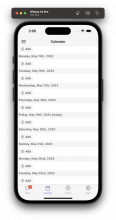
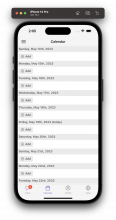
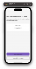
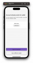
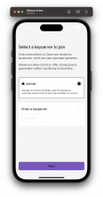
I also think this looks better. Note that panelSecondaryForeground is only used in the calendar, as well as the inner tile in ExistingEthereumAccount. Meanwhile, panelSecondaryForegroundBorder is only used for placeholder text in the new registration flow, and the border around a non-selected radio button in RegistrationTile. Screenshots for all three are in the Test Plan.
Depends on D7887
Test Plan:
| before | after | |
| calendar (secondary foreground) | ||
| inner tile (secondary foreground) | ||
| RegistrationTile (secondary foreground border) | ||
For RegistrationTile, the secondary foreground border color is used in the non-selected radio button border and the placeholder text.
Note that the registration flow will ONLY support dark mode; the screenshots are shared to give some visual context, but are not real screenshots that will be possible in the app.
Reviewers: ted
Reviewed By: ted
Subscribers: tomek, atul
Differential Revision: https://phab.comm.dev/D7888
