[web] Fix "See more..." button alignment regression
Summary: Noticed another regression in the latest deploy of the web app. This change moves the "See more..." text so it's aligned with the text on the sidebars.
Test Plan:
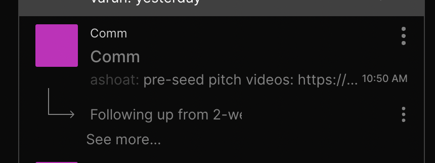
Before:
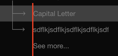
Looks as expected on Chrome/Safari:
Reviewers: atul
Reviewed By: atul
Subscribers: ashoat, palys-swm, Adrian
Differential Revision: https://phab.comm.dev/D4278