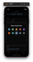
[native] Increase contrast between ColorPickerModal and background view
Summary:
Added a drop shadow to the ColorPickerModal to increase contrast between the modal and the background.
Talked to @atul about this -- but the shadow is noticeably jagged/not smooth around the edge of the modal. You can see the change in shadow color in the circled red spots here:
New to React Native, so I'm open to approaches about how to make this look better!
- (Current approach) Continue using Shadow Props, but fine-tuning the actual values (height, width, or the shadowRadius) to make the shadow smoother
- Not using a drop shadow, but a stroke or something similar instead
- Another styling approach
Test Plan:
Tested on iOS 15.4 and works as expected
Reviewers: atul, ashoat
Reviewed By: atul, ashoat
Subscribers: ashoat, palys-swm, Adrian, karol-bisztyga
Differential Revision: https://phabricator.ashoat.com/D3846

