Page MenuHomePhabricator

[native] Increase contrast between `ColorPickerModal` and background view
ClosedPublic

Authored by abosh on Apr 25 2022, 6:21 PM.
Tags
None
Referenced Files
Unknown Object (File)
Mon, Aug 26, 2:32 AM
Unknown Object (File)
Thu, Aug 15, 3:31 PM
Unknown Object (File)
Tue, Aug 13, 3:14 PM
Unknown Object (File)
Tue, Aug 13, 3:14 PM
Unknown Object (File)
Tue, Aug 13, 3:14 PM
Unknown Object (File)
Tue, Aug 13, 3:13 PM
Unknown Object (File)
Tue, Aug 13, 3:08 PM
Unknown Object (File)
Mon, Aug 12, 6:04 PM

Details

Summary

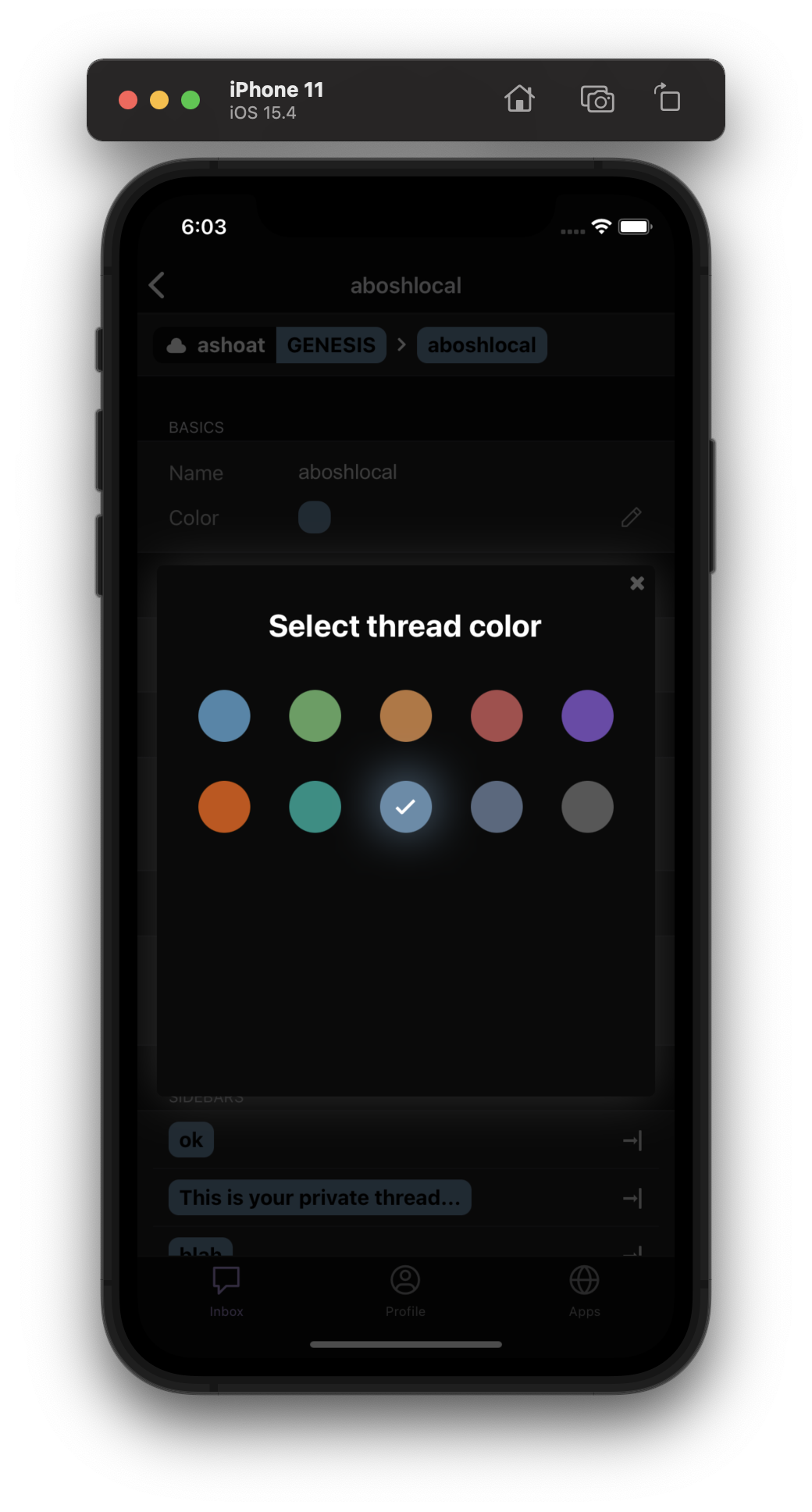
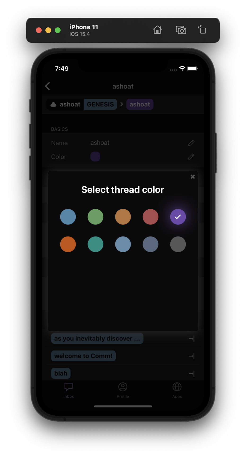
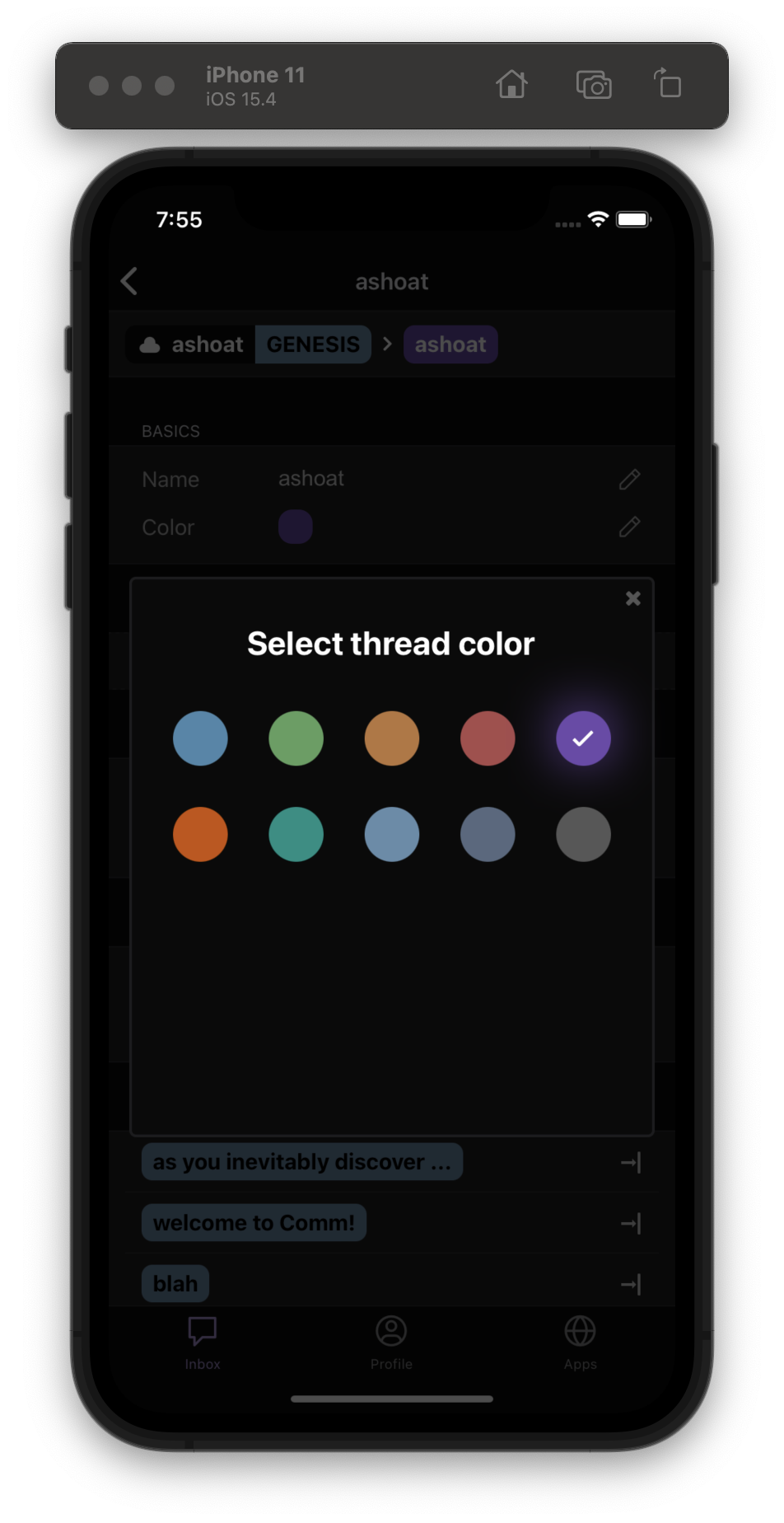
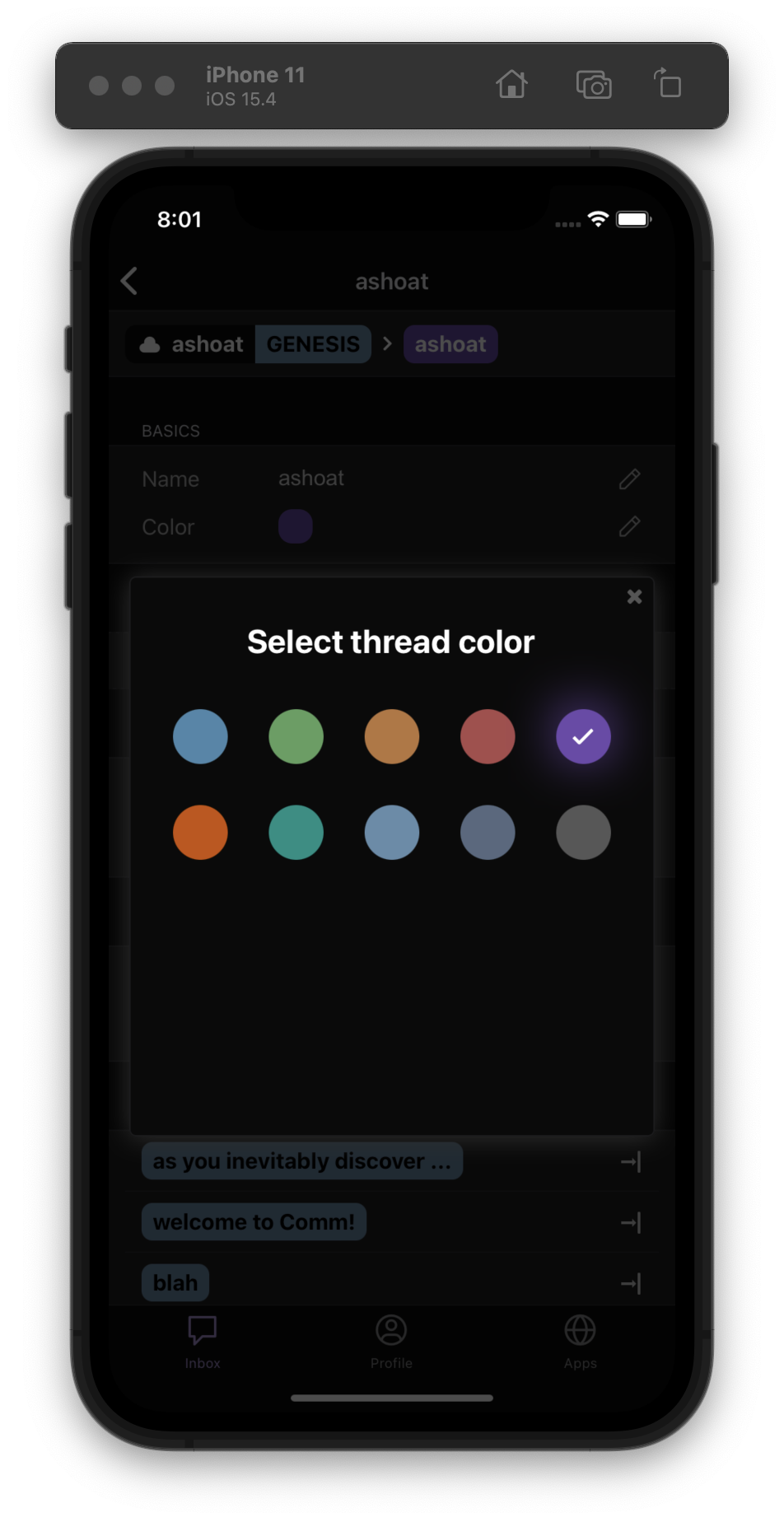
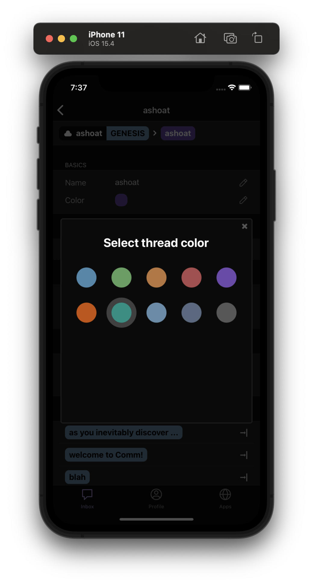
Added a drop shadow to the ColorPickerModal to increase contrast between the modal and the background.

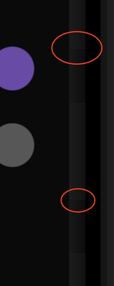
Talked to @atul about this -- but the shadow is noticeably jagged/not smooth around the edge of the modal. You can see the change in shadow color in the circled red spots here:

image.png (1×470 px, 50 KB)

New to React Native, so I'm open to approaches about how to make this look better!

  • (Current approach) Continue using Shadow Props, but fine-tuning the actual values (height, width, or the shadowRadius) to make the shadow smoother
  • Not using a drop shadow, but a stroke or something similar instead
  • Another styling approach
Test Plan

Tested on iOS 15.4 and works as expected

image.png (1×1 px, 509 KB)

Diff Detail

Repository
rCOMM Comm
Lint
Lint Not Applicable
Unit
Tests Not Applicable

Event Timeline

abosh edited the test plan for this revision. (Show Details)
abosh added 1 blocking reviewer(s): atul.

the shadow is noticeably jagged/not smooth around the edge of the modal

I'm not sure I see what you're pointing out with the red circles. It looks fine to me.

(adding @ashoat as blocking since it's a visual change, context: https://linear.app/comm/issue/ENG-1040/[native]-increase-contrast-between-modal-and-background-view)

This revision is now accepted and ready to land.Apr 26 2022, 7:59 AM
This revision now requires review to proceed.Apr 26 2022, 7:59 AM
ashoat requested changes to this revision.Apr 27 2022, 10:54 AM

I definitely see what @yayabosh is talking about. @atul, can you take a look / sync with @yayabosh to:

  1. Start by seeing the visual abberation
  2. Then try to understand if it's a result of what's displayed underneath the modal
  3. If it's not a result of what's displayed underneath, then we should try to understand what's causing the abberation before moving forward
This revision now requires changes to proceed.Apr 27 2022, 10:54 AM

Are you guys talking about the horizontal lines in the red circles? Pretty sure those are just the strokes at the top/bottom of each thread settings "section" in the view behind the modal?

Or is it that the shadow appears "brighter" over the brighter areas of the view it overlays? Not sure that's an "aberration," but what should be expected with this approach?

If we don't want the background view to be a factor in how the modal appears, we should go with a 1px opaque light gray stroke or something.

Are you guys talking about the horizontal lines in the red circles? Pretty sure those are just the strokes at the top/bottom of each thread settings "section" in the view behind the modal?

Yeah, I think so. Would be helpful to see a screenshot with the modal dismissed

Are you guys talking about the horizontal lines in the red circles? Pretty sure those are just the strokes at the top/bottom of each thread settings "section" in the view behind the modal?

Yeah, that is what it is. Great catch! It's funny because I only noticed this after finishing my latest solution that I devised with @atul this week which was just to make a small outline on the modal (used the modalForegroundBorder color for the outline from colors.js after looking through all the modals on native).

Would be helpful to see a screenshot with the modal dismissed

Here's a side-by-side of the modal dismissed and the modal with the glow/drop shadow (current state of this diff).

image.png (1×1 px, 525 KB)
image.png (1×1 px, 510 KB)

As you can see, the jagged aberrations match up with the thread settings sections.

Here's a screenshot of the solution @atul suggested this week (just the small outline on the modal):

image.png (1×952 px, 381 KB)

If we choose to go with the drop shadow/glow, we'll have to figure out a way to make it look nice with the background (but I'm not sure how we can get this done without brightening the color of the shadow itself, which would make it too overstated). If we're okay with the background coming through the shadow as it is right now, then we can leave the diff as is. Or we can change it to just an outline. Personally, I think a light outline and a light glow looks best since there's minimal overlap with the background and the edges of the modal are clear:

image.png (1×952 px, 387 KB)

I'm not sure I like the glow... not sure it matches our design language super well. Could you guys (@yayabosh and @atul) take a look at modals in our Figma (web and native) and see what we do there? I think the light outline seems like a good option but not 100% sure

This revision is now accepted and ready to land.Apr 30 2022, 4:21 PM

Removed glow and kept light outline.

image.png (1×1 px, 479 KB)

I think this solves the immediate issue and is good to land. We can always revisit using a shadow/"glow" later on.