[web] cleanup password change modal
Summary:
This diff cleans up the one off styles in the password change modal and replaces it with styles of the redesigned modal.
As part of cleanup for this modal there were some creative liberties I took which I will outline below:
- The old password change modal would display their error message to the left of the main CTA button
- However based on the new redesigned modals: "If there is only one button for the modal, then the button will fill up the entire space of the section"
- I moved the error message to be below the last input of the modal
- I also added a placeholder spacing (to match the height of the error message) below the last input so that if an error message is shown then the height of the modal will not change
Linear task: https://linear.app/comm/issue/ENG-5943/extendmodify-the-modal-props-api-to-follow-new-modal-designs
Depends on D10230
Test Plan:
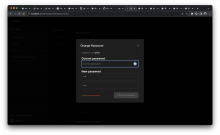
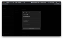
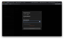
Please see screenshot below
default case:
error case:
Reviewers: atul, rohan, kamil
Reviewed By: rohan
Subscribers: ashoat, tomek
Differential Revision: https://phab.comm.dev/D10232


