[web] Introduce :disabled and :hover styles for Button
Summary:
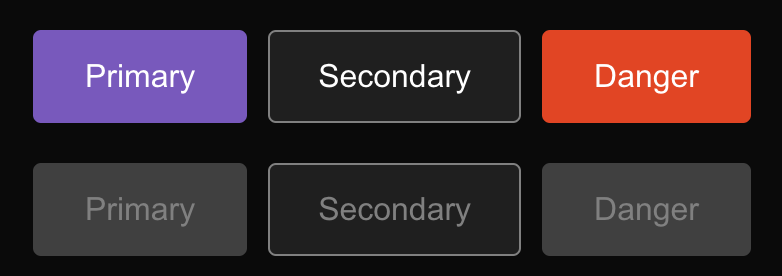
Introduce styles for disabled buttons with primary, secondary and danger variants.
Also added :hover background color change for secondary and danger variants, because it was missing.
Following styles in Desktop App and Mobile Figma design:
Disabled Primary button - https://www.figma.com/file/a1nkbWgbgjRlrOY9LVurTz/Comm-%2F-Desktop-app?node-id=1077%3A69208
Secondary buttons - https://www.figma.com/file/2H0BQsi8MgC5MpjNtViJxB/Comm-%2F-Mobile-Design-System?node-id=480%3A4797
Test Plan: Currently existing buttons in web app should have proper disabled state - e.g. the ones in thread settings.
Reviewers: palys-swm, atul, benschac
Reviewed By: atul
Subscribers: ashoat, Adrian, atul, karol-bisztyga, benschac, yayabosh
Differential Revision: https://phabricator.ashoat.com/D3813