Page MenuHomePhabricator

[web] Introduce `:disabled` and `:hover` styles for `Button`
ClosedPublic

Authored by jacek on Apr 22 2022, 2:33 AM.
Tags
None
Referenced Files
Unknown Object (File)
Sun, Sep 8, 11:11 AM
Unknown Object (File)
Sun, Sep 8, 11:11 AM
Unknown Object (File)
Sun, Sep 8, 11:11 AM
Unknown Object (File)
Sun, Sep 8, 11:11 AM
Unknown Object (File)
Sun, Sep 8, 11:11 AM
Unknown Object (File)
Sun, Sep 8, 11:02 AM
Unknown Object (File)
Wed, Aug 28, 12:09 AM
Unknown Object (File)
Aug 17 2024, 2:51 PM

Details

Summary

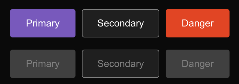
Introduce styles for disabled buttons with primary, secondary and danger variants.
Also added :hover background color change for secondary and danger variants, because it was missing.
Following styles in Desktop App and Mobile Figma design:
Disabled Primary button - https://www.figma.com/file/a1nkbWgbgjRlrOY9LVurTz/Comm-%2F-Desktop-app?node-id=1077%3A69208
Secondary buttons - https://www.figma.com/file/2H0BQsi8MgC5MpjNtViJxB/Comm-%2F-Mobile-Design-System?node-id=480%3A4797

Screenshot_Google Chrome_2022-04-22_105218@2x.png (276×782 px, 29 KB)

Test Plan

Currently existing buttons in web app should have proper disabled state - e.g. the ones in thread settings.

Diff Detail

Repository
rCOMM Comm
Lint
Lint Not Applicable
Unit
Tests Not Applicable

Event Timeline

Looks good. Had a couple of questions. Additionally, could you add the figma link?

web/components/button.css
24 ↗(On Diff #11774)

why switch all of these to background-color? `background is shorthand, does the same thing?

I find it a bit easier to read:

background: blue;
color: red

You know what the background is and what the text color is`. When I see background-color then ask what color is. Additionally, it's a bit more typing.

I'm not really married to background but I think we should stick to one way or another for consistency.

Thanks for the video showing what all of the different states look like!

This revision is now accepted and ready to land.Apr 24 2022, 2:25 PM
web/components/button.css
24 ↗(On Diff #11774)

I wanted to standardize the convention in this file, since it contained both background and background-color. I did quick searched and found, that in web styles, background is used ~35 times, and background-color over 60 times, so I used the latter.

I don't think there is a big difference between these forms, and I'm ok if we decide to stick to any of them.

web/components/button.css
24 ↗(On Diff #11774)

There's a significant difference between background and background-color. The shorthand sets a lot of props, not only the color. If we have a style where we set e.g. background-image it will be unset by calling background: #color. Overall, both of the props have their usages, but usually background is what we really want: we want to set a background to be a solid color. On the other hand, if we introduce some global background props, like e.g. background-clip (if we ever have to), then using background would effectively unset them.

So currently, it looks like using background is better, because it expresses our intention, but we might need to change that in the future.

replace background-color with background & rebase