Page MenuHomePhabricator

[web] Increase clickable region of `ChatThreadListItem`
ClosedPublic

Authored by atul on Mar 29 2022, 11:24 AM.
Tags
None
Referenced Files
Unknown Object (File)
Fri, Jul 5, 6:51 AM
Unknown Object (File)
Tue, Jul 2, 2:02 PM
Unknown Object (File)
Mon, Jul 1, 12:10 AM
Unknown Object (File)
Sun, Jun 30, 9:55 PM
Unknown Object (File)
Sat, Jun 29, 6:52 PM
Unknown Object (File)
Sat, Jun 29, 12:16 PM
Unknown Object (File)
Wed, Jun 26, 6:05 PM
Unknown Object (File)
Wed, Jun 26, 6:05 PM

Details

Summary

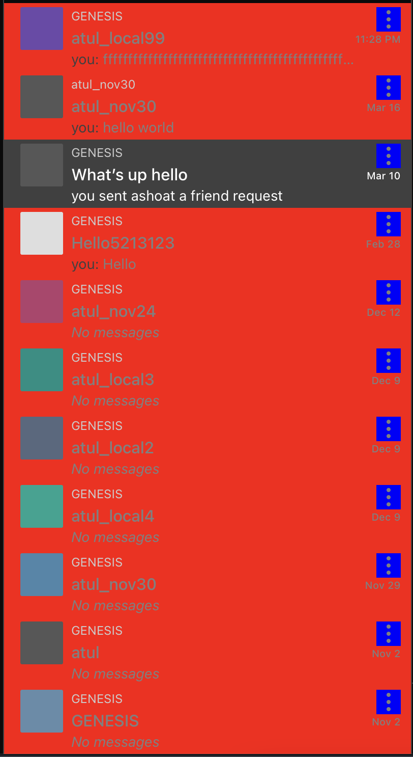
Addresses issue described in: https://linear.app/comm/issue/ENG-842/fix-threadlist-click-area

("Clickable" region in red)
Before:

20f6.png (1×804 px, 114 KB)

After:
deac.png (1×812 px, 162 KB)

Test Plan

Tried clicking between threads, marking threads as read/unread, etc. and made sure things look/behave as expected"

Diff Detail

Repository
rCOMM Comm
Lint
Lint Not Applicable
Unit
Tests Not Applicable

Event Timeline

atul edited the summary of this revision. (Show Details)

cursor:pointer

atul requested review of this revision.Mar 29 2022, 11:38 AM
web/chat/chat-thread-list-item-menu.react.js
24 ↗(On Diff #10786)

Basically

  • If the user clicks anywhere in the "clickable" thread list item div, we want to navigate to the corresponding thread
  • If the user clicks the vertical ellipsis, we want to display the "mark as [read/unread]" menu.

Without event.stopPropogation(), when the user clicks the vertical ellipsis for an inactive thread:

  • The "mark as [read/unread" menu appears
  • The user is navigated to the corresponding thread even though they didn't intend to
tomek added 1 blocking reviewer(s): ashoat.

This makes sense, but I'm not sure about extending clickable area near vertical ellipsis. The issue might be that it is not clear where one clickable area ends and another begins, so a user might be confused (e.g. the intention was to open the menu but instead a thread was opened).
If we agree this is a real issue, we can e.g. find a way for a cursor to become default when hovering from thread to ellipsis so that it's clear where one area ends and another begins. We can also extend the clickable area only to some point on the right hand side.

We can also extend the clickable area only to some point on the right hand side.

This is actually what I tried originally. I changed the layout a bit and was able to change the "active" area from
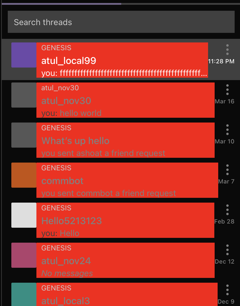
20f6.png (1×804 px, 114 KB)

to
bcf8-1.png (774×824 px, 86 KB)

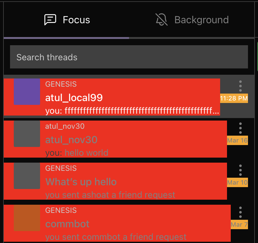
but it was weird in practice because there were unexpected "dead areas" on the right (like under the timestamp).

Based on my experimentation, I think the best bet is the make the whole "cell" sans the ellipsis navigate the user to the thread, and for the ellipsis to bring up the menu.

If we agree this is a real issue, we can e.g. find a way for a cursor to become default when hovering from thread to ellipsis so that it's clear where one area ends and another begins.

But you're right that we should make it clear to the user where one clickable region begins and ends.

I think the best option is to introduce a hover state for the ellipsis icon? What are your thoughts on an approach like that? We could also "un-highlight" the thread cell when the ellipsis is "active" to make it more clear? (would address these styling changes to make clickable regions clear in a separate diff)

ashoat added inline comments.
web/chat/chat-thread-list-item-menu.react.js
24 ↗(On Diff #10786)

Thanks for sharing this explanation here

This revision is now accepted and ready to land.Mar 30 2022, 11:02 PM
This revision was landed with ongoing or failed builds.Mar 31 2022, 9:16 AM
This revision was automatically updated to reflect the committed changes.