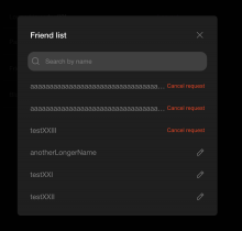
When a username is longer than available space, we should display an ellipsis at its end, just like we do in other places. We also need to make sure that the text in a button doesn't wrap.
Details
Send a friend request to a user with long username and check if the name is displayed correctly on friend list.
Diff Detail
- Repository
- rCOMM Comm
- Lint
Lint Not Applicable - Unit
Tests Not Applicable
Event Timeline
When a username is longer than available space, we should display an ellipsis at its end, just like we do in other places.
Makes sense
We also need to make sure that the text in a button doesn't wrap.
Is this because if the username is too long it pushes the button text past the right edge of the container div?
I'd guess that if we're setting the button text we'd be able to ensure it wouldn't overflow? If that is the issue, we should be able to solve it by making the buttons flex: 1 or something?
I think it'd be good to avoid letting users take actions that they can't fully read?
The default behavior is that the button content is fully visible, but because text consists of two words, they are put in two lines. By using nowrap we make sure that the content is exactly one line. Regarding overflow I checked it and it isn't necessary (will update the diff). But overall, because the username always can shrink, the button will always be fully visible.
