Page MenuHomePhabricator

[web] [fix] sidebar app switcher correct width
ClosedPublic

Authored by benschac on Feb 23 2022, 3:46 AM.
Tags
None
Referenced Files
Unknown Object (File)
Wed, Dec 4, 1:30 AM
Unknown Object (File)
Nov 16 2024, 10:19 PM
Unknown Object (File)
Nov 15 2024, 6:05 AM
Unknown Object (File)
Nov 8 2024, 2:02 AM
Unknown Object (File)
Nov 8 2024, 1:51 AM
Unknown Object (File)
Nov 2 2024, 6:36 AM
Unknown Object (File)
Nov 2 2024, 6:36 AM
Unknown Object (File)
Nov 2 2024, 6:36 AM

Details

Summary

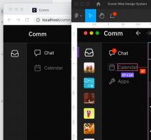
I updated the width of the sidebar community picker to match the correct width of the Figma design.

Figma: https://www.figma.com/file/a1nkbWgbgjRlrOY9LVurTz/Comm-%2F-Desktop-app?node-id=1170%3A78356

before:

Image 2022-02-23 at 6.51.22 AM.jpg (2×2 px, 338 KB)

after:

Image 2022-02-23 at 6.50.20 AM.jpg (2×2 px, 344 KB)

updated solution: 2/28/2022

Image 2022-02-28 at 3.27.50 PM.jpg (1×1 px, 190 KB)

https://linear.app/comm/issue/ENG-797/left-panel-width-too-small

Test Plan

Should match figma.

Diff Detail

Repository
rCOMM Comm
Branch
arcpatch-D3267
Lint
No Lint Coverage
Unit
No Test Coverage

Event Timeline

benschac edited the test plan for this revision. (Show Details)
ashoat requested changes to this revision.Feb 23 2022, 11:33 AM

I'm a bit confused here, and it's not clear to me if this change matches the intention of the Figma designs. Two questions:

  1. Designs: According to Figma, is the CommunityPicker supposed to have a fixed width, or a flexible one? How is the width supposed to be determined?
  2. CSS: Now that there's no explicit width declaration, how will the browser determine the width of the CommunityPicker?
This revision now requires changes to proceed.Feb 23 2022, 11:33 AM
In D3267#87466, @ashoat wrote:

I'm a bit confused here, and it's not clear to me if this change matches the intention of the Figma designs. Two questions:

  1. Designs: According to Figma, is the CommunityPicker supposed to have a fixed width or a flexible one? How is the width supposed to be determined?
  2. CSS: Now that there's no explicit width declaration, how will the browser determine the width of the CommunityPicker?
  1. Image 2022-02-24 at 3.08.19 PM.jpg (1×1 px, 179 KB)
    assumption is that every element that's in the grid overlay should be responding to size to a certain point. Community picker and app picker do not seem to have a flexible width.

Currently Conversation Items have a fixed value from the absolute positioning layout issue we've spoke about. I created a linear task for it: https://linear.app/comm/issue/ENG-810/chat-layout-is-absolutely-positioned-breaking-layout-at-smaller

  1. https://developer.mozilla.org/en-US/docs/Web/CSS/min-width -- there's still width defined.
ashoat requested changes to this revision.Feb 27 2022, 8:39 PM

Still don't have the context I need to accept. If the CommunityPicker is supposed to have a fixed width, why are we moving from width (which fixes the width) to min-width (which apparently provides a minimum width)?

This revision now requires changes to proceed.Feb 27 2022, 8:39 PM
In D3267#88587, @ashoat wrote:

Still don't have the context I need to accept. If the CommunityPicker is supposed to have a fixed width, why are we moving from width (which fixes the width) to min-width (which apparently provides a minimum width)?

We didn't need a min-width.

I think it was because the parent element had 100% width, pushing in the Community Switcher component.

This revision is now accepted and ready to land.Feb 28 2022, 8:04 PM

ADDRESS THIS COMMENT BEFORE LANDING

The screenshot above does not seem to match the Figma. In the Figma, the ratio of the app switcher container width to the inbox icon width seems to be lower than in your screenshot.

In the screenshot, it looks like there's enough space to the right of the inbox icon to fit a whole nother inbox icon. (This doesn't appear to be the case in the Figma.)

Is this discrepancy because the icon is the wrong size in production? Please address this prior to landing, and in the future please preemptively highlight/address these discrepancies to save your reviewer the time they will inevitably have to spend asking about it.

In D3267#88921, @ashoat wrote:

ADDRESS THIS COMMENT BEFORE LANDING

The screenshot above does not seem to match the Figma. In the Figma, the ratio of the app switcher container width to the inbox icon width seems to be lower than in your screenshot.

In the screenshot, it looks like there's enough space to the right of the inbox icon to fit a whole nother inbox icon. (This doesn't appear to be the case in the Figma.)

Is this discrepancy because the icon is the wrong size in production? Please address this prior to landing, and in the future please preemptively highlight/address these discrepancies to save your reviewer the time they will inevitably have to spend asking about it.

In the Figma, the ratio of the app switcher container width to the inbox icon width seems to be lower than in your screenshot.

I've spent about 20 minutes reading over your comment.

  • The app switcher component is about 2px smaller than in the figma. This is because we don't have a border-box (https://developer.mozilla.org/en-US/docs/Web/CSS/box-sizing) set globally. But i don't think that's specifically what you're commenting on here.
  • My only other assumption to why the ratio might look a bit off is because the icons are a bit larger than what they should be per-figma, like you mentioned.

Image 2022-03-01 at 9.49.27 AM.jpg (1×1 px, 111 KB)

I've been looking at both side-to-side and I'm not seeing it. Could you be more specific or add a screen shot? Or could we hop on a 5-minute call?

I've looked at both side-by-side and measured their widths and confirmed this is what the design calls for.

I'm going to hold off handing until I can answer your question.

ADDRESS THIS BEFORE LANDING

It looks like it's probably the size of the icons? I used the macOS screenshot tool to measure the pixel sizes of the icons in your screenshot, and found there was a 15% discrepancy (46 pixel height instead of 40 pixel height).

If you confirm that discrepancy, then we can conclude that the issue here is icon sizing and we can follow-up in a separate diff. Before landing this, you will need to create a Linear task or a follow-up diff that addresses the issue.

I've been looking at both side-to-side and I'm not seeing it. Could you be more specific or add a screen shot? Or could we hop on a 5-minute call?

I've looked at both side-by-side and measured their widths and confirmed this is what the design calls for.

We should definitely chat about what happened here, but I don't think it's urgent. The above comments should hopefully be enough to unblock you.

I definitely want to chat about what you spent 20 minutes on. To be entirely frank, it took me less than 5 minutes with a pixel tool to identify a 15% discrepancy in icon sizing. It certainly took me more time than that to write up the feedback in the previous comment and this comment, though.

We really need to find a way for you to be able to improve reading comprehension / ability to parse feedback. One suggestion to you: in the future, when you read feedback from me that is confusing, can you try to check with @atul to get his perspective on it before replying on the diff?

I definitely want to chat about what you spent 20 minutes on. To be entirely frank, it took me less than 5 minutes with a pixel tool to identify a 15% discrepancy in icon sizing. It certainly took me more time than that to write up the feedback in the previous comment and this comment, though.

Honestly, it's more nerves than anything. I really want to make sure I don't miss anything obvious and make you feel like I'm not taking your feedback seriously.

We really need to find a way for you to be able to improve reading comprehension / ability to parse feedback. One suggestion to you: in the future, when you read feedback from me that is confusing, can you try to check with @atul to get his perspective on it before replying on the diff?

  • Yeah, I can ask @atul next time for sure.
In D3267#89131, @ashoat wrote:

It looks like it's probably the size of the icons? I used the macOS screenshot tool to measure the pixel sizes of the icons in your screenshot, and found there was a 15% discrepancy (46 pixel height instead of 40 pixel height).

confirmed

If you confirm that discrepancy, then we can conclude that the issue here is icon sizing and we can follow-up in a separate diff. Before landing this, you will need to create a Linear task or a follow-up diff that addresses the issue.

I'm addressing the icon sizing issue in this diff stack (https://phabricator.ashoat.com/D3299) and this issue: https://linear.app/comm/issue/ENG-800/re-introduce-default-paddings-in-icon-set. When this diff is landed the icon sizes will be adjusted as well. I'll update my diff description as well to reflect the icon sizing change.