[landing] clean up competitor comparison UI
Summary:
As I was inputting copy for one of the competitors I came across some modals/elements that were not super clean visaully. Spoke with @ted and he gave me some tips on how to clean things up.
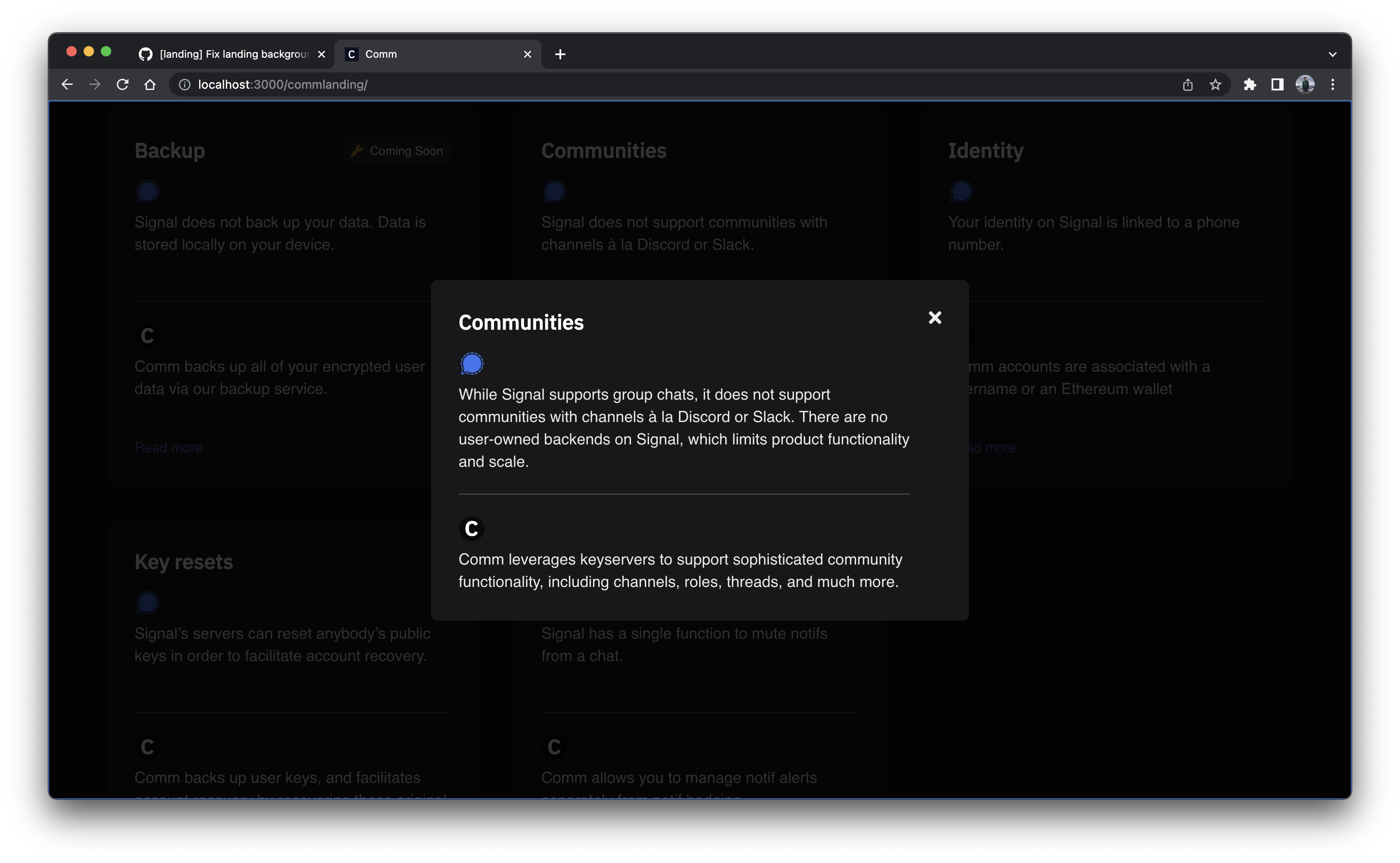
- We should make the padding for the modal container 32px all around
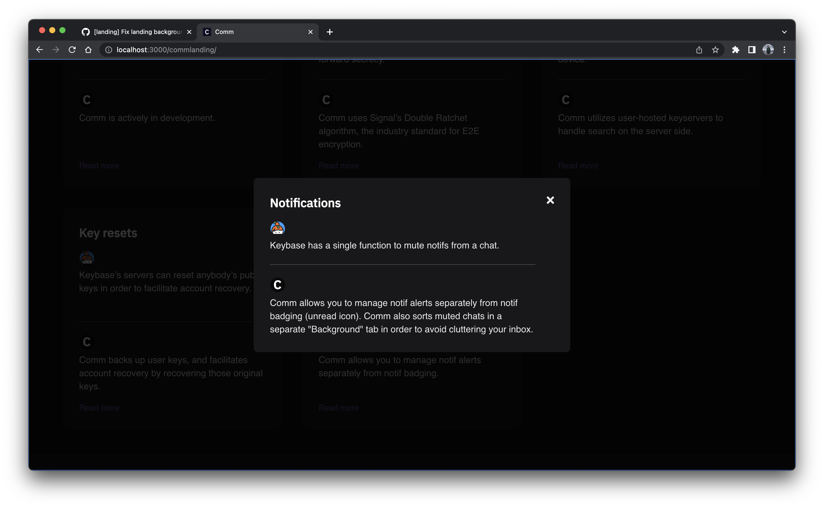
- The descriptions in the competitor feature comparison modal should not have a min height
- The dividers in the competitor feature cards that have are a tad off
Linear task: https://linear.app/comm/issue/ENG-4346/remove-min-height-for-competitor-feature-comparison-modal
Depends on D8176
Test Plan:
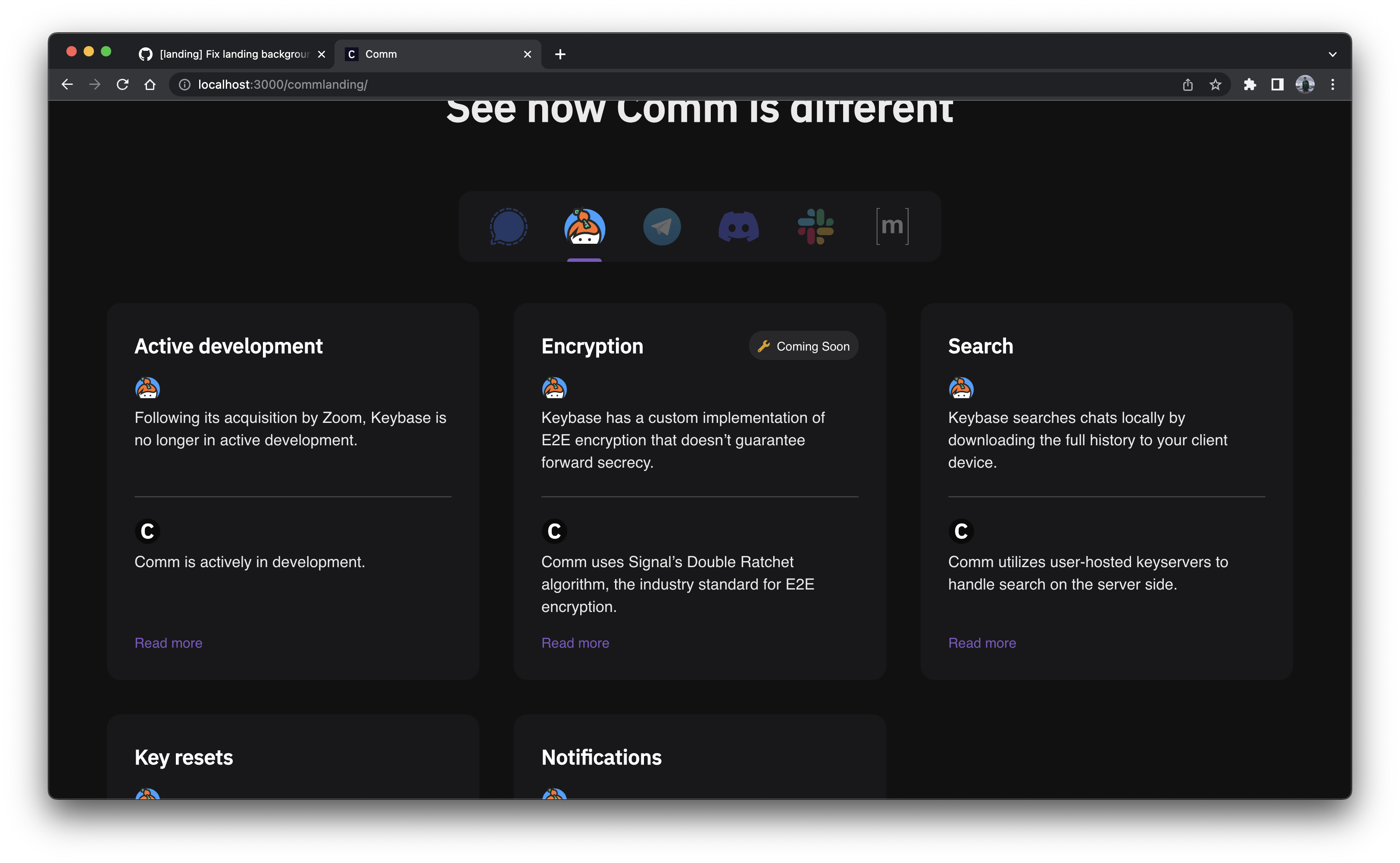
Please see the screenshots below to see that each point in the summary was addressed:
We should make the padding for the modal container 32px all around
Before:

After:
The descriptions in the competitor feature comparison modal should not have a min height
Before:
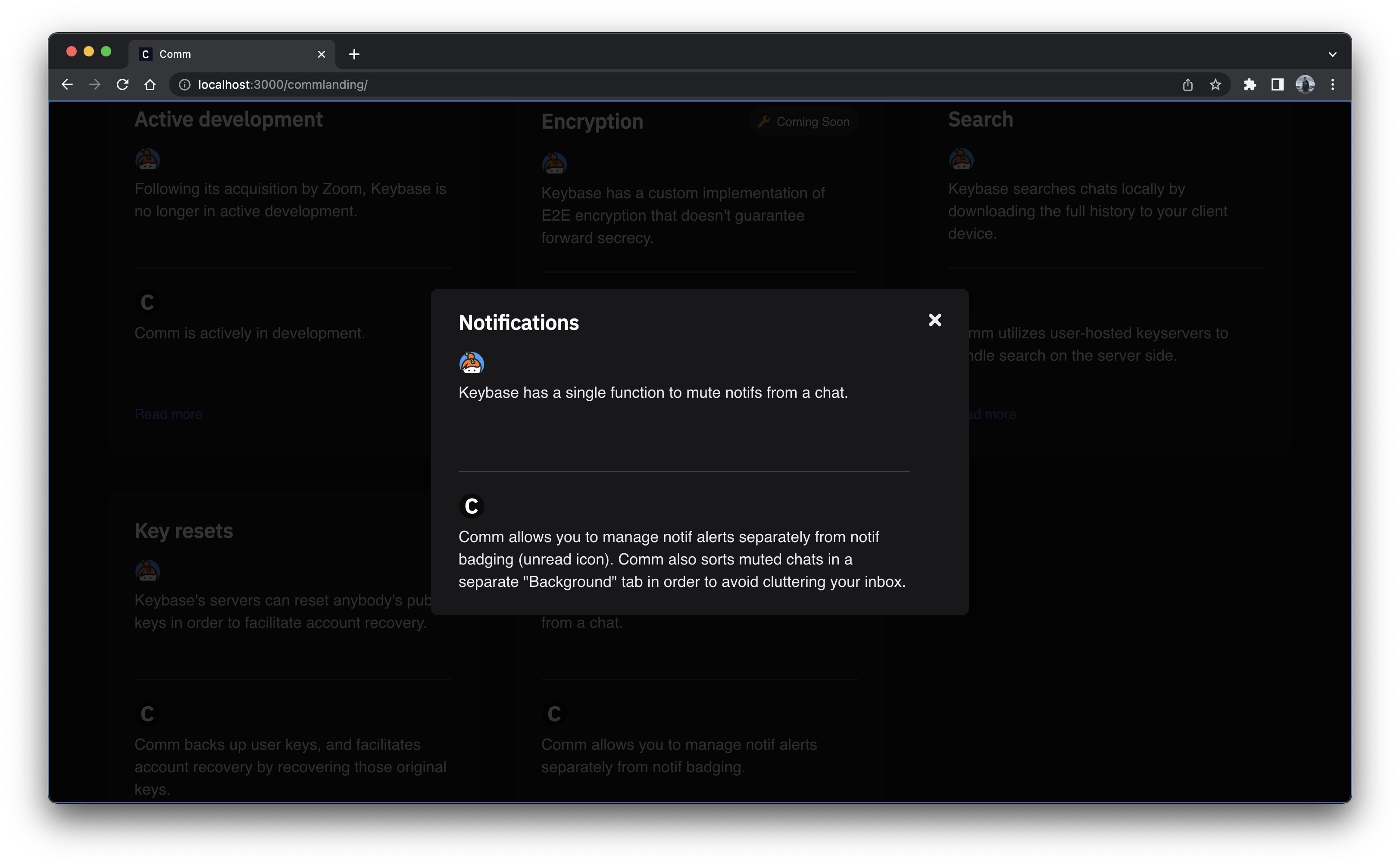
After:
The dividers in the competitor feature cards that have are a tad off
Before:
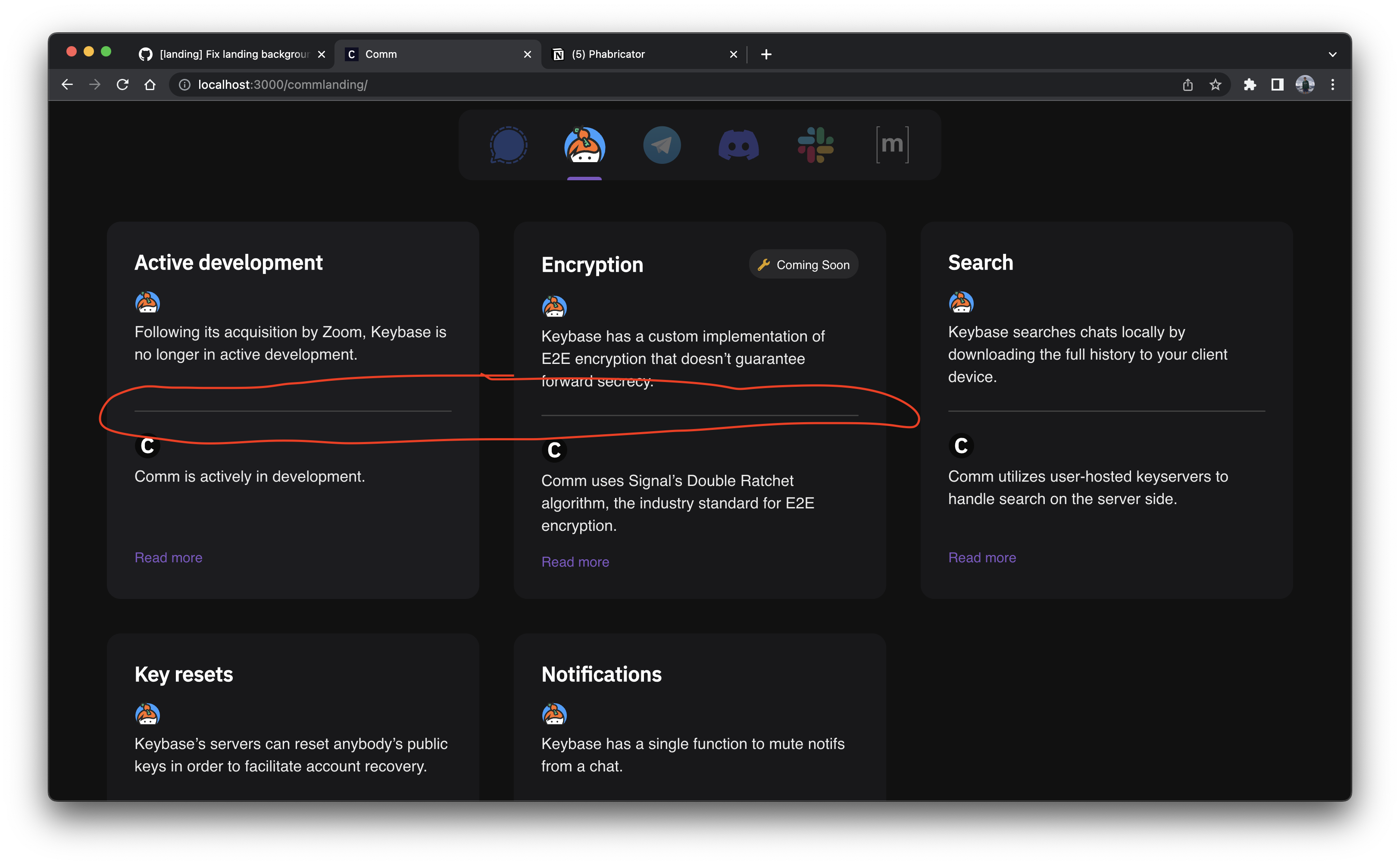
After:
Reviewers: atul, kamil
Reviewed By: atul, kamil
Subscribers: ashoat, tomek, ted
Differential Revision: https://phab.comm.dev/D8477