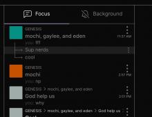
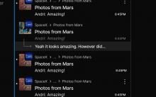
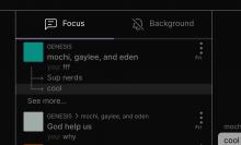
had to toggle menu button size to make arrows touch. Additionally, there wasn't any design for sub thread unread menu on hover.
Details
make sure it looks like the screen shot
Diff Detail
- Repository
- rCOMM Comm
- Lint
Lint Not Applicable - Unit
Tests Not Applicable
Event Timeline
@benschac, if you ever feel the need to short-circuit the review process please communicate clearly the purpose for the urgency
| web/chat/chat-thread-list-item-menu.react.js | ||
|---|---|---|
| 26 ↗ | (On Diff #9541) |
|
address diff comments
| web/chat/chat-thread-list-item-menu.react.js | ||
|---|---|---|
| 26 ↗ | (On Diff #9541) |
|
We're using the same component in multiple contexts that call for different design.
Before landing, can you share screenshots of the two different designs in Figma, so it's clear to your reviewers why we need this new renderStyle prop?
Sure:
- the arrows on web figma don't have multiple threads. After chatting with ashoat, we made the decision to show multiple threads like this
After:
Why render style:
- Additionally, there wasn't a unread button shown in figma either. In order to keep the arrows touching + unread buttions we needed a smaller menu buttion for threads.
Link to figma: https://www.figma.com/file/a1nkbWgbgjRlrOY9LVurTz/Comm-%2F-Desktop-app?node-id=1170%3A77104
@benschac: After seeing your screenshots, and then re-reading the diff description, I think I finally understand what's going on now.
What I understand now: we agreed that we wanted the line to be continuous, but you didn't see a design in Figma so you had to make one up. You wanted to minimize the amount of work, and to do that you wanted to compose the line by only using the icon. The easiest way to do that was to hack the design and make the height of the thread unit shorter.
I really wish you had taken the time to explain this in more detail in the diff description. The screenshots that you later provided were helpful, and should've been there originally. Additionally, I wish your diff description was longer, and looked more like my last paragraph in terms of the level of detail.
Anyways: I don't agree with this design hack and I wish we had had an explicit discussion about it. Let's follow-up in a separate task. Creating ENG-766 to track.


