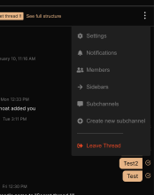
Added Leave Thread option.
It's functionality after click will be added in separate diff.
Details
Tested if the item is displayed in threads, that can be left. It shouldn't appear in Personal threads.
Diff Detail
- Repository
- rCOMM Comm
- Lint
Lint Not Applicable - Unit
Tests Not Applicable
Event Timeline
| web/chat/thread-menu.css | ||
|---|---|---|
| 58 ↗ | (On Diff #9602) | My guess is that we should specify a margin instead of max-width, so that when there's a really long item, or all the items are short, the layout still looks ok. We can use both max-with and margin just to make sure that the separator is never too short. |
| web/chat/thread-menu.react.js | ||
| 119 ↗ | (On Diff #9602) | We shouldn't do it like that. If there are more items from the second section it would be hard to determine if we need a separator. We should instead check in menuItems if there are items from the second section and either render the first section, or first section + separator + second section. This breaks my idea of avoiding repetition in menuItems. |
| web/chat/thread-menu.css | ||
|---|---|---|
| 58 ↗ | (On Diff #9602) |
It is exactly what I did.
How the use of max-width would make sure it is long enough? Did you mean min-width? Personally, I think it looks ok as it's now. |
| web/chat/thread-menu.react.js | ||
|---|---|---|
| 119 ↗ | (On Diff #9602) | I haven't seen any design of the thread menu in Figma, that would require additional items below the separator, except the "Leave Thread" one. |
| web/chat/thread-menu.css | ||
|---|---|---|
| 58 ↗ | (On Diff #9602) | You're totally right, sorry for the confusion. I guess adding min-width might be a good idea though. |
| web/chat/thread-menu.react.js | ||
| 119 ↗ | (On Diff #9602) | The issue with current solution is that leaveThreadItem consists of two parts, one of them is the separator. The problem is that we can't say that the separator is a part of the item and at the same time the code is telling exactly that. So the relationship is more like "something is next to something" and not "something is a part of something". Regarding the designs, it is true that we don't have that, but at the same time it would be much easier to add such a thing in the future if the separator was defined inside the menu. The reason is that the leaveThreadItem is rendered conditionally and it is possible that someone is going to miss the fact that it renders both an item and a separator. This could lead to bugs with missing / duplicate separator. As a side note, when you need to use Fragment, but don't need to give it any props, there's a shorthand for that <>. |
