Page MenuHomePhabricator

[web] Update the styles of password modal
ClosedPublic

Authored by tomek on Mar 21 2022, 4:03 AM.
Tags
None
Referenced Files
Unknown Object (File)
Tue, Jan 14, 2:08 AM
Unknown Object (File)
Thu, Jan 9, 7:44 PM
Unknown Object (File)
Thu, Jan 9, 10:12 AM
Unknown Object (File)
Wed, Jan 8, 11:35 PM
Unknown Object (File)
Wed, Jan 8, 6:27 PM
Unknown Object (File)
Wed, Jan 8, 6:27 PM
Unknown Object (File)
Wed, Jan 8, 6:27 PM
Unknown Object (File)
Wed, Jan 8, 6:22 PM

Details

Summary

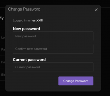
We don't have the designs but wanted to make this more or less consistent with what we have in other places. Note that modal and input styles do not match the designs from figma e.g. https://www.figma.com/file/a1nkbWgbgjRlrOY9LVurTz/Comm-%2F-Desktop-app?node-id=1061%3A63258 so the appearance will change in the future.

password_settings_2.0.png (1×1 px, 94 KB)

Depends on D3475

Test Plan

Open modal and check if it looks ok

Diff Detail

Repository
rCOMM Comm
Lint
Lint Not Applicable
Unit
Tests Not Applicable

Event Timeline

tomek requested review of this revision.Mar 21 2022, 4:15 AM
This revision is now accepted and ready to land.Mar 21 2022, 7:01 AM
This revision now requires review to proceed.Mar 21 2022, 9:21 AM

Styles look much cleaner!

Note that modal and input styles do not match the designs from figma e.g. https://www.figma.com/file/a1nkbWgbgjRlrOY9LVurTz/Comm-%2F-Desktop-app?node-id=1061%3A63258 so the appearance will change in the future.

Makes sense, so this was more of a stopgap measure to get things looking consistent before a proper reskin?

web/settings/password-change-modal.css
8–10 ↗(On Diff #10560)

If I understand correctly, this is functionally the same as display: block? Each of the children of the div appearing one below the other?

51 ↗(On Diff #10560)

Do we no longer need to set font-family explicitly here? Does it "cascade" down from some global style?

This revision is now accepted and ready to land.Mar 22 2022, 1:57 PM
ashoat requested changes to this revision.Mar 22 2022, 9:59 PM
This comment was removed by ashoat.
This revision now requires changes to proceed.Mar 22 2022, 9:59 PM

I think we should improve how this looks. @palys-swm and @atul, can you sync and discuss this a little bit? In particular, the prompt for the current password looks really awkward, and it's not clear to me that it's necessary. I understand we're still iterating on the modal and input styles, but the prompt doesn't seem to have anything to do with either.

Probably the easiest solution would be to simply remove the prompt?

Display username and delete prompt

web/settings/password-change-modal.css
8–10 ↗(On Diff #10560)

Yeah, I think so. There are some differences in terms of growing / shrinking, but positioning is similar.

51 ↗(On Diff #10560)

Yes, it is set in style.css for body

@atul Added username and deleted the prompt. Could you suggest any other improvements?

Makes sense, so this was more of a stopgap measure to get things looking consistent before a proper reskin?

Yeah, we need to update these components at some point and that would affect how our whole app looks like. Ideally, we can update just them without any more adjustments, but I think this is unlikely.

With the prompt gone this looks much better!! I think we can land as-is, but also curious if @atul has any suggestions.

Looks good!

One minor note: I think that I've seen other apps put the current password input above the new password input, but don't personally have a strong feeling either way.

This revision is now accepted and ready to land.Mar 25 2022, 9:24 AM

One minor note: I think that I've seen other apps put the current password input above the new password input, but don't personally have a strong feeling either way.

Ok, so I think we can land as is and if we ever feel strongly, we can create a task for it

This revision was automatically updated to reflect the committed changes.