Page MenuHomePhabricator

[web] [fix] ENG-761 add padding between timestamp and message
AbandonedPublic

Authored by benschac on Mar 29 2022, 5:47 AM.
Tags
None
Referenced Files
Unknown Object (File)
Fri, Nov 15, 1:05 AM
Unknown Object (File)
Thu, Nov 7, 1:49 AM
Unknown Object (File)
Tue, Nov 5, 5:38 AM
Unknown Object (File)
Tue, Nov 5, 5:38 AM
Unknown Object (File)
Tue, Nov 5, 5:38 AM
Unknown Object (File)
Tue, Nov 5, 5:35 AM
Unknown Object (File)
Oct 22 2024, 9:11 PM
Unknown Object (File)
Oct 21 2024, 12:18 AM

Details

Summary

Image 2022-03-29 at 12.24.29 PM.jpg (1×1 px, 574 KB)

Test Plan

List of elements and spacing: https://www.notion.so/commapp/web-fix-ENG-761-add-padding-between-timestamp-and-message-ea1c2afb878b485b90ef0ef867f73656

the web should match the mobile spacing.

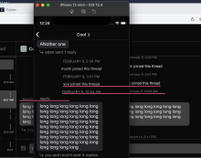
It's kind of tricky to go into the code and get an exact 1:1 on sizing because native explicitly sets the height. But, using the inspector you can see the height of both native and web are 26px exactly, confirming the regression is gone and the spacing is consistent/correct.

CleanShot 2022-05-17 at 11.34.27@2x.png (1×740 px, 332 KB)

CleanShot 2022-05-17 at 11.35.15@2x.png (530×1 px, 74 KB)

Diff Detail

Repository
rCOMM Comm
Branch
fix-message-height
Lint
No Lint Coverage
Unit
No Test Coverage

Event Timeline

benschac edited the test plan for this revision. (Show Details)
benschac added reviewers: tomek, jacek.
ashoat requested changes to this revision.EditedMar 29 2022, 8:14 AM

The goal isn't to match Figma here – we're explicitly ignoring the spacing for the Figma designs for the MessageList. Alicja designed those with lots of spacing, whereas our approach was more compact. I indciated to Alicja that she should follow the designs we already have in the mobile app, and that the spacing on the web app (before the recent changes) was already good.

The goal here is to undo the regression that occurred during the recent changes, NOT to match the Figma designs. A good place to start would be to check out an older version of the codebase (when we still had the SquadCal designs), take a screenshot, and see how it looked there.

Another approach would be to take a look at the spacing in the mobile app today, and see if it matches. It would probably be good to do both of these.

I don't think we should base this on the Figma designs, as I'm not sure the spacing there is correct.

This revision now requires changes to proceed.Mar 29 2022, 8:14 AM
benschac edited the test plan for this revision. (Show Details)
ashoat requested changes to this revision.EditedMar 30 2022, 9:58 PM

Can you modify the test plan so that it includes a table comparing padding/margin on all MessageList items between native / web? You can pull these numbers directly from the code, or use something like the React Native "Inspector" from the debug menu

This revision now requires changes to proceed.Mar 30 2022, 9:58 PM
benschac edited the test plan for this revision. (Show Details)
In D3537#97513, @ashoat wrote:

Can you modify the test plan so that it includes a table comparing padding/margin on all MessageList items between native / web? You can pull these numbers directly from the code, or use something like the React Native "Inspector" from the debug menu

I just used the debugger on both native and web. If this still isn't good enough lets talk IRL.

ashoat requested changes to this revision.May 17 2022, 12:45 PM

Passing back to you for the changes I requested on March 31st.

This revision now requires changes to proceed.May 17 2022, 12:45 PM
In D3537#97513, @ashoat wrote:

Can you modify the test plan so that it includes a table comparing padding/margin on all MessageList items between native / web? You can pull these numbers directly from the code, or use something like the React Native "Inspector" from the debug menu

It's in the test plan now in the notion link.

This revision now requires changes to proceed.May 23 2022, 11:56 AM

adding request review so it's in your queue ashoat.

ashoat requested changes to this revision.May 23 2022, 12:05 PM

I'm pretty sure we explicitly talked about this before, but I'll mention it again: this needs to based on code archaeology, not visual exploration. Use git grep
This revision now requires changes to proceed.May 23 2022, 12:05 PM
atul abandoned this revision.
atul edited reviewers, added: benschac; removed: atul.

Closing since this was handled by D4777

atul edited reviewers, added: atul; removed: benschac.