Page MenuHomePhabricator

[native] Add active state to `ColorSelector`
ClosedPublic

Authored by abosh on Apr 27 2022, 7:09 PM.
Tags
None
Referenced Files
Unknown Object (File)
Sat, Jul 6, 2:23 AM
Unknown Object (File)
Fri, Jul 5, 7:30 PM
Unknown Object (File)
Fri, Jul 5, 12:09 PM
Unknown Object (File)
Thu, Jul 4, 9:07 PM
Unknown Object (File)
Thu, Jul 4, 11:50 AM
Unknown Object (File)
Wed, Jul 3, 10:10 PM
Unknown Object (File)
Wed, Jul 3, 3:42 AM
Unknown Object (File)
Tue, Jul 2, 12:23 AM

Details

Summary

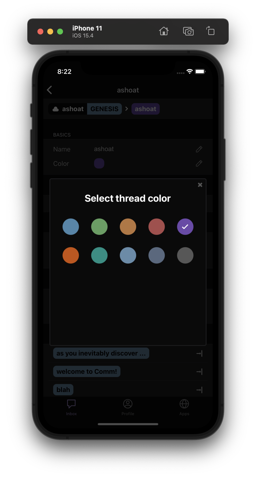
Part of ongoing redesign of ColorPicker component on native to match the ColorSelector component on web. Depends on D3798.

Adds active state to ColorSelector by adding styling and a checkmark to the ColorSelectorButton that is currently selected as the thread color.

Will add onPress handling and updating the thread color in a later diff, as outlined in the plan on this Linear issue.

Test Plan

Tested on iOS 15.4 and works as expected:

Diff Detail

Repository
rCOMM Comm
Lint
Lint Not Applicable
Unit
Tests Not Applicable

Event Timeline

abosh edited the test plan for this revision. (Show Details)
abosh added 1 blocking reviewer(s): atul.
native/components/color-selector-button.react.js
45 ↗(On Diff #12022)

Why did ColorSelectorButton shift from returning a View to returning a TouchableOpacity?

Styling a TouchableOpacity as a color splotch that should be selected is easier than styling a view because, per the React Native docs, a TouchableOpacity is "a wrapper for making views respond properly to touches." This adds lots of helpful functionality that a generic View does not provide (like opacity changes on press down).

atul requested changes to this revision.May 2 2022, 7:05 AM

Couple of changes and I think it should be good


As an aside, did you find designs with the glow/checkmark on Figma? I did a quick scan and couldn't find anything, would be handy if you could link to it.

If there aren't designs for native, we should probably stick with the designs from web?

native/components/color-selector-button.react.js
9 ↗(On Diff #12022)

Good catch making this readonly

19–27 ↗(On Diff #12022)
21–22 ↗(On Diff #12022)

We can move these (along with shadowOpacity and shadowRadius to StyleSheet.create( and create a style named activeButton or something.

Then we can move shadowColor to the selectedButtonStyle useMemo and set it conditionally based on isSelected.

That should reduce some clutter "inside the component" and push it to the outer styles object.

38 ↗(On Diff #12022)

Maybe selectedButtonIndicator?

I usually associate "content" with like images/text/etc... not really with a checkmark?

native/components/color-selector.react.js
17–23 ↗(On Diff #12022)

This should be wrapped in React.useMemo as it is in web/.../color-selector.react.js

Did you run into any issues if/when you tried this?

This revision now requires changes to proceed.May 2 2022, 7:05 AM

Addressed inline feedback and updated styles by removing glow. For now, it's basically mimicking the styles on web (see attached image) except the styles on web use a hover property which can't really be done on native. Instead, the checkmark is what indicates to the user what the current color is. Didn't seem to find a Figma design for native, so that might have to be updated or decided upon.

Since the glow is no longer needed, also removed the selectedButtonStyle useMemo and added the justifyContent and alignItems styling to all buttons. This way, if any become selected, the only extra useMemo call is for the checkmark.

image.png (1×1 px, 477 KB)

For now, it's basically mimicking the styles on web (see attached image) except the styles on web use a hover property which can't really be done on native. Instead, the checkmark is what indicates to the user what the current color is.

We can still use the translucent outer ring to indicate that a color is selected, right?

Added translucent outer ring and removed checkmark to match web design.

atul requested changes to this revision.May 4 2022, 1:43 PM

Looks close! I think this diff should be good once the feedback about outerRingStyle is addressed.

native/components/color-selector-button.react.js
20–25 ↗(On Diff #12181)

Instead of this, we should create a new style called outerRingActive or outerRingSelected within StyleSheet.create( that has backgroundColor set to "#404040"

Then we could just do:

<View style={isSelected ? outerRingSelected : outerRing}>

or something and avoid having to create an object

This revision now requires changes to proceed.May 4 2022, 1:43 PM
abosh marked 5 inline comments as done.

Address feedback about outerRingStyle -- created new Stylesheet style for selected outerRing.

This revision is now accepted and ready to land.May 5 2022, 4:52 AM
This revision was landed with ongoing or failed builds.May 5 2022, 11:32 AM
This revision was automatically updated to reflect the committed changes.