Page MenuHomePhabricator

[web] Finish styling `ColorSelector` on iOS and Android
ClosedPublic

Authored by abosh on Jun 13 2022, 12:48 PM.
Tags
None
Referenced Files
F2204754: D4254.id13510.diff
Sat, Jul 6, 6:01 PM
F2201646: D4254.id13633.diff
Sat, Jul 6, 4:37 AM
Unknown Object (File)
Thu, Jul 4, 5:38 PM
Unknown Object (File)
Thu, Jul 4, 9:18 AM
Unknown Object (File)
Wed, Jul 3, 5:14 PM
Unknown Object (File)
Tue, Jul 2, 10:36 PM
Unknown Object (File)
Mon, Jul 1, 6:32 PM
Unknown Object (File)
Mon, Jul 1, 3:34 AM

Details

Summary

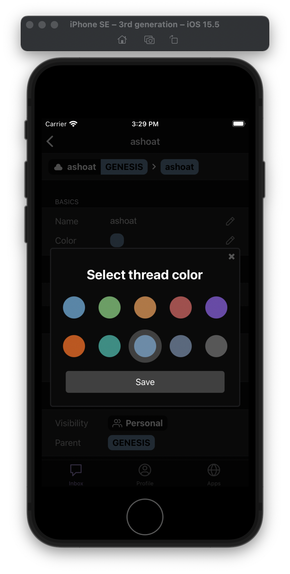
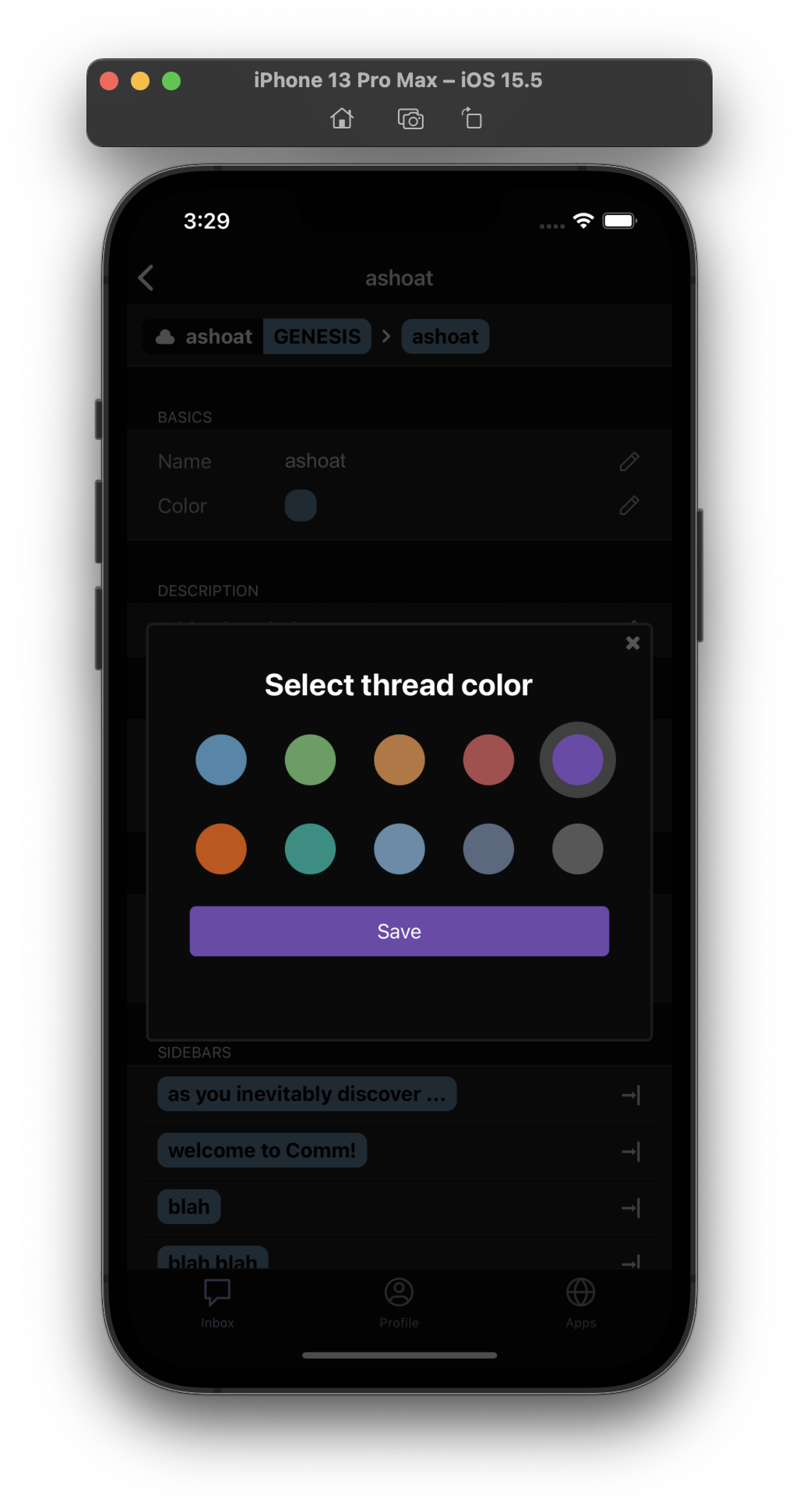
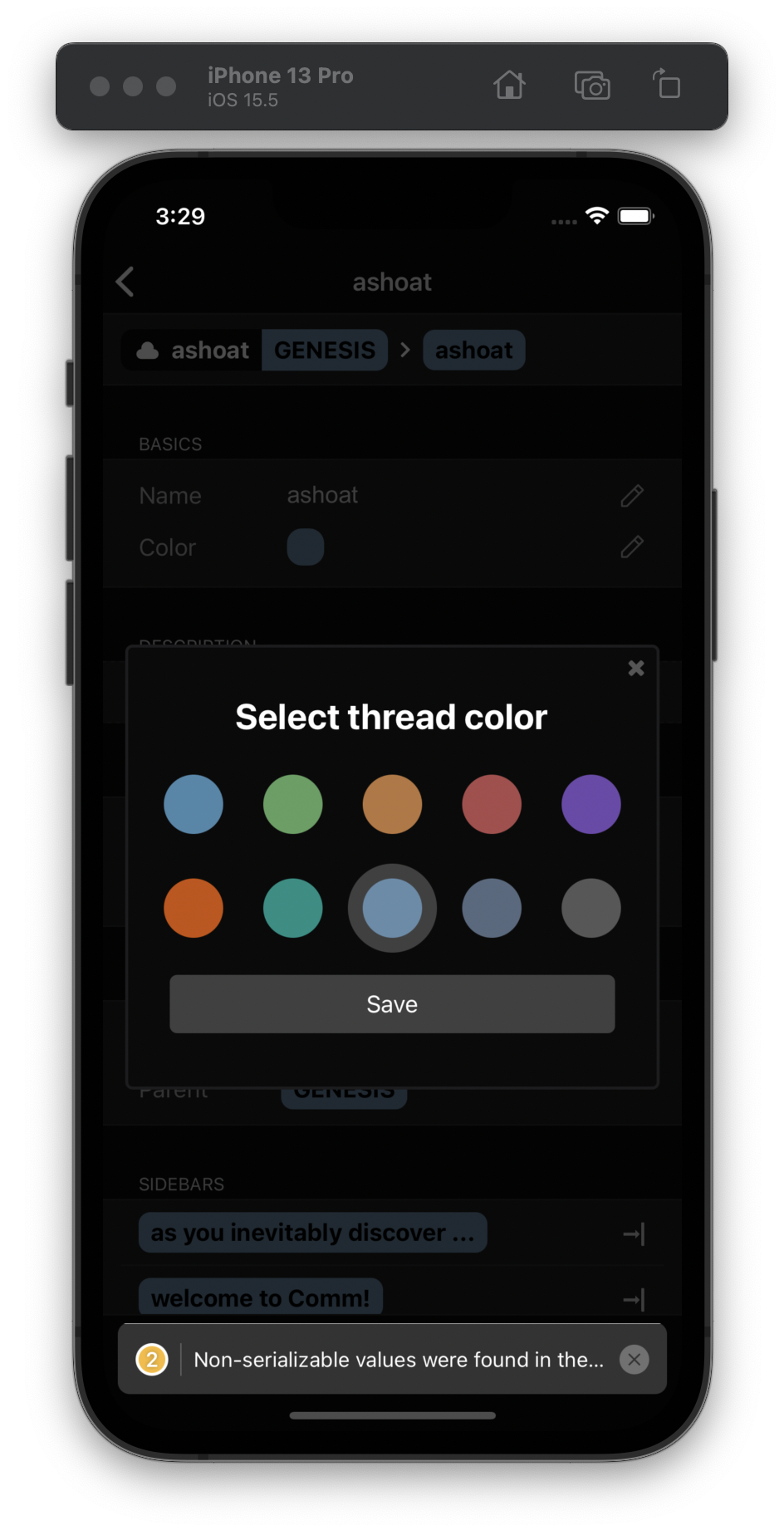
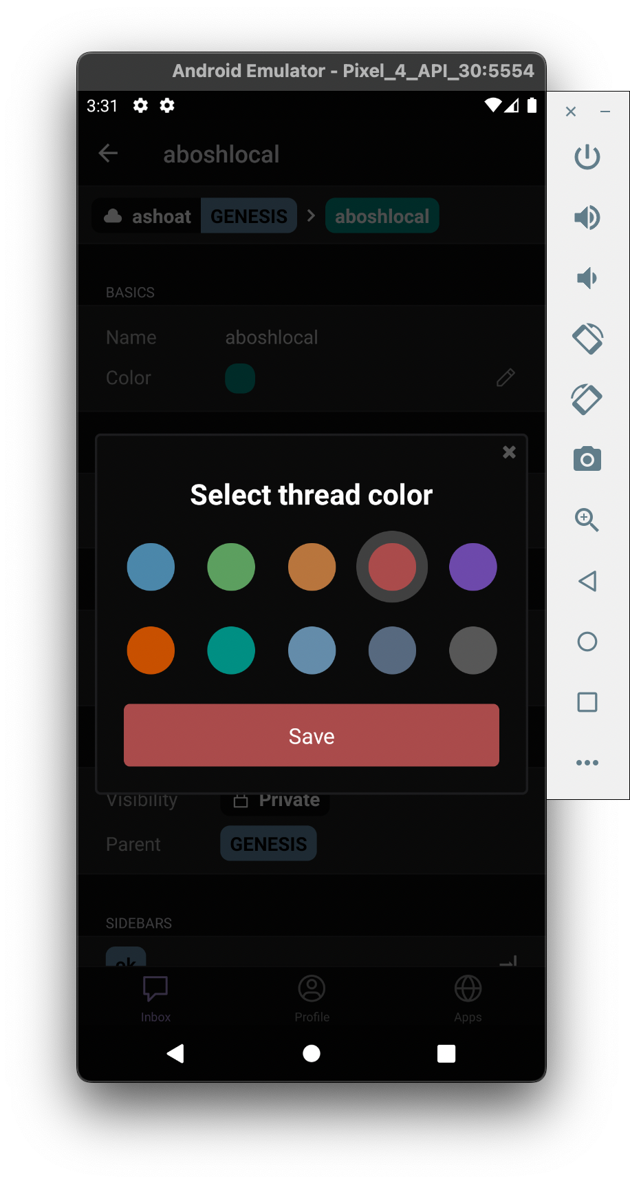
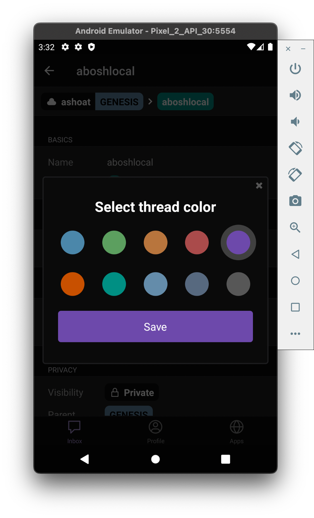
Completed styling ColorSelector on iOS and Android using different devices and breakpoints.

Part of ongoing redesign of ColorPicker component. Relevant Linear issue here.

Depends on D3939.

As @atul pointed out in the last diff, any code changes that could break something else shouldn't be committed, but noted in the Summary. This is a change that was made to better encompass the new ColorSelector. The height of the ColorPickerModal was modified to:

image.png (80×900 px, 29 KB)

Test Plan

Looks and works as expected on iOS and Android devices. Note the small and large devices (iPhone SE and iPhone 13 Pro Max, for example):

Screen Shot 2022-06-13 at 3.29.26 PM.png (1×938 px, 851 KB)

Screen Shot 2022-06-13 at 3.29.22 PM.png (1×1 px, 606 KB)

Screen Shot 2022-06-13 at 3.29.30 PM.png (1×944 px, 801 KB)

Screen Shot 2022-06-13 at 3.31.06 PM.png (1×916 px, 673 KB)

Screen Shot 2022-06-13 at 3.32.15 PM.png (1×1 px, 679 KB)

Diff Detail

Repository
rCOMM Comm
Lint
Lint Not Applicable
Unit
Tests Not Applicable

Event Timeline

abosh added 1 blocking reviewer(s): atul.
abosh edited the test plan for this revision. (Show Details)
native/components/color-selector-button.react.js
51 ↗(On Diff #13476)

This was changed because the previous borderRadius was not showing up on Android (the outer ring looked like a square View, instead of as a circular outer ring.

native/components/color-selector.react.js
33–42 ↗(On Diff #13476)

Refactored the buttons to be two rows, instead of one long row wrapped using flexWrap. This allows the styling to work on devices of all sizes, as each row of buttons can be spaced across any device evenly using justifyContent: space-evenly.

49 ↗(On Diff #13476)

The 1.3 here is just a number that made the width of the Save button look nice on all devices. Also tried to match the width of the Save button on the Change password screen.

50–55 ↗(On Diff #13476)

The Button had to replaced with a TouchableOpacity since Android and iOS have differing effects with regards to the color prop. Also TouchableOpacity is generally more flexible with styling than Buttons on React Native.

Updated borderRadius style (now half of the height of the outer ring).

Updated borderRadius style (now half of the height of the outer ring).

Thoughts on changing the title of the modal from "Select thread color" to "Thread color"?

native/components/color-selector.react.js
49 ↗(On Diff #13525)

Instead of /1.3 can we do like props.windowWidth * 0.75 or something?

This revision is now accepted and ready to land.Jun 17 2022, 11:17 AM

Thoughts on changing the title of the modal from "Select thread color" to "Thread color"?

This is something I definitely thought about and struggled with, but I decided to stick with "Select thread color" for a couple of reasons.

  • I scrolled through some of my apps that have chats that have customizables within them (theme, color, background, etc.), and the Messenger modal and WhatsApp screen to change the theme and wallpaper both use verbs:

IMG_2992.jpg (1×828 px, 142 KB)

IMG_2993.jpg (1×828 px, 153 KB)

"Preview and select theme" and "Choose a New Wallpaper."

I think the verb adds more direction to the modal and its purpose.

  • Secondly, I polled @varun and some other friends on what they liked better. Including me and @atul, 4 people said they like the "Select thread color" and 3 suggested "Thread color" (and 1 of these 3 wanted "Thread Color") as the name. It's pretty tight, but I think since both were evenly selected I'd stick with "Select thread color."
  • Lastly, there are no other modals that open up on native like the ColorSelector. The other customizables (like Name, Description, and Password) don't have modals, they just open inline editors. So there wasn't a standard to follow in terms of titling the modal. In the future, if we wanted a Description modal, for example, we could decide if we wanted "Select thread color" and "Edit description" or just "Thread color" and "Description."