Page MenuHomePhabricator

[web] Fix `See more...` button alignment regression
ClosedPublic

Authored by abosh on May 4 2022, 11:15 AM.
Tags
None
Referenced Files
Unknown Object (File)
Fri, Oct 4, 8:11 PM
Unknown Object (File)
Thu, Sep 26, 8:38 AM
Unknown Object (File)
Sun, Sep 15, 1:38 AM
Unknown Object (File)
Sun, Sep 15, 1:38 AM
Unknown Object (File)
Sun, Sep 15, 1:38 AM
Unknown Object (File)
Sun, Sep 15, 1:33 AM
Unknown Object (File)
Aug 24 2024, 3:04 AM
Unknown Object (File)
Aug 23 2024, 9:28 PM

Details

Summary

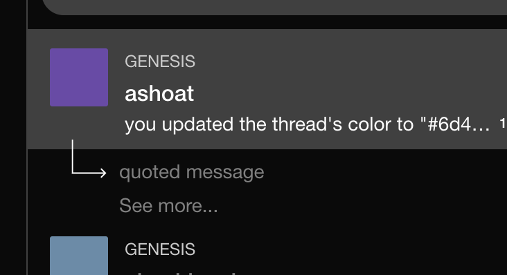
Noticed a regression in the See more... sidebar button's alignment with the sidebars. Fixed this by adjusting the padding-left.

As an aside, because the ChatThreadList component is being actively worked on, I suspect the alignment may be messed up in the future if the arrow/sidebar get bigger or smaller. Therefore, we should probably pull in the padding from some central place so we don't introduce new regressions when modifying the styling of one part of the component.

Test Plan

Tested on Chrome/Safari and works as expected:
Before:

Screen Shot 2022-05-04 at 11.08.13 AM.png (384×810 px, 35 KB)

After:
image.png (398×732 px, 33 KB)

Diff Detail

Repository
rCOMM Comm
Lint
Lint Not Applicable
Unit
Tests Not Applicable

Event Timeline

abosh edited the test plan for this revision. (Show Details)
abosh added 1 blocking reviewer(s): atul.
ashoat added a subscriber: benschac.

Adding @benschac since he was working on this recently and I suspect he introduced the regression (but not sure)

Went over this fix with @yayabosh and it made sense to me.

I hadn't noticed the issue since none of the threads in my dev environment had enough recent sidebars for the "See more..." button to appear. Tough one to catch

This revision is now accepted and ready to land.May 4 2022, 2:35 PM