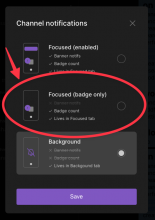
Introduce a component describing one notification setting with radio button.
Details
It's not used yet. Tested when introducing modal with multiple options in one of next diffs.
Diff Detail
- Repository
- rCOMM Comm
- Lint
Lint Not Applicable - Unit
Tests Not Applicable
Event Timeline
Accepting, but it would be good to clarify the distinction between the different meanings of "active" in the NotificationsOption and NotificationsOptionInfo components... maybe using different words to make things clearer? Could make the changes where the names are introduced and rebase this stack... or just add a diff to the end of this stack.
It looks like the image in the diff description is from the Figma document?
Would be handy to see how the component looks as is (in a dummy modal with placeholder values or something?)
| web/modals/threads/notifications/notifications-option.react.js | ||
|---|---|---|
| 11 ↗ | (On Diff #12357) | At this level of abstraction, I'm guessing that active means that "this" notification option (eg "Foreground"/"Background") is active. I guess the isActive being destructured in the description array below is referring to whether the given OptionInfo is "true" or "false"... is that right? |
| 15 ↗ | (On Diff #12357) | Guessing this should be $ReadOnlyArray? Let me know if I'm missing something though |
| 34 ↗ | (On Diff #12357) | Ah, looks like this is the CSS selector that I noted was unused in D3947 |
- I'll change the active prop here into selected and the prop in NotificationsOptionInfo into valid and it should make the code much easier to read.
- The image here is in fact an implemented component - and it looks almost exactly as in Figma (what was the goal, I suppose :) ).
Here is the comparison - implementation on left, Figma on right:
I'm not sure if it's needed to extract the component into a dummy container, but it's also not a big problem, so I can do it if you like.
| web/modals/threads/notifications/notifications-option.react.js | ||
|---|---|---|
| 11 ↗ | (On Diff #12357) | Yes, exactly, I'll rename the prop here to selected as I feel it's a better name. |
| 15 ↗ | (On Diff #12357) | Yes, thanks for catching it |
I'll change the active prop here into selected and the prop in NotificationsOptionInfo into valid and it should make the code much easier to read.
Sweet, thanks for making that change
The image here is in fact an implemented component - and it looks almost exactly as in Figma (what was the goal, I suppose :) ).
Whoa, didn't realize how far it was. Looks great!

