Page MenuHomePhabricator

[web] Restyle delete account modal
ClosedPublic

Authored by tomek on May 24 2022, 8:34 AM.
Tags
None
Referenced Files
Unknown Object (File)
Thu, Sep 19, 5:51 AM
Unknown Object (File)
Thu, Sep 19, 5:51 AM
Unknown Object (File)
Thu, Sep 19, 5:51 AM
Unknown Object (File)
Thu, Sep 19, 5:51 AM
Unknown Object (File)
Thu, Sep 19, 5:45 AM
Unknown Object (File)
Sat, Sep 14, 10:00 AM
Unknown Object (File)
Fri, Sep 13, 3:44 PM
Unknown Object (File)
Sep 1 2024, 10:59 PM

Details

Summary

Try to improve the style of the modal and make it consistent with e.g. password modal. There are no designs for this modal, so any advices will be really appreciated.

delete_modal_error.png (926×1 px, 88 KB)

delete_modal.png (974×1 px, 83 KB)

Depends on D4118

Test Plan

Open the modal and check if it is displayed correctly.
Click Delete Account and check if an unknown error is displayed.
Type an incorrect password, click Delete Account and check if wrong password error is displayed.
Type a correct password, click the button and verify that the account was deleted.

Diff Detail

Repository
rCOMM Comm
Lint
No Lint Coverage
Unit
No Test Coverage

Event Timeline

tomek added inline comments.
web/settings/account-delete-modal.react.js
74

Without this break the text is displayed in a way where just this. is in the second line.

tomek requested review of this revision.May 24 2022, 8:41 AM

There are no designs for this modal, so any advices will be really appreciated.

It might be worth looking at the ThreadSettingsModalDeleteTab for inspiration? There weren't any designs for that either... but it's probably worth keeping them consistent?
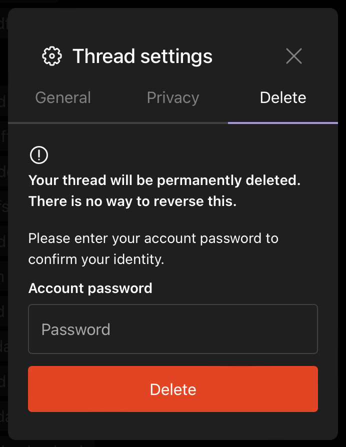
3912.png (894×692 px, 73 KB)

web/settings/account-delete-modal.react.js
74

Instead of using the <br/ > tag, could we split the text into two separate <p> tags?

It might be a little more work getting the vertical height between the sentences right, but I think it could be a cleaner solution. IIRC we should avoid using <br /> and <hr /> for layout if at all possible?

This revision is now accepted and ready to land.May 25 2022, 8:25 AM
tomek requested review of this revision.May 26 2022, 9:49 AM

@atul thanks for the suggestion! Could you check if it looks ok, and suggest any other improvements?

Note: haven't followed button width from ThreadSettingsModalDeleteTab because here we need to display an error. (we can display the error above the button, but changing modal height doesn't sound the best).

@atul thanks for the suggestion! Could you check if it looks ok, and suggest any other improvements?

Looks good to me!

This revision is now accepted and ready to land.May 27 2022, 7:47 AM
This revision was automatically updated to reflect the committed changes.