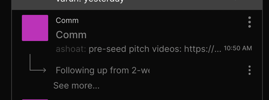
Noticed another regression in the latest deploy of the web app. This change moves the "See more..." text so it's aligned with the text on the sidebars.
Details
Details
- Reviewers
atul - Commits
- rCOMMfd73aacadbdf: [web] Fix "See more..." button alignment regression
Before:
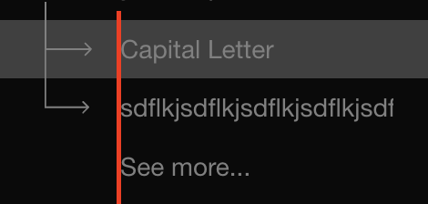
Looks as expected on Chrome/Safari:
Diff Detail
Diff Detail
- Repository
- rCOMM Comm
- Lint
Lint Not Applicable - Unit
Tests Not Applicable