Page MenuHomePhabricator

[web] Fix sidebar title cutoff in `ChatThreadList`
ClosedPublic

Authored by abosh on Jun 16 2022, 12:30 PM.
Tags
None
Referenced Files
F3647619: D4284.diff
Sun, Jan 5, 1:03 AM
Unknown Object (File)
Dec 1 2024, 7:16 PM
Unknown Object (File)
Dec 1 2024, 7:16 PM
Unknown Object (File)
Nov 24 2024, 10:55 PM
Unknown Object (File)
Nov 24 2024, 10:55 PM
Unknown Object (File)
Nov 24 2024, 10:55 PM
Unknown Object (File)
Nov 9 2024, 9:34 PM
Unknown Object (File)
Nov 9 2024, 9:24 PM
Subscribers

Details

Summary

Linear issue with full context here.

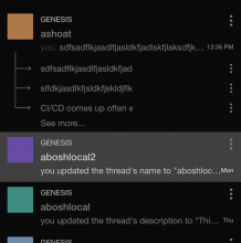
Seems to be a regression, not sure when it was introduced exactly. This diff repositions the ChatThreadListItemMenu .menuSidebar div to be absolutely positioned so that it doesn't interfere with the ChatThreadListSidebar. Before, the ChatThreadListSidebar was being covered by the ChatThreadListItemMenu and it probably went unnoticed since it wasn't tested with a sidebar message that was long enough to trigger the ellipsis overflow.

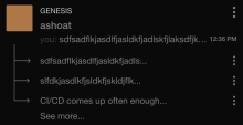
Before:

image.png (342×794 px, 30 KB)

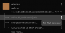
After:

image.png (634×804 px, 57 KB)

Test Plan

Looks as expected on Chrome/Safari and the ChatThreadListItemMenu still works as expected.

Diff Detail

Repository
rCOMM Comm
Lint
Lint Not Applicable
Unit
Tests Not Applicable

Event Timeline

abosh edited the summary of this revision. (Show Details)
ashoat requested changes to this revision.Jun 17 2022, 9:20 AM
  1. The sidebar title should flow the same as normal titles. I'm glad you added an ellipsis here, but the title still seems to be limited to half of the width of the containing component
  2. Is position: absolute strictly necessary here? This problem doesn't strike me as one that should necessitate absolute positioning, so I'd like to see if we can solve the problem otherwise
This revision now requires changes to proceed.Jun 17 2022, 9:20 AM

The sidebar title should flow the same as normal titles. I'm glad you added an ellipsis here, but the title still seems to be limited to half of the width of the containing component

Ah, so this seems to be a bug of some sort that isn't related to the CSS. The ellipsis is a result of the text-overflow: ellipsis property, which was already set. However, the ellipsis wasn't shown before because the ChatThreadListItemMenu was positioned above the SidebarItem (which includes the title of the sidebar), hiding the ellipsis. Therefore, the ellipsis wasn't added, it just showed up as a result of positioning the ChatThreadListItemMenu absolutely.

As for why the text is still "overflowing" with the ellipsis, I noticed that all sidebar titles are truncated to be exactly 30 characters long (including the 3 characters for the ellipsis). I did some investigating and found that this is because for some reason, the threadInfo.uiName that is getting passed into SidebarItem is already truncated/trimmed:

image.png (450×1 px, 84 KB)

Note that when I hardcode the sidebar title to be a long string, it shows up fine:

image.png (656×810 px, 64 KB)

This means the CSS is not interfering with the overflow -- the ellipsis is literally a part of the string. If, however, we remove the change made in this diff (position: absolute, etc.), it looks like:

image.png (374×848 px, 32 KB)

This is a result of the non-absolutely positioned ChatThreadListItemMenu:

image.png (364×1 px, 46 KB)

Is position: absolute strictly necessary here? This problem doesn't strike me as one that should necessitate absolute positioning, so I'd like to see if we can solve the problem otherwise

Thus, you're right, there may be a better solution than position: absolute. I can see if I can find one by tinkering around with it, however, the bigger issue is the 30-character trimming of sidebar titles (continued below).

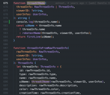
In thread-utils, this is the only function that tinkers with the uiName:

image.png (374×898 px, 82 KB)

However, by using some console.logs, by the time the uiName is passed into this function, it's already been trimmed. That means it's getting trimmed somewhere else.

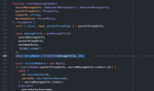
In thread-utils, there's another function createPendingSidebars:

image.png (878×1 px, 236 KB)

This function actually does trim the text, and to 30 characters! So this must be the function that is doing the trimming. threadName gets passed through a createPendingSidebar until it ends up back in the threadUIName function:

image.png (914×1 px, 222 KB)

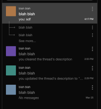
But even if I change threadName to something like "blah blah," the console.log(threadInfo.name) still prints the actual thread names:

image.png (126×1 px, 34 KB)

Whereas if I change the thread uiName to something else, it does show up:

image.png (356×982 px, 80 KB)
image.png (916×850 px, 79 KB)

Overall puzzled on why this is happening. I thought I zeroed in on the source of the trimming (the call to trimText(messageTitle, 30)), but when I fiddled with it it didn't change the way I thought it would. Not sure when this regression was introduced, but any guidance would be great.

In summary, the CSS doesn't seem to be the reason why the sidebar titles are cut off. I understand that the position: absolute may not be the best solution, so once I figure out why the sidebar titles are being trimmed (and how), I will work on a better CSS solution. But first, I'd like to know why the titles are being trimmed to 30 characters in the first place. Is this a native rule that made it to web? Or is there some other reason?

But first, I'd like to know why the titles are being trimmed to 30 characters in the first place.

I think you figured it out on Linear – when we generate the title of a sidebar, we trim it. It looks like we should increase this number a bit. As for this stuff, would still love a solution that avoids position: absolute

Address feedback. No longer uses position: absolute and actually addresses the cause of the bug instead of repositioning other elements.

The old .threadButtonSidebar CSS selector included a flex: 1 rule which was causing all other elements in the parent container (ChatThreadListSidebar) to take up the same width as their content. Because the ChatThreadListItemMenu needed space for the "Mark as unread" text and mail icon, it was taking up space in the ChatThreadListSidebar even when it wasn't open.

The absolute positioning temporarily solved this bug because it removed the ChatThreadListItemMenu from the document entirely and absolutely positioned it to appear next to the three dots that opened the ChatThreadListItemMenu, rendering the flex: 1 rule essentially useless since only one element in the parent ChatThreadListSidebar container was being used to apply the flex: 1 rule.

The cutoff stemmed from the space needed for the "Mark as unread" and mail icon text from the ChatThreadListSidebar. This change resolves that.

You can see that before, the ChatThreadListItemMenu is a fixed size here which is cutting off the text because of the flex: 1 applied to .threadButtonSidebar:

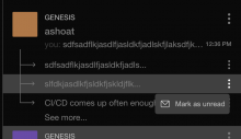
Whereas after, each ChatThreadListItemMenu flexibly scales, depending on the size of the SidebarItem:

Before:

image.png (788×784 px, 80 KB)

After:

image.png (400×776 px, 43 KB)

image.png (406×802 px, 46 KB)

image.png (468×810 px, 50 KB)

Will address title trimming in another diff.

web/chat/chat-thread-list-item-menu.css
50 ↗(On Diff #13912)

An extraneous newline that can be deleted, unrelated to the rest of this diff.

This revision is now accepted and ready to land.Jun 28 2022, 1:41 PM