Page MenuHomePhabricator

[web] Make "Mark as unread" button easier to click reliably
ClosedPublic

Authored by atul on Jul 28 2022, 11:32 AM.
Tags
None
Referenced Files
Unknown Object (File)
Sat, Nov 9, 11:35 AM
Unknown Object (File)
Fri, Nov 8, 8:29 PM
Unknown Object (File)
Fri, Nov 8, 8:29 PM
Unknown Object (File)
Fri, Nov 8, 8:29 PM
Unknown Object (File)
Tue, Nov 5, 2:05 AM
Unknown Object (File)
Oct 19 2024, 7:21 PM
Unknown Object (File)
Oct 13 2024, 1:52 AM
Unknown Object (File)
Oct 4 2024, 10:07 PM
Subscribers

Details

Summary

Context: https://linear.app/comm/issue/ENG-992/mark-as-unread-button-can-be-hard-to-press-on-web

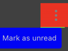
Users reported that sometimes the "Mark as unread" button would disappear before they were able to click it. It looks like this was because there was a 1px gap (see image below) between the menu button (vertical ellipsis) and the toggle unread status button ("Mark as unread") where onMouseLeave would trigger and hide the toggle unread status button.

Screen Shot 2022-07-28 at 2.20.46 PM.png (1×1 px, 59 KB)

I was able to reproduce this issue consistently when moving the cursor slowly from the vertical ellipsis to "Mark as unread" button, but was able to avoid the issue by moving my cursor "fast." Not sure why onMouseLeave doesn't trigger if you move the cursor back within the div fast enough, but that's the behavior I observed.

This diff basically closes that 1px gap and gets things working reliably.
Test Plan

Was able to consistently mark a thread as read/unread without the "Mark as unread" button disappearing.

Diff Detail

Repository
rCOMM Comm
Branch
master
Lint
No Lint Coverage
Unit
No Test Coverage

Event Timeline

Harbormaster returned this revision to the author for changes because remote builds failed.Jul 28 2022, 11:38 AM
Harbormaster failed remote builds in B10952: Diff 15065!
atul requested review of this revision.Jul 28 2022, 11:57 AM
This revision is now accepted and ready to land.Jul 28 2022, 12:08 PM
This revision now requires review to proceed.Jul 28 2022, 12:24 PM

Here's where the + 1px was introduced: https://phab.comm.dev/D462

Based on the diff description I think this was a visual/style change and wasn't to fix some other bug/issue

(cc @ashoat)

atul added a reviewer: ashoat. atul removed 1 blocking reviewer(s): tomek.Jul 28 2022, 12:59 PM

No context, seems good

web/chat/chat-thread-list-item-menu.css
44

Pretty sure we don't need calc if it's just 100%, can't we just use 100%?

Please look into just using 100% before landing, I think it's the same

This revision is now accepted and ready to land.Jul 28 2022, 11:25 PM

remove unnecessary calc(...)

Please look into just using 100% before landing, I think it's the same

Yeah they're the same, updated this diff.