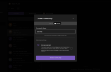
I think this is more readable. It was previously too small IMO.
This matches the font-size in Figma. Previously reduced from 12px to 10px so the text would fit on one line as in the designs. However, now that we have the CommunityCreationModal "size" set to "large" we can fit things fine.

