Page MenuHomePhabricator

[web] Replace `TooltipButton` with `TooltipTextItem` in `MessageActionButton`
ClosedPublic

Authored by atul on Feb 28 2022, 9:51 AM.
Tags
None
Referenced Files
F3300601: D3302.diff
Sun, Nov 17, 8:16 PM
Unknown Object (File)
Fri, Nov 15, 6:06 AM
Unknown Object (File)
Fri, Nov 8, 8:07 PM
Unknown Object (File)
Sat, Nov 2, 8:55 AM
Unknown Object (File)
Sat, Nov 2, 8:55 AM
Unknown Object (File)
Sat, Nov 2, 8:55 AM
Unknown Object (File)
Sat, Nov 2, 8:55 AM
Unknown Object (File)
Sat, Nov 2, 8:53 AM

Details

Summary

Context: https://linear.app/comm/issue/ENG-794#comment-a3728358

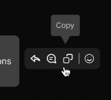
In the past, there was an ellipsis button that when clicked would reveal a menu with possible actions ("Create sidebar", "Reply"). In the future, the icons for each action will be displayed in a row. But, we still want to display an informative "alt text" tooltip when the icons are hovered over. In this diff we're making the tooltip content static and triggering it onMouseEnter instead of onClick
Test Plan

Diff Detail

Repository
rCOMM Comm
Lint
Lint Not Applicable
Unit
Tests Not Applicable

Event Timeline

atul requested review of this revision.Feb 28 2022, 9:58 AM
tomek requested changes to this revision.EditedMar 1 2022, 1:52 AM
tomek added a reviewer: ashoat.

A couple of overall comments:

  1. It would be helpful of the summary contained some description of what this diff is supposed to do. Linking to the issue helps to explain the whole stack, but having something diff-specific will be even better
  2. For me it is a lot more useful to see screenshots / videos embedded instead of just links to them. This approach allows quickly checking what's going on instead of having to download and open each file. To do that you could either edit the summary or create a comment with embedded media (you can drag and drop them). It's just a nit though, and if other reviewers have different preference, we can keep this approach.
  3. It's always a good idea to have a test plan that is dedicated to the diff. In this case, the diff affects how the things looks and behave, so there are some things that should be tested.
  4. When working with stacks, always set depends on relationship between diffs, so that the stack can be easily navigated.

I think this approach makes a lot of sense! I'm just not sure about the styling here: for the timestamp tooltip we have an arrow pointing at the message, which is not present here. Was that intentional? If adding the arrow would take significant effort, we can also keep the current approach.

I'm including @ashoat as a reviewer, so that he can decide if he likes this design.

This revision now requires changes to proceed.Mar 1 2022, 1:52 AM
ashoat requested changes to this revision.Mar 1 2022, 7:30 AM

Agree with all of @palys-swm's comments above. Especially that you should *always* set the "Depends On" relationship for your diff. Please keep this in mind when creating any and all diffs going forward.

Separately, regarding the design – it's not clear to me when we're still keeping the "Create sidebar" overlay... that doesn't seem to be covered by the Figma designs. Is the idea that it's more informative?

atul requested review of this revision.EditedMar 7 2022, 6:36 AM

It would be helpful of the summary contained some description of what this diff is supposed to do. Linking to the issue helps to explain the whole stack, but having something diff-specific will be even better (@palys-swm)

In the past, there was an ellipsis button that when clicked would reveal a menu with possible actions ("Create sidebar", "Reply").

In the future, the icons for each action will be displayed in a row. But, we still want to display an informative "alt text" tooltip when the icons are hovered over.

In this diff we're making the tooltip content static and triggering it "onMouseEnter" instead of onClick

This approach allows quickly checking what's going on instead of having to download and open each file. (@palys-swm)

Ah sorry about that, I use Safari and it opens the videos directly in the browser. I keep forgetting that isn't the case in Chrome (guessing there's some header that would fix that).

In the future I'll just drag the videos in.

When working with stacks, always set depends on relationship between diffs, so that the stack can be easily navigated. (@palys-swm)

Will do that going forward

Separately, regarding the design – it's not clear to me when we're still keeping the "Create sidebar" overlay... that doesn't seem to be covered by the Figma designs. (@ashoat)

ab3c.png (232×256 px, 11 KB)

(https://www.figma.com/file/a1nkbWgbgjRlrOY9LVurTz/Comm-%2F-Desktop-app?node-id=1170%3A77706)

Am I missing something? By "overlay" are you referring to the tooltip?

If adding the arrow would take significant effort, we can also keep the current approach. (@palys-swm)

The Figma designs do have an arrow, and the intention is the match that design.

This diff and the next few are more about refactoring and moving things to the right place. The styling (arrow, tooltip positioning, fg/bg colors, etc) will be addressed later in the stack.

Oh – you're right, the overlay is still there, it just looks different. I guess that's addressed by a later diff

Note that this comment from @palys-swm was not addressed:

It's always a good idea to have a test plan that is dedicated to the diff. In this case, the diff affects how the things looks and behave, so there are some things that should be tested.

Thanks @atul for the explanation!

Ah sorry about that, I use Safari and it opens the videos directly in the browser. I keep forgetting that isn't the case in Chrome (guessing there's some header that would fix that).

In my Chrome it downloads a file, which is really annoying. Having images / videos embedded makes comparing them a lot easier.

Regarding the test plan, I guess that sometimes a video with the new behavior might be good enough, so we shouldn't block this diff on that. But it also doesn't hurt to include a short description of the process.

This revision is now accepted and ready to land.Mar 8 2022, 6:58 AM

Regarding the test plan, I guess that sometimes a video with the new behavior might be good enough, so we shouldn't block this diff on that. But it also doesn't hurt to include a short description of the process.

Gotcha, I've been putting these in the summary but I guess I should just put them in the Test Plan instead. I'll also add some commentary on what's happening in the video I guess.

atul edited the test plan for this revision. (Show Details)
atul edited the summary of this revision. (Show Details)
This revision was landed with ongoing or failed builds.Mar 8 2022, 10:06 AM
This revision was automatically updated to reflect the committed changes.