Page MenuHomePhabricator

[web] [fix] style mark as unread
ClosedPublic

Authored by benschac on Mar 14 2022, 9:40 AM.
Tags
None
Referenced Files
Unknown Object (File)
Sat, Nov 2, 8:20 AM
Unknown Object (File)
Sat, Nov 2, 8:18 AM
Unknown Object (File)
Tue, Oct 29, 12:13 AM
Unknown Object (File)
Oct 7 2024, 5:29 AM
Unknown Object (File)
Oct 7 2024, 5:29 AM
Unknown Object (File)
Oct 7 2024, 5:29 AM
Unknown Object (File)
Oct 7 2024, 5:26 AM
Unknown Object (File)
Sep 19 2024, 8:54 PM

Details

Summary

update mark as read. https://www.figma.com/file/a1nkbWgbgjRlrOY9LVurTz/Comm-%2F-Desktop-app?node-id=1085%3A85147

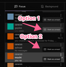
We decided to switch the background color for hover state mark as unread button.

Image 2022-03-22 at 9.35.04 AM.jpg (910×893 px, 218 KB)

to option one.
the selected chat thread item (mochi) is the selected state which is not changing from the design.
the reason we needed to update the background color for the hover state mark as unread button is because the background color of hover chat thread item and background color of mark as unread button are the same color in the figma file.
Test Plan

check figma. We still have similar issues around the hover state leaving too soon on mouse leave which need to be fixed in another diff. This is just updating the styling to match our spec.

Diff Detail

Repository
rCOMM Comm
Branch
mark-as-unread
Lint
No Lint Coverage
Unit
No Test Coverage

Event Timeline

Accepting.. but one question inline about an extraneous onHover style.

web/chat/chat-thread-list-item-menu.css
61–63

Why do we need this if we aren't changing the color on hover? It looks like it's --chat-thread-list-menu-bg for both the hover and non hover state?

This revision is now accepted and ready to land.Mar 14 2022, 5:32 PM
web/chat/chat-thread-list-item-menu.css
61–63

We don't need it, removing. It was laying around before and I just updated it because I saw it. You're right.

@ashoat -- updated colors of the mark as unread button based off of D3421 changes to hover and selected state. We currently don't have design for mark as unread (because the previous diff flips the hover and selection colors from what's in figma).

In the screenshot below there are two options that looked reasonable. IMO I think option 1 looks better.

Curious what your thoughts are? I can update this diff with the updated mark as unread background color after we've decided on a background color.

before:

Image 2022-03-22 at 10.03.32 AM.jpg (208×876 px, 20 KB)

after:

Image 2022-03-22 at 9.35.04 AM.jpg (910×893 px, 218 KB)

@ashoat - no code changes. Just putting this in your queue to get input on the updated background color options.

I agree, option 1 looks best!

(Just to be clear, this diff isn't in my queue since I'm not on the review)

benschac edited the summary of this revision. (Show Details)

Not super clear why I'm being added to the review... I thought you just wanted my opinion on the different designs, which I gave above.

In the future, can you please make your intentions clear for short-circuiting the standard review process? There are plenty of good reasons to do this, but I can't tell what the reason is here.

web/chat/chat-thread-list-item-menu.css
44 ↗(On Diff #10379)

There's an extraneous space here

This revision is now accepted and ready to land.Mar 22 2022, 9:54 PM
In D3422#94966, @ashoat wrote:

Not super clear why I'm being added to the review... I thought you just wanted my opinion on the different designs, which I gave above.

In the future, can you please make your intentions clear for short-circuiting the standard review process? There are plenty of good reasons to do this, but I can't tell what the reason is here.

I wanted to make sure it was in your queue so you wouldn't miss it. I wasn't trying to short circuit but just make sure you saw the comment and replied to it. I can be more explicit the next time I ask for feedback.

I wanted to make sure it was in your queue so you wouldn't miss it.

Wouldn't miss what? If you just want me to see the diff, you should add me to the CC list (I'm on the CC list of every diff already, though). If you wanted me to review the diff, then you should clarify the reason for short-circuiting review process.

My best is that you simply misinterpreted my earlier comment?