Page MenuHomePhabricator

[web] Introduce `ThreadMenuItem`
ClosedPublic

Authored by jacek on Feb 14 2022, 3:32 AM.
Tags
None
Referenced Files
F3270528: D3188.diff
Sat, Nov 16, 4:35 AM
Unknown Object (File)
Sat, Nov 2, 6:37 AM
Unknown Object (File)
Sat, Nov 2, 6:37 AM
Unknown Object (File)
Sat, Nov 2, 6:37 AM
Unknown Object (File)
Sat, Nov 2, 6:37 AM
Unknown Object (File)
Sat, Nov 2, 6:37 AM
Unknown Object (File)
Sat, Nov 2, 6:35 AM
Unknown Object (File)
Sat, Nov 2, 6:17 AM

Details

Summary

Introduced component for item inside thread menu.

Currently, it uses FontAwesome icons, which will be replaced in the future with SWMIconPack.
Because of quite complicated way of adding SWM icons to project, I think, it would be better to replace all icons at once in a follow-up task.
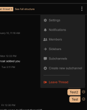
Screenshot_Google Chrome_2022-02-14_122438.png (1×880 px, 89 KB)

Test Plan

Tested after adding menu actions in next diffs.

Diff Detail

Repository
rCOMM Comm
Lint
No Lint Coverage
Unit
No Test Coverage

Event Timeline

tomek added inline comments.
web/chat/thread-menu-item.react.js
11 ↗(On Diff #9597)

If that's not a problem, we should prefer accepting all the functions, not just the ones that do not return

web/chat/thread-menu.css
34 ↗(On Diff #9597)

Why do we need to provide column gap when there's only one column?

This revision is now accepted and ready to land.Feb 14 2022, 4:13 AM
This revision now requires review to proceed.Feb 14 2022, 4:13 AM
web/chat/thread-menu.css
34 ↗(On Diff #9597)

There are two columns - for icon and text

tomek requested changes to this revision.Feb 14 2022, 5:37 AM
tomek added inline comments.
web/chat/thread-menu.css
34 ↗(On Diff #9597)

I guess we should use margins instead - and use column-gap when there are multiple columns of text.
But now I noticed that something is wrong here. Where is css.topBarMenuActionDescription defined?

This revision now requires changes to proceed.Feb 14 2022, 5:37 AM
web/chat/thread-menu.css
34 ↗(On Diff #9597)

The class is not necessary now. I'll remove it.
@palys-swm what is the profit of using margins instead of column-gap here? II suppose it would work in the same way, isn't it?
How do we decide which element should contain margin - icon or text?

removed redundant css class, replaced column-gap with margin, changed onClick callback function type.

tomek added inline comments.
web/chat/thread-menu.css
34 ↗(On Diff #9597)

Margins are better understood by developers, but more importantly, all the browsers support them. With column-gap https://developer.mozilla.org/en-US/docs/Web/CSS/column-gap the are some issues, especially due to the fact that

Initially a part of Multi-column Layout, the definition of column-gap has been broadened to include multiple layout methods. Now specified in Box Alignment, it may be used in Multi-column, Flexible Box, and Grid layouts.

Regarding the placement of margins, I don't think it matters. I can see that you added it to the icon and I think we can keep it there.

ashoat requested changes to this revision.Feb 14 2022, 9:10 PM
ashoat added 1 blocking reviewer(s): benschac.

@benschac should take a look here. I suspect he will have a couple comments, both about margins and about using the SWM icon pack instead of the FontAwesome ones

This revision now requires changes to proceed.Feb 14 2022, 9:11 PM

Added React.memo after Tomek's suggestion

@benschac could you take a look to unblock?

benschac added inline comments.
web/chat/thread-menu-item.react.js
24 ↗(On Diff #9714)

we should create a variant in our button component rather than creating more one-off components.

button.react.js in the components folder.

web/chat/thread-menu.css
44–45 ↗(On Diff #9714)

I don't think we need to be explicitly setting width here.

This revision now requires changes to proceed.Feb 16 2022, 7:05 AM
web/chat/thread-menu-item.react.js
24 ↗(On Diff #9714)

I think it shouldn't be a part of Button component, the only thing common for other buttons and this menu item is usage of semantic html <button> tag, which could be also li tag as well. I think our Button component should be reserved for more for detached-like buttons and not used for elements of the menu list.

web/chat/thread-menu.css
44–45 ↗(On Diff #9714)

It is now required in order to properly align text, but will be removed in the future after switching to SWMIconPack (where all icons have the same width)

@benschac, in your review please make sure you address any potential concerns relating to the two things I mentioned below:

In D3188#85300, @ashoat wrote:

@benschac should take a look here. I suspect he will have a couple comments, both about margins and about using the SWM icon pack instead of the FontAwesome ones

web/chat/thread-menu-item.react.js
24 ↗(On Diff #9714)

Agree with @def-au1t here... not sure I understand why these two types of HTML <button>s need to be represented by the same Button component

This comment was removed by ashoat.
ashoat requested changes to this revision.EditedFeb 22 2022, 12:21 AM

Just noticed that the FontAwesome vs. SWM icon question is referenced in the diff description:

Currently, it uses FontAwesome icons, which will be replaced in the future with SWMIconPack.
Because of quite complicated way of adding SWM icons to project, I think, it would be better to replace all icons at once in a follow-up task.

@def-au1t, can you link the follow-up task (either on Linear or Phabricator)? You should never reference a follow-up task without linking where that task is tracked.

Once you share that link and @benschac responds, this diff should be unblocked. I think the discussion here is tied to the discussion that needs to happen on D3187, so let's make sure you guys cover this when you have that discussion.

This revision now requires changes to proceed.Feb 22 2022, 12:21 AM
In D3188#86963, @ashoat wrote:

@def-au1t, can you link the follow-up task (either on Linear or Phabricator)? You should never reference a follow-up task without linking where that task is tracked.

Link to follow-up task on Linear: https://linear.app/comm/issue/ENG-700/replace-fontawesome-icons-with-swmiconpack

Link to follow-up task on Linear: https://linear.app/comm/issue/ENG-700/replace-fontawesome-icons-with-swmiconpack

You forgot to subscribe people to that task! Please always subscribe people to tasks you create. (I added some folks)

This revision now requires review to proceed.Feb 22 2022, 12:48 PM
benschac added inline comments.
web/chat/thread-menu-item.react.js
24 ↗(On Diff #9714)

Base CSS for the button is the same across the board:

border: none;
cursor: pointer;
background-color: transparent;

This button could be called something like transparent and used again.

This revision is now accepted and ready to land.Feb 23 2022, 4:06 AM
web/chat/thread-menu.css
34 ↗(On Diff #9597)

I'm not a fan of margin: https://mxstbr.com/thoughts/margin/ for these reasons.

I'm also late to this diff and I don't think it makes much difference.

web/chat/thread-menu.css
34 ↗(On Diff #9597)

Thanks for sharing this - it really makes sense!
In this case I would prefer using flexbox with space-between instead of using column-gap

This revision was automatically updated to reflect the committed changes.