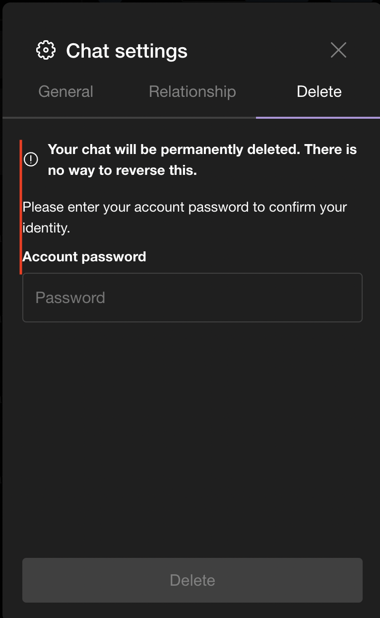
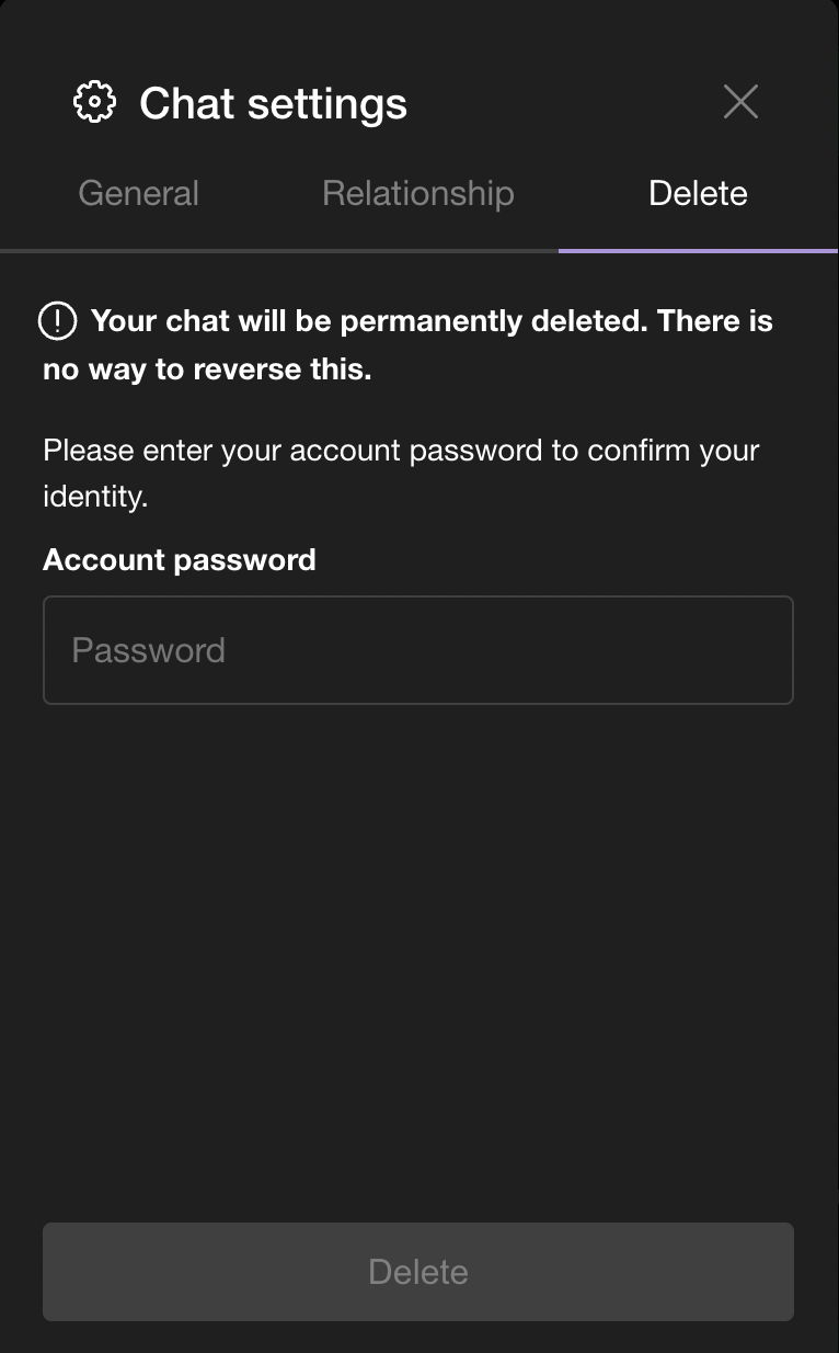
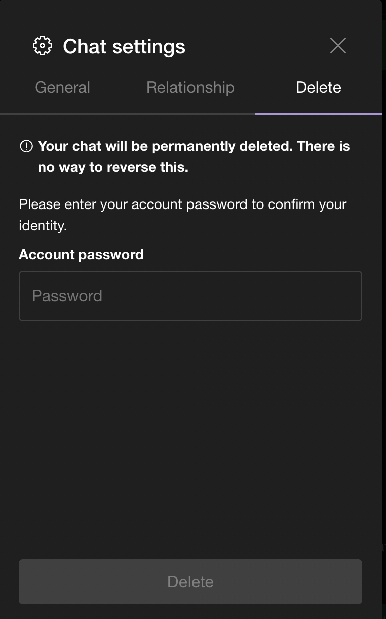
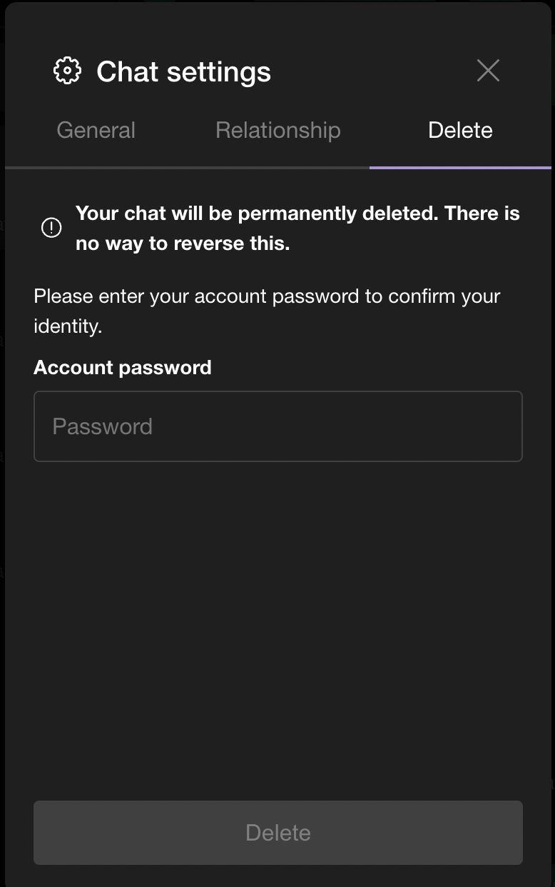
Moved the i icon to be in-line with the warning text when
attempting to delete a chat. This was done by moving the SWMansionIcon
element to be inside the paragraph element.
Details
Details
Confirmed visually that this change works as expected, and will
attach before/after photos so reviewers can see.
Before:
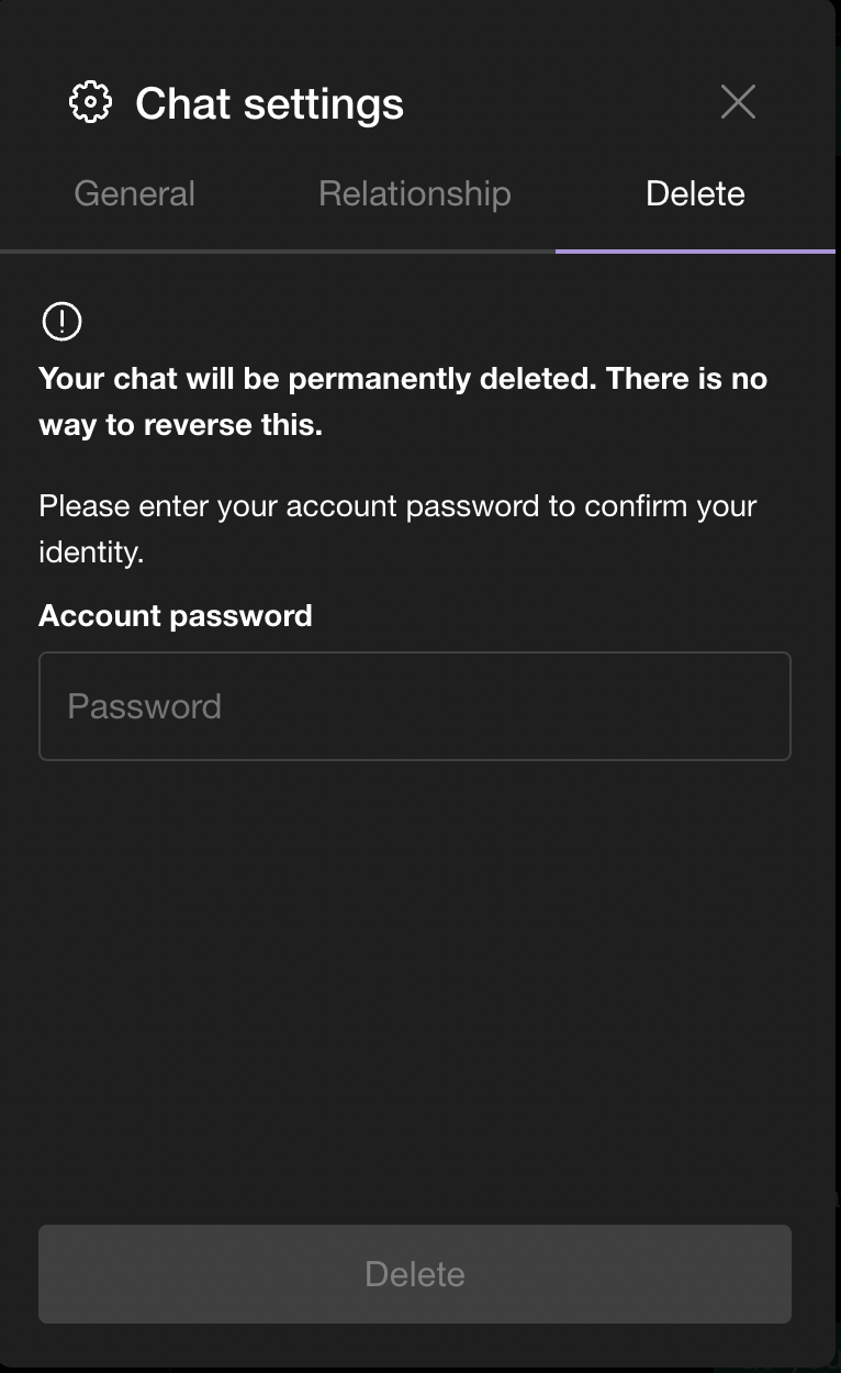
After:
Diff Detail
Diff Detail
- Repository
- rCOMM Comm
- Lint
Lint Not Applicable - Unit
Tests Not Applicable
Event Timeline
Comment Actions
Align the icon and text side by side without putting the icon inside the
paragraph content. If it's better to push the content and icon a little to the left still, that can be done

Comment Actions
I would personally align the i icon back a bit so that it is flush with the text below