Page MenuHomePhabricator

[landing] updated layout of team members wrapper
ClosedPublic

Authored by ginsu on Oct 4 2022, 2:11 PM.
Tags
None
Referenced Files
Unknown Object (File)
Tue, Nov 26, 5:02 PM
Unknown Object (File)
Tue, Nov 26, 5:02 PM
Unknown Object (File)
Mon, Nov 25, 10:31 PM
Unknown Object (File)
Sun, Nov 24, 12:25 PM
Unknown Object (File)
Sun, Nov 24, 12:53 AM
Unknown Object (File)
Tue, Nov 19, 5:21 AM
Unknown Object (File)
Tue, Nov 19, 12:25 AM
Unknown Object (File)
Sat, Nov 9, 8:09 PM

Details

Summary

updated layout of team member wrapper by doubling the row-gap property and adding a max-width


Linear Task: ENG-1506

Depends: D5295

Test Plan

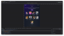
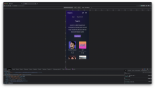
Please review the screenshots to see the before and after of the changes I made:

Before:

Screen Shot 2022-10-04 at 4.47.12 PM.png (2×3 px, 3 MB)

After:

Please note for this image I added the red border just to highlight the size of max-width:

Screen Shot 2022-10-04 at 5.13.19 PM.png (1×3 px, 3 MB)

Screen Shot 2022-10-04 at 5.14.14 PM.png (2×3 px, 3 MB)

Diff Detail

Repository
rCOMM Comm
Lint
Lint Not Applicable
Unit
Tests Not Applicable

Event Timeline

ginsu requested review of this revision.Oct 4 2022, 2:20 PM
This revision is now accepted and ready to land.Oct 4 2022, 6:28 PM

Definite improvement. Have we checked with various browsers and various resolutions / screen formats?

Definitely looks better!

Definite improvement. Have we checked with various browsers and various resolutions / screen formats?

Yup! I thought everything looked okay when I tested initially, but here are some screenshots on several different devices, if you want to double-check:

On bigger screen/monitor:

Screen Shot 2022-10-05 at 9.29.26 AM.png (3×5 px, 6 MB)

On iPad Air:

Screen Shot 2022-10-05 at 9.30.53 AM.png (3×5 px, 3 MB)

On iPhone 12:

Screen Shot 2022-10-05 at 9.31.12 AM.png (3×5 px, 2 MB)

Looks great!! Thanks for checking :)