Page MenuHomePhabricator

[native] fixed tooltip triangle color
ClosedPublic

Authored by ginsu on Nov 14 2022, 2:00 PM.
Tags
None
Referenced Files
F3373987: D5628.diff
Tue, Nov 26, 1:04 PM
Unknown Object (File)
Sat, Nov 23, 2:42 AM
Unknown Object (File)
Thu, Nov 14, 8:10 PM
Unknown Object (File)
Thu, Nov 14, 3:08 PM
Unknown Object (File)
Mon, Nov 11, 8:57 AM
Unknown Object (File)
Fri, Nov 8, 9:58 AM
Unknown Object (File)
Fri, Nov 8, 9:58 AM
Unknown Object (File)
Fri, Nov 8, 9:58 AM

Details

Summary

Found a small ui bug as I was working with the tooltips where the triangles had a different color than styles.items and was dark in "light mode".

Also as a side note, I think the color for the tooltip is a little too dark and it's hard to see the triangles. I didn't change it because the focus of this diff is to unify the color of the triangles, but just something we should think about especially now that we have some designers on the team


Linear Task: ENG-2052
Test Plan

Please see the screenshots to see the changes I made

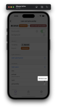
Before:
Dark Mode:

Screen Shot 2022-11-14 at 4.52.22 PM.png (1×1 px, 548 KB)

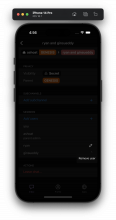
Light Mode:

Screen Shot 2022-11-14 at 4.54.53 PM.png (1×1 px, 612 KB)

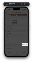
After:
Dark Mode:

Screen Shot 2022-11-14 at 4.56.26 PM.png (1×1 px, 608 KB)

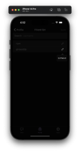
Light Mode:

Screen Shot 2022-11-14 at 4.56.11 PM.png (1×1 px, 606 KB)

Diff Detail

Repository
rCOMM Comm
Branch
eng-2037 (branched from master)
Lint
No Lint Coverage
Unit
No Test Coverage

Event Timeline

ginsu requested review of this revision.Nov 14 2022, 2:13 PM

Thanks for catching that!!

I didn't change it because the focus of this diff is to unify the color of the triangles, but just something we should think about especially now that we have some designers on the team

Yeah agree, though we should still probably pick a color with better contrast for the time being

This revision is now accepted and ready to land.Nov 14 2022, 2:20 PM

The tooltip is way too dark in dark mode. That's not what I'm seeing in the latest Testflight build... it looks normal (white) there. Is there something in your stack that's doing that? Or did one of Atul's recent changes during his light mode work do that? We should make sure we resolve it before we ship the next build so that we don't have a regression.

Or did one of Atul's recent changes during his light mode work do that?

Yeah my bad I introduced that regression... I'll put up a diff to fix.

Should I still land the diff right now as is, or wait until @atul's new diff

You should make a decision on that based on whether @atul's diff will affect yours and whether you want to put up a new diff in case you need to rethink things after Atul's

okay sounds good, i'll land as is right now and make sure when @atul makes the new diff that everything still looks good and make any necessary changes if needed

This revision was automatically updated to reflect the committed changes.

Yeah my bad I introduced that regression... I'll put up a diff to fix.

Is there a task for this?

Yeah my bad I introduced that regression... I'll put up a diff to fix.

Is there a task for this?

https://linear.app/comm/issue/ENG-2259/fix-background-color-of-tooltip-in-dark-mode