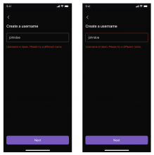
See designs here. Some additional comments inline.
Details
Diff Detail
- Repository
- rCOMM Comm
- Lint
Lint Not Applicable - Unit
Tests Not Applicable
Event Timeline
| native/account/registration/username-selection.react.js | ||
|---|---|---|
| 55–75 ↗ | (On Diff #26814) | Arguably it's a bit weird to have this JSX in React state. If preferred, I'm open to updating the React state to an enum, and rendering this conditionally based on the enum |
| 129–143 ↗ | (On Diff #26814) | I got a lot of these props from RegisterPanel here |
| 142 ↗ | (On Diff #26814) | I added this onBlur because I figured that if the user dismisses the keyboard, they might see a gray button and not be clear on why it's gray, and not have any action they can take to figure out what is wrong. In contrast, if the keyboard is up, the gray button isn't visible, and the "Next" button on the keyboard is always pressable (and will yield an error message when pressed if appropriate) |
| 167 ↗ | (On Diff #26814) | This is necessary to make sure that the width of "1." is the same as the width of "2.". Otherwise the list for the error state on line 54 looks a bit clunky In a later diff I'll update all body text to use Arial for consistency |
| 179 ↗ | (On Diff #26814) | This is pulled from how we render Markdown lists, and is also used in ConnectEthereum |
Should we style the input w/ a red outline when there's invalid input + some sort of error state? (cc @ted)
I would expect something more like the right:
Either way, implementation matches the designs
| native/account/registration/username-selection.react.js | ||
|---|---|---|
| 55–75 ↗ | (On Diff #26814) | Ah yeah, I think either enum or having errorText be some sort of array of strings would be better. Not sure on best practices or whatever, but JSX in state seems unusual |
Good call – I agree this makes sense. Thanks for creating DES-89 – I added a concrete question about the new registration flow there in a comment, and assuming we get buy-in from Ted once he's back, I'll implement that change in a later diff.
