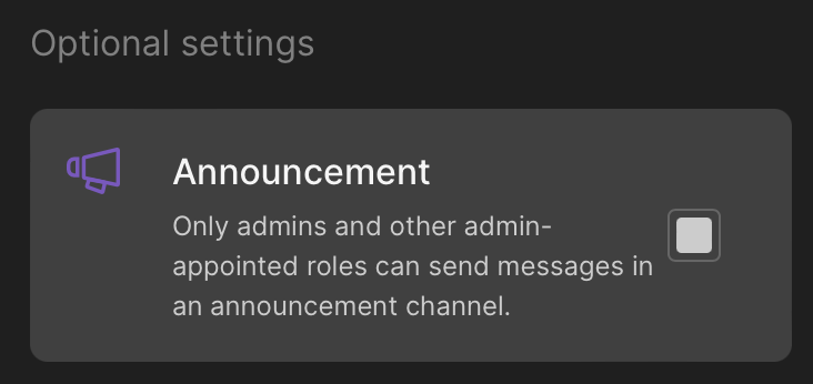
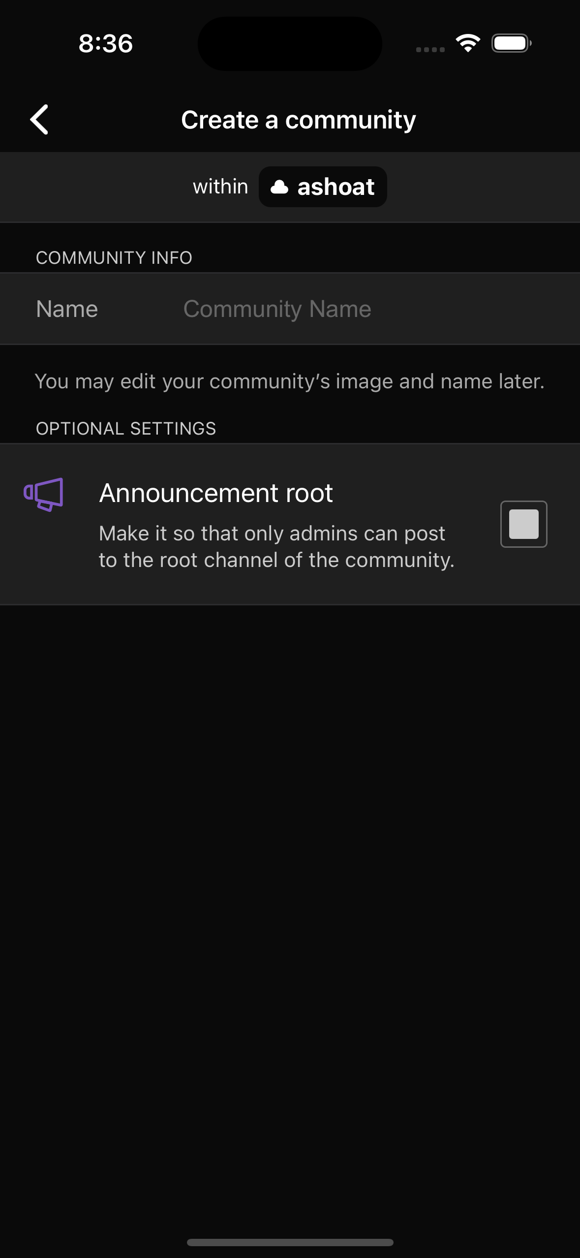
Have the enumCheckBox in CommunityConfiguration toggle announcementSetting when tapped.
Depends on D7967
Differential D7968
[native] Make `enumCheckBox` functional in `CommunityConfiguration` Authored by atul on May 24 2023, 7:56 PM. Tags None Referenced Files
Details Have the enumCheckBox in CommunityConfiguration toggle announcementSetting when tapped. Depends on D7967 Looks as expected: 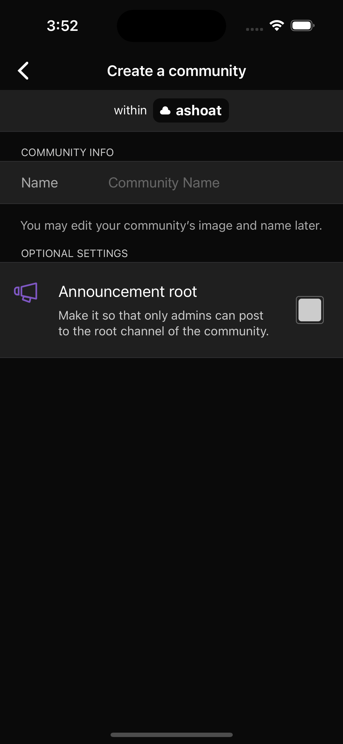 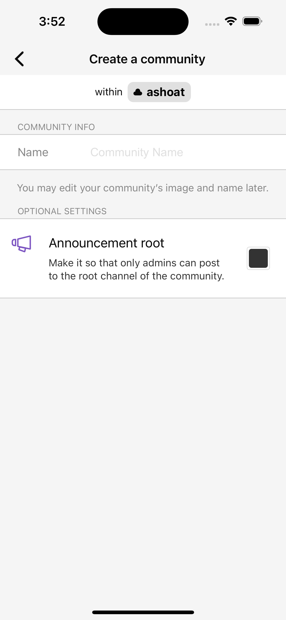
Diff Detail
Event TimelineComment Actions Requesting changes for design iteration. Really wish this was captured in the designs we got from @ted before the hand-off
| ||||||||||||||||||||||||||||||||||||||||||||||