Page MenuHomePhabricator

[web] Relocate the icon in ThreadSettingsDeleteTab to be in-line with the warning text
ClosedPublic

Authored by rohan on Sep 30 2022, 1:03 PM.
Tags
None
Referenced Files
F3538603: D5273.id17305.diff
Wed, Dec 25, 11:09 PM
F3538595: D5273.id17276.diff
Wed, Dec 25, 11:09 PM
F3538296: D5273.id17258.diff
Wed, Dec 25, 10:41 PM
F3538279: D5273.id17253.diff
Wed, Dec 25, 10:35 PM
F3538271: D5273.id17304.diff
Wed, Dec 25, 10:31 PM
F3533323: D5273.diff
Wed, Dec 25, 11:28 AM
Unknown Object (File)
Sun, Dec 15, 6:32 PM
Unknown Object (File)
Sat, Nov 30, 12:19 PM

Details

Summary

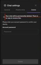
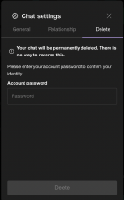
Moved the i icon to be in-line with the warning text when
attempting to delete a chat. This was done by moving the SWMansionIcon
element to be inside the paragraph element.

Addresses: https://linear.app/comm/issue/ENG-1921/relocate-the-icon-in-threadsettingsdeletetab-to-be-in-line-with-the

Test Plan

Confirmed visually that this change works as expected, and will
attach before/after photos so reviewers can see.

Before:

Before.png (1×766 px, 242 KB)

After:

After.png (1×766 px, 235 KB)

Diff Detail

Repository
rCOMM Comm
Branch
ENG-1913
Lint
No Lint Coverage
Unit
No Test Coverage

Event Timeline

rohan retitled this revision from [web] Relocate the icon in ThreadSettingsDeleteTab to be in-line with the warning text to [web] Relocate the icon in ThreadSettingsDeleteTab to be in-line with thewarning text.Sep 30 2022, 1:04 PM
rohan edited the summary of this revision. (Show Details)
rohan edited the test plan for this revision. (Show Details)
rohan attached a referenced file: F187505: After.png. (Show Details)
rohan attached a referenced file: F187504: Before.png. (Show Details)
rohan requested review of this revision.Sep 30 2022, 1:13 PM
ashoat requested changes to this revision.Sep 30 2022, 1:51 PM

Let's get it aligned better, we don't want the text to wrap with the icon

This revision now requires changes to proceed.Sep 30 2022, 1:51 PM

Align the icon and text side by side without putting the icon inside the
paragraph content. If it's better to push the content and icon a little to the left still, that can be done

Revision.png (1×770 px, 241 KB)

ashoat requested changes to this revision.Oct 1 2022, 3:55 AM

Center icon, increasing padding

This revision now requires changes to proceed.Oct 1 2022, 3:55 AM

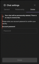
Spoke with Ashoat offline and improved the centering & padding

Screen Shot 2022-10-01 at 3.38.11 PM.png (1×732 px, 675 KB)

Screen Shot 2022-10-01 at 3.35.52 PM.png (1×778 px, 253 KB)

rohan retitled this revision from [web] Relocate the icon in ThreadSettingsDeleteTab to be in-line with thewarning text to [web] Relocate the icon in ThreadSettingsDeleteTab to be in-line with the warning text.

Looks great!! Will also love @atul's take

I would personally align the i icon back a bit so that it is flush with the text below
In D5273#155747, @ginsu wrote:

I would personally align the i icon back a bit so that it is flush with the text below

Agree with this, think they should be left-aligned

atul requested changes to this revision.Oct 3 2022, 12:44 PM
This revision now requires changes to proceed.Oct 3 2022, 12:44 PM
In D5273#155747, @ginsu wrote:

I would personally align the i icon back a bit so that it is flush with the text below
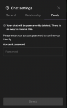
Thanks for the suggestion @ginsu! Do you think just the icon should be shifted to the left with the text below, or the entire container (ie the icon and the warning text) should be shifted left?

Tagging @atul as well since you have the same suggestion

I would shift the entire container (icon with the warning text) to the left

ginsu requested changes to this revision.Oct 3 2022, 12:55 PM

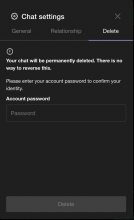
Left aligned the icon with the text below

updated.png (1×766 px, 228 KB)

This revision is now accepted and ready to land.Oct 3 2022, 1:55 PM