Page MenuHomePhabricator

[web] update the calendar ui
AcceptedPublic

Authored by ginsu on Jan 8 2024, 1:06 AM.
Tags
None
Referenced Files
Unknown Object (File)
Sun, Nov 3, 3:40 AM
Unknown Object (File)
Sun, Nov 3, 3:40 AM
Unknown Object (File)
Sun, Nov 3, 3:40 AM
Unknown Object (File)
Oct 11 2024, 5:23 PM
Unknown Object (File)
Sep 20 2024, 9:57 AM
Unknown Object (File)
Sep 18 2024, 2:36 AM
Unknown Object (File)
Sep 18 2024, 2:36 AM
Unknown Object (File)
Sep 18 2024, 2:35 AM
Subscribers

Details

Reviewers
atul
inka
Summary

PLEASE NOTE THAT THIS DIFF AND SUBSEQUENT DIFFS IN THIS STACK WILL NOT BE LANDED UNTIL MORE OF THE REDESIGN IS READY SINCE THIS WILL CAUSE REGRESSIONS IN PROD

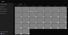
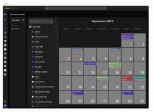
This diff updates the calendar ui to match the ui in the new web app redesign. For reference, here is a screenshot of the figma:

Screenshot 2024-01-08 at 4.09.20 AM.png (932×1 px, 155 KB)

Linear task: https://linear.app/comm/issue/ENG-5937/calendar-ui-updates

Depends on D10568
Test Plan

Please see the demo video below

Diff Detail

Repository
rCOMM Comm
Lint
No Lint Coverage
Unit
No Test Coverage

Event Timeline

ginsu published this revision for review.Jan 8 2024, 1:12 AM
ginsu edited the summary of this revision. (Show Details)
ginsu edited the test plan for this revision. (Show Details)
ginsu added reviewers: atul, inka.

will make sure ci passes before landing

This revision is now accepted and ready to land.Jan 8 2024, 12:40 PM

Can we make it so that when the user scrolls down the window, the filters button changes position? So that it is fixed to the component it is in, not the screen

In D10569#306316, @inka wrote:

Can we make it so that when the user scrolls down the window, the filters button changes position? So that it is fixed to the component it is in, not the screen

I think that would be weird given that the filter panel is fixed. I think it's good that the filter button is always visible and fixed, given that the filter panel is the same

I think that would be weird given that the filter panel is fixed. I think it's good that the filter button is always visible and fixed, given that the filter panel is the same

It looks a bit weird because if the month starts on Sunday, then the button is hidden by the day tile.

image.png (1×3 px, 255 KB)

Also it looks weird to me that the month name is hidden, but the button that seems to be in the same "header" space doesn't. Maybe we could fix the whole "header"? Then the button wouldn't be hidden under the day tile, but would also be accessible all the time.
By "header" I mean this whole part:
image.png (164×2 px, 24 KB)

Good points @inka. I like the idea of fixing the entire header. @ginsu what do you think? If we don't have the cycles for that right now, then at least making sure the button appear over the calendar would be a good start