Page MenuHomePhabricator

[web] update the chat input bar ui
AcceptedPublic

Authored by ginsu on Jan 8 2024, 12:33 AM.
Tags
None
Referenced Files
Unknown Object (File)
Sun, Nov 3, 3:40 AM
Unknown Object (File)
Sun, Nov 3, 3:40 AM
Unknown Object (File)
Sun, Nov 3, 3:40 AM
Unknown Object (File)
Oct 12 2024, 10:51 AM
Unknown Object (File)
Oct 5 2024, 9:31 PM
Unknown Object (File)
Sep 14 2024, 11:02 PM
Unknown Object (File)
Sep 14 2024, 11:01 PM
Unknown Object (File)
Sep 14 2024, 11:01 PM
Subscribers

Details

Reviewers
atul
inka
Summary

PLEASE NOTE THAT THIS DIFF AND SUBSEQUENT DIFFS IN THIS STACK WILL NOT BE LANDED UNTIL MORE OF THE REDESIGN IS READY SINCE THIS WILL CAUSE REGRESSIONS IN PROD

This diff updates the chat input bar + any extra relevant elements as part of the chat input bar (join chat button, image previews, and explanations). In this diff I did the following:

  • I added a border top drop shadow inset to the join chat button and to the multimedia previews container, and explanation container
  • I added a border top drop shadow inset to the chat input bar and removed any top padding
  • I moved the multimedia button to be housed within the chat input bar

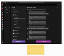
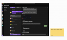
Here are some figma screenshots that show the different edge cases:

Screenshot 2024-01-08 at 3.51.12 AM.png (1×1 px, 272 KB)

Screenshot 2024-01-08 at 3.51.37 AM.png (1×1 px, 221 KB)

Linear task: https://linear.app/comm/issue/ENG-5971/update-the-chat-input-field-ui and https://linear.app/comm/issue/ENG-5972/update-the-join-chat-button-ui

Depends on D10565
Test Plan

Please see the demo video below

Diff Detail

Repository
rCOMM Comm
Lint
No Lint Coverage
Unit
No Test Coverage

Event Timeline

Harbormaster returned this revision to the author for changes because remote builds failed.Jan 8 2024, 1:05 AM
Harbormaster failed remote builds in B25575: Diff 35342!
ginsu requested review of this revision.Jan 8 2024, 1:13 AM

will make sure ci passes before landing

Changes looks good

web/chat/chat-input-bar.react.js
322–323

I see they're not colored in the Figma designs... but did we intentionally choose to stop styling this icon with thread icon? I vaguely remember it being discussed, but I don't remember decision (CC @ashoat?)

This revision is now accepted and ready to land.Jan 8 2024, 1:01 PM
web/chat/chat-input-bar.react.js
322–323

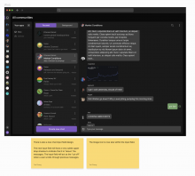
Sorry should have put this in the summary, but in this screenshot it shows that the image icon now no longer uses the thread color (the send button still does)

Screenshot 2024-01-08 at 4.03.04 PM.png (982×1 px, 211 KB)

Happy to bring this back tho, if we prefer using the thread color for the image icon

Personally I think I like having it colored. @ginsu what do you think?