Page MenuHomePhabricator

[web] Add `success` variant to `Button` component
ClosedPublic

Authored by ginsu on Sep 9 2022, 4:21 AM.
Tags
None
Referenced Files
Unknown Object (File)
Dec 8 2024, 4:02 PM
Unknown Object (File)
Dec 2 2024, 10:35 PM
Unknown Object (File)
Nov 9 2024, 11:50 PM
Unknown Object (File)
Nov 9 2024, 10:33 PM
Unknown Object (File)
Nov 9 2024, 9:16 PM
Unknown Object (File)
Nov 9 2024, 7:05 PM
Unknown Object (File)
Nov 9 2024, 5:43 PM
Unknown Object (File)
Nov 9 2024, 3:46 PM

Details

Summary

Added success variant to button component based on atuls previous comments.

Test Plan

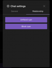
Please view the attached screenshots to see the before and after to see the changes i implemented:

Before: (the only color the button had)

Screen Shot 2022-09-09 at 8.13.55 PM.png (1×850 px, 52 KB)

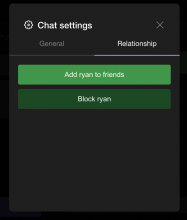
After:
success and success hover example:

Screen Shot 2022-09-14 at 10.46.12 PM.png (986×840 px, 189 KB)

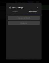
disabled example:

Screen Shot 2022-09-14 at 12.42.34 AM.png (1×1 px, 263 KB)

Diff Detail

Repository
rCOMM Comm
Lint
No Lint Coverage
Unit
No Test Coverage

Event Timeline

ginsu requested review of this revision.Sep 9 2022, 4:31 AM
ginsu retitled this revision from added logic for color prop in button component to [web] added logic for color prop in button component.Sep 11 2022, 8:39 AM
atul retitled this revision from [web] added logic for color prop in button component to [web] Add `color` prop to `Button` component.Sep 12 2022, 10:29 AM
atul requested changes to this revision.Sep 12 2022, 12:13 PM

Instead of creating a separate color prop, can we create a new variant?

We currently have the danger variant which is probably good for "block user", etc. We can introduce a success variant with the corresponding green for "add friend", etc?

If anything, I think it'd be better to introduce a general purpose style prop than one specifically for color... but think the cleanest/simplest approach here is to just introduce a new variant.

This revision now requires changes to proceed.Sep 12 2022, 12:13 PM
ginsu edited the test plan for this revision. (Show Details)

resovled atuls comments to add additional variant to button instead of new color prop

ginsu retitled this revision from [web] Add `color` prop to `Button` component to [web] Add `success` variant to `Button` component.Sep 13 2022, 9:00 AM
ginsu edited the summary of this revision. (Show Details)
ginsu edited the test plan for this revision. (Show Details)
atul requested changes to this revision.Sep 13 2022, 10:31 AM

Looks good, this is a much cleaner solution!

Let's revert the values in theme.css to avoid making any design/visual changes here and stick to what's already in the web app and it should be good to land!

web/theme.css
69 ↗(On Diff #16622)

Let's use --success-dark-50 here as well so we match the current relationship-button-green and don't make any design changes

70 ↗(On Diff #16622)

And we can use some darker variant of success here to match the change to --btn-bg-success.

103 ↗(On Diff #16622)

Let's just stick to --success-dark-50 here so we aren't making any design changes

This revision now requires changes to proceed.Sep 13 2022, 10:31 AM

reverted the values in theme.css

ginsu edited the test plan for this revision. (Show Details)
This revision is now accepted and ready to land.Sep 14 2022, 7:55 AM