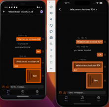
Android interprets borderColors differently from iOS. On iOS borders are on top of the body of the component, and on Android, borders are next to it.
Details
Checking new behavior with different colors and themes, on both operations systems.
Result (Android on the left):
Diff Detail
- Repository
- rCOMM Comm
- Lint
Lint Not Applicable - Unit
Tests Not Applicable
Event Timeline
Can we make this look exactly like iOS? Please share screenshots of iOS in the Test Plan. I think a border is still missing
(Feel free to handle this in a separate task if you prefer)
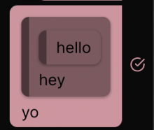
I am not sure what you mean by looking exactly like iOS. The current version looks like this:
I will remove from Test Plan screen that was made before the changes.
On both platforms all the borders are present (according to the test plan). The only difference is that all the colors on iOS look less saturated, but if we really want to address that, we should do it as a separate task.
You're right! I was thinking of web, which I think looks a little better:
(I agree that making native look like this is out-of-scope here)


