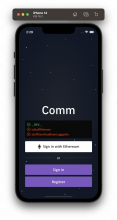
For the emoji avatar creation screen, I need a white color value. In the colors.js file there is a color entry for loginText which is white. I noticed that it was only being used in one place, so changed the name from loginText to whiteText so that it could be better used in both places
Details
- Reviewers
ashoat atul - Commits
- rCOMMc198c0e0f858: [native] changed name of loginText to whiteText
Searched for all uses of loginText and saw that it was used in one place. After this change, I checked the login screen and everything looked the same as it did before:
Diff Detail
- Repository
- rCOMM Comm
- Lint
Lint Not Applicable - Unit
Tests Not Applicable
Event Timeline
| native/themes/colors.js | ||
|---|---|---|
| 96 ↗ | (On Diff #24818) | Why aren't we using purpleButton for this? The longer you make this list, the harder it is to maintain a consistent design system. Please try to be a thoughtful steward of the codebase and minimize the amount of maintenance work / debt you're putting on the team in the future |
| 97–98 ↗ | (On Diff #24818) | Can we entirely avoid having any avatar-specific entries here? Please consult Ted about which of the existing options would be best to use, and if none are good then consult him on whether one of the existing options should be updated to match these new designs. If you guys are absolutely sure we need new styles, think about where else in the app we might use them, and try to give them a title that indicates how they might be used (eg. "modal", "panel", "list") My instinct is that this is a "panel" situation (since it's coming from the Profile page) but I'm not sure |
| 158 ↗ | (On Diff #24818) | The purpleLink color appears to differ in light mode from what Ted proposed for editEmojiText. This is the kind of concern you need to bubble up to Ted. We need to figure out where this is used, and whether we want to have a different design there vs. in this new avatar screen (likely no, we want them to be consistent) It's all of our collective responsibility to maintain a consistent design system. Please anticipate this feedback going forward any time you're expanding this list... we should have a really good reason for introducing new entries here |
| native/themes/colors.js | ||
|---|---|---|
| 158 ↗ | (On Diff #24818) |
Noted. Moving forward I will be more conscious of this. When I saw specific color values for things like siwe, community drawer, and typeahead I thought it was fine to just add in a color for a specific use case. Should I create a follow-up task to track cleaning this up? |
| native/themes/colors.js | ||
|---|---|---|
| 158 ↗ | (On Diff #24818) | Yeah that seems like a good idea. I just checked and I can't find an existing task for it, but I might be missing something. Worth checking with Ted, and making sure he's aware of this file |
| native/themes/colors.js | ||
|---|---|---|
| 158 ↗ | (On Diff #24818) | Synced with ted and made this task to track https://linear.app/comm/issue/ENG-3639/clean-up-color-entries-in-colorsjs |
