Details
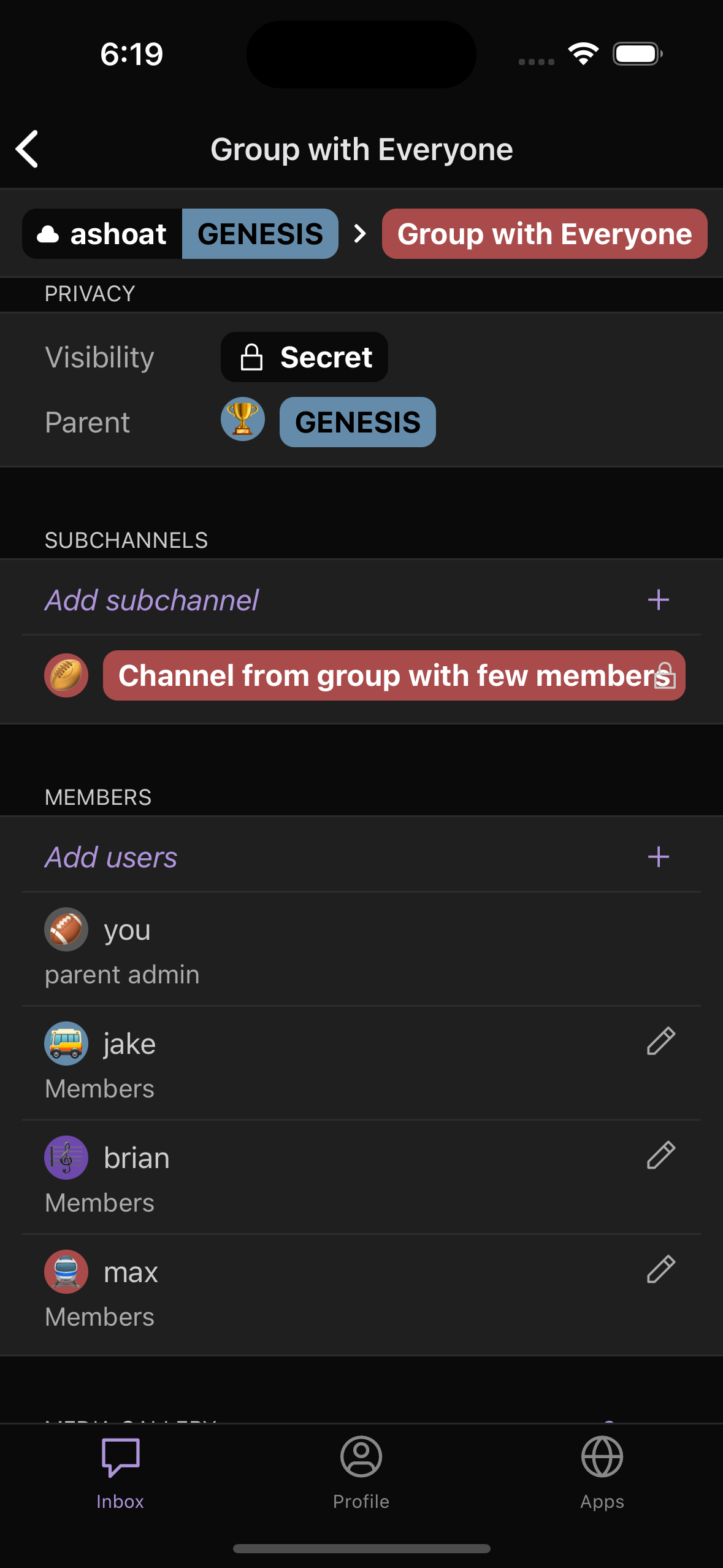
Please see below for what the changes look like (again, for testing I allowed 'Members' to display, but only Admin/custom roles will be shown)
Diff Detail
- Repository
- rCOMM Comm
- Lint
Lint Not Applicable - Unit
Tests Not Applicable
Event Timeline
Code change looks fine
CC @ashoat for copy (should we "singularize" "Members" and "Admins" so it appears as "Member" and "Admin"?)
CC @ted for design (current design doesn't looks great imo. Text seems busy + don't think it looks great left-aligned with avatar on next line. Could we consider alternative approaches? I've seen other messaging apps indicate admin vs. "member" with a crown icon for example. Maybe roles could have icons?)
(should we "singularize" "Members" and "Admins" so it appears as "Member" and "Admin"?)
Thought about this a bit with @ted, but we concluded that when users are able to come up with their own titles for roles, it might be a bit weird / complicated to "singularize" the user-provided titles
CC @ted for design (current design doesn't looks great imo. Text seems busy + don't think it looks great left-aligned with avatar on next line. Could we consider alternative approaches? I've seen other messaging apps indicate admin vs. "member" with a crown icon for example. Maybe roles could have icons?)
I think for Roles, icons might be a bit tough since there isn't always going to be just admins and "members". Communities could have multiple different roles which might get messy in terms of displaying icons for the needed roles. I think displaying the role names work, just needs to be laid out a bit differently. Possibly having the Role name be horizontally aligned on the same line.
With the new roles feature, we show the roles for the members list on web now as well, so mobile should match that.
I'll work on a solution!
Preemptively remove the check for a parent admin. Tested with the changes
made in D8072