Page MenuHomePhabricator

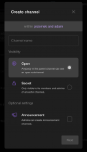
[web] Added extra margin in "Create subchannel" modal
ClosedPublic

Authored by przemek on Oct 7 2022, 2:34 AM.
Tags
None
Referenced Files
F3246431: D5314.diff
Thu, Nov 14, 11:43 PM
Unknown Object (File)
Tue, Oct 22, 1:57 PM
Unknown Object (File)
Tue, Oct 22, 1:57 PM
Unknown Object (File)
Tue, Oct 22, 2:18 AM
Unknown Object (File)
Tue, Oct 22, 12:26 AM
Unknown Object (File)
Sep 7 2024, 3:29 AM
Unknown Object (File)
Sep 7 2024, 3:28 AM
Unknown Object (File)
Sep 7 2024, 3:28 AM
Subscribers

Details

Summary

Changed margin in wrapper around Visibility Option Content in Create
Subchannel modal.

Screenshot 2022-10-07 at 11.50.50.png (1×854 px, 117 KB)

Test Plan

Build app.
Visually checked if it looks correctly after changes.

Diff Detail

Repository
rCOMM Comm
Lint
Lint Not Applicable
Unit
Tests Not Applicable

Event Timeline

przemek edited the test plan for this revision. (Show Details)
przemek added 1 blocking reviewer(s): tomek.
przemek retitled this revision from Added margin in create channel to [web] Added margin in create channel.
przemek retitled this revision from [web] Added margin in create channel to [web] Added extra margin in "Create subchannel" modal.Oct 7 2022, 4:14 AM

Hey @przemek, your attachment didn't work because of a quirk in Phabricator, unfortuantely... read more here

Hi @ashoat, thanks for pointing this out. It should be fixed now

Looks good!

Some tips for next diffs you push up:

  1. In the description linking the linear task would be helpful so that reviewers can gain more context of what you are working on
  2. For UI changes, it is nice to include two screenshots (a before and after of the changes you made) so that reviewers can easily see the change
atul added inline comments.
web/components/enum-settings-option.css
34 ↗(On Diff #17407)

I think it might sense to use padding (internal to optionContent) instead of margin (external to optionContent) here... defer to @tomek who is blocking reviewer.

tomek added inline comments.
web/components/enum-settings-option.css
34 ↗(On Diff #17407)

I think that margin makes sense - it is a space between elements and not something internal to the element. If we had a background color here, I think that it shouldn't touch the input icon (but at the same time, some padding would also be added).

Usually a better way of doing this is for the container to decide how to position its children. So e.g. use gap, justify-content, etc. But margin is good enough for this simple use case.

This revision is now accepted and ready to land.Oct 10 2022, 2:17 AM