Page MenuHomePhabricator

[web] intoduce MessageLikeTooltipButton component
ClosedPublic

Authored by ginsu on Dec 27 2022, 7:28 AM.
Tags
None
Referenced Files
F3749238: D6056.id20449.diff
Thu, Jan 9, 8:57 PM
Unknown Object (File)
Sat, Jan 4, 7:22 PM
Unknown Object (File)
Sat, Jan 4, 7:19 PM
Unknown Object (File)
Sat, Jan 4, 7:18 PM
Unknown Object (File)
Sat, Jan 4, 3:21 PM
Unknown Object (File)
Fri, Jan 3, 6:25 PM
Unknown Object (File)
Thu, Jan 2, 12:37 AM
Unknown Object (File)
Thu, Jan 2, 12:37 AM
Subscribers

Details

Summary

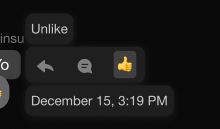
introduce MessageLikeTooltipButton component. This component returns 👍 wrapped in a div, and the class of the div changes depending on the viewerReacted prop that gets passed down. I imagine that this will be a temporary component that will eventually be deleted once we extend from message liking to message reactions


Depends on D6055

Linear Task: ENG-2474
Test Plan

Please look at the screenshots to see the MessageLikeTooltipButton component:

When viewerReacted is true:

Screenshot 2022-12-27 at 1.24.52 PM.png (680×1 px, 91 KB)

When viewerReacted is false:

Screenshot 2022-12-27 at 1.25.03 PM.png (802×1 px, 94 KB)

Diff Detail

Repository
rCOMM Comm
Lint
No Lint Coverage
Unit
No Test Coverage

Event Timeline

Harbormaster returned this revision to the author for changes because remote builds failed.Dec 27 2022, 7:31 AM
Harbormaster failed remote builds in B14803: Diff 20189!
Harbormaster returned this revision to the author for changes because remote builds failed.Dec 27 2022, 10:39 AM
Harbormaster failed remote builds in B14806: Diff 20195!
tomek requested changes to this revision.Dec 29 2022, 5:13 AM
tomek added inline comments.
web/chat/message-like-tooltip-button.css
7–9 ↗(On Diff #20196)

For other tooltip actions we don't need to manually set this style. Can we use the mechanism we already have, or are there any reasons for not doing so?

This revision now requires changes to proceed.Dec 29 2022, 5:13 AM
ginsu requested review of this revision.Dec 29 2022, 7:55 AM
ginsu added inline comments.
web/chat/message-like-tooltip-button.css
7–9 ↗(On Diff #20196)

I believe the other icons don't need to set this style because it is built into IcomoonReact. When I switched the Like action tooltip button with one of the icons the hover style just works out of the box. Wondering if @atul has more context since he is pretty familiar with the icons stuff

tomek requested changes to this revision.Dec 29 2022, 8:03 AM
tomek added inline comments.
web/chat/message-like-tooltip-button.css
7–9 ↗(On Diff #20196)

It wouldn't make too much sense for Icomoon to provide hover effects for icons because they could be used in other places - not only as buttons. It seems like the style on hover is applied in message-tooltip.css

div.messageActionButtons svg:hover {
  cursor: pointer;
  color: var(--fg);
}

so it should be enough to apply this style also to the new button.

This revision now requires changes to proceed.Dec 29 2022, 8:03 AM
web/chat/message-like-tooltip-button.css
7–9 ↗(On Diff #20196)

Ahhhhh that makes sense, thank you for clarifying, I will make the necessary changes

addressed tomeks comments

Looks good, one question inline

web/chat/message-tooltip.css
28–29 ↗(On Diff #20350)

Should this be

tomek added inline comments.
web/chat/message-like-tooltip-button.css
4 ↗(On Diff #20392)

We shouldn't use colors directly. In theme.css there are two sections: one with color definitions and one where we match colors with component names. We should introduce a new variable to the second sections and use here.

This revision is now accepted and ready to land.Dec 30 2022, 5:55 AM