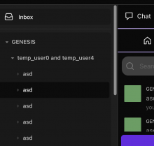
issue: https://linear.app/comm/issue/ENG-2671/style-community-drawer-on-web
Styling the community drawer (only the drawer for now, the top bar and other elements changed during the drawer tasks will be styled in a separate diff).
I made the header 4px taller for now, because until there is a navigation state info in the main content's header (see https://linear.app/comm/issue/ENG-2740/add-navigation-state-info-to-the-top-bar,
https://www.figma.com/file/a1nkbWgbgjRlrOY9LVurTz/Comm-%2F-Desktop-app?node-id=7780%3A136895&t=xSs7qrxIaOTjRJxA-4) the drawers header and main contents header bottom borders are almost aligned, and having them be off by 4px looked bad.
I also talked to the design team and we agreed that the purple line next to the active "Inbox"/"All communities"/"Settings" should be 3px, because otherwise it "sinks under" the browsers border (is not well visible).
Details
Details
- Reviewers
michal • kuba - Commits
- rCOMMe1d183a1ff18: [web] Style the community drawer
Run web app, check that the styles display correctly.
Diff Detail
Diff Detail
- Repository
- rCOMM Comm
- Lint
No Lint Coverage - Unit
No Test Coverage
Event Timeline
Comment Actions
So settings aren't immediately visible and you have to scroll to them. Was it decided somewhere that it should work like this?
Currently, the scroll applies to the whole community picker and not just to the community drawer:
So settings aren't immediately visible and you have to scroll to them. Was it decided somewhere that it should work like this?
| web/sidebar/community-picker.react.js | ||
|---|---|---|
| 31–34 ↗ | (On Diff #22327) | Nit: can we move the always true case to the top? Also, could this be moved closer to the inboxButtonContainerClass? (sideLineX are near each other so I think that makes sense) |
Comment Actions
@michal you're right! It is supposed to scroll differently. Here is how it works now:
Comment Actions
I talked to the design team, and "Settings" / "Inbox" / "All communities" buttons are not supposed to be highlighted after all. There will be the purple line next to them, but no highlight.
