Issue: https://linear.app/comm/issue/ENG-3014/add-a-button-to-close-the-filter-panel
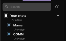
There is supposed to be a button for closing the filter panel, inside of the filter panel. Additionally some styles around it were changed, so I changed them as well to keep the panel looking consistent. Note that in the issues comments it had been decided to keep the search bars background colour consistent with the rest of the app for now.
The filters buttnon (the one used for opening) is supposed to disappear when the panel is open
Details
Details
- Reviewers
michal kamil • kuba - Commits
- rCOMM64ece713fb17: [web] Restyle search area in FilterPanel
run web app, checked that items in the filter panel display correctly.
Diff Detail
Diff Detail
- Repository
- rCOMM Comm
- Lint
No Lint Coverage - Unit
No Test Coverage
Event Timeline
Comment Actions
Make the button close the panel - it turned out it required very little changes, so amending to this diff
| web/calendar/calendar.react.js | ||
|---|---|---|
| 167 ↗ | (On Diff #22995) | Instead of changing the style, can we conditionally render the filter button? |
