Page MenuHomePhabricator

[web] introduce panel component
ClosedPublic

Authored by ginsu on Dec 29 2023, 2:52 PM.
Tags
None
Referenced Files
F3203853: D10500.diff
Sat, Nov 9, 8:30 PM
Unknown Object (File)
Thu, Oct 31, 4:21 AM
Unknown Object (File)
Mon, Oct 28, 7:49 AM
Unknown Object (File)
Oct 8 2024, 8:51 PM
Unknown Object (File)
Oct 3 2024, 1:00 PM
Unknown Object (File)
Oct 3 2024, 1:00 PM
Unknown Object (File)
Oct 3 2024, 1:00 PM
Unknown Object (File)
Oct 3 2024, 1:00 PM
Subscribers

Details

Summary

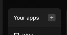
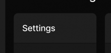
This component introduces the "Panel" component. I built the "Panel" component as the new UI is moslty made up of these "Panels" to house various parts of Comm, and I wanted to make sure we could easily enforce the style rules that every "Panel" will need. The "Panel" component is made up of two parts: the header and the body.

Here are some examples of the header:

Screenshot 2023-12-29 at 6.11.31 PM.png (164×1 px, 43 KB)

Screenshot 2023-12-29 at 6.12.04 PM.png (230×1 px, 19 KB)

Screenshot 2023-12-29 at 6.11.23 PM.png (300×562 px, 15 KB)

Screenshot 2023-12-29 at 6.11.59 PM.png (208×434 px, 10 KB)

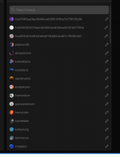
Here are examples of the body:

Screenshot 2023-12-29 at 6.14.27 PM.png (1×1 px, 245 KB)

Screenshot 2023-12-29 at 6.14.07 PM.png (840×648 px, 78 KB)

Screenshot 2023-12-29 at 6.14.21 PM.png (1×234 px, 14 KB)

Screenshot 2023-12-29 at 6.13.48 PM.png (1×280 px, 21 KB)

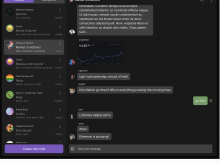
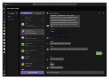
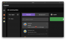
Another thing the "Panel" component needs to consider is that a "Panel" component can have multiple sections. For example, in the screenshot below the app list has one section but the chat card has two sections (the thread list, and the message list). In the screenshot you can see that the message list has a darker background shade than the thread list, indicating that there are two sections here.

Screenshot 2023-12-29 at 6.03.35 PM.png (1×1 px, 259 KB)

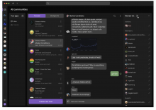
Here is an example of a card with three sections (thread list, message list, and members list). Please note that the thread list and members list have the same lighter shade of black compared to the message list)

Screenshot 2023-12-29 at 6.03.27 PM.png (1×1 px, 311 KB)

Depends on 10499

Test Plan

Please see the following screenshots

Here is an example of single section card (should be no visual differences which is expected)

Screenshot 2023-12-29 at 6.20.34 PM.png (1×434 px, 40 KB)

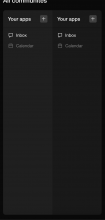
Here is an example of a two section card:

Screenshot 2023-12-29 at 6.22.31 PM.png (1×682 px, 52 KB)

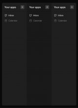
Here is an example of a three section card:

Screenshot 2023-12-29 at 7.01.37 PM.png (1×1 px, 61 KB)

safari (checking for the shadow styles):

Screenshot 2024-01-03 at 1.35.57 PM.png (1×3 px, 889 KB)

firefox (checking for the shadow styles):

Screenshot 2024-01-03 at 1.36.25 PM.png (2×3 px, 883 KB)

Diff Detail

Repository
rCOMM Comm
Lint
No Lint Coverage
Unit
No Test Coverage

Event Timeline

uncovered a small visual bug when a card has more than 2 sections

ginsu edited the summary of this revision. (Show Details)
ginsu edited the test plan for this revision. (Show Details)

update

ginsu edited the test plan for this revision. (Show Details)
atul requested changes to this revision.Dec 30 2023, 1:48 AM

Left a comment about using React.Children.* APIs which are listed as "legacy" in the React docs.


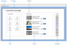
As an aside, my instinct would be to name this "container component" something like "pane" or "panel." I usually think of "card" as an element of a container (eg a post in a social feed).

Here's two quick examples from a quick Google search which seem to confirm that naming convention:

4jgWc.png (710×1 px, 139 KB)

6232a1.png (1×1 px, 283 KB)

web/components/card.css
28–31 ↗(On Diff #35115)

Can you quickly make sure that this looks correct on Safari and Firefox before landing?

web/components/card.react.js
34 ↗(On Diff #35115)

Huh, was unfamiliar with using React.Children.* to interact with child components... but it looks like we already use it a couple places in the codebase.

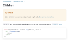
That said, it looks like React.Children.* is listed as a "Legacy React API" in the React docs:

e96b77.png (1×1 px, 143 KB)

(https://react.dev/reference/react/Children)

I haven't done much research so I don't know exactly why using React.Children is "is uncommon and can lead to fragile code," but figure we should avoid it if possible?

Could we update this component to use children prop instead?

This revision now requires changes to proceed.Dec 30 2023, 1:48 AM

Left a comment about using React.Children.* APIs which are listed as "legacy" in the React docs.

I read through the alternative solutions to the React.Children API in the link you attached in your comments above and felt that the methods outlined here were the best alternative
https://react.dev/reference/react/Children#accepting-an-array-of-objects-as-a-prop

I have confirmed that everything still works with this new alternative solution.

In regards to changing the name of this component from "Card" to "Panel" I mentioned earlier that I wasn't sold on the naming convention either but was struggling to come up with something better. I think "Panel" does fit better for this component; however, with that said we already do have a "Panel" color family that is used other places. I think it would be better to rename that old panel color family to "frame" (based on the screenshots you sent me that is what we use the old panel family for). If there is no opposition to using that name I will update the naming convention in a follow up diff.

Also updated the test plan to show screenshots of safari and firefox

ginsu retitled this revision from [web] introduce card component to [web] introduce panel component.Jan 3 2024, 10:38 AM
ginsu edited the summary of this revision. (Show Details)
ginsu edited the test plan for this revision. (Show Details)
web/components/panel.css
9 ↗(On Diff #35166)

We already have a "panel" color family.

In the comment above I explained that I think we should rename that color family to "frame" and then we can rename this color family to "panel". This will be done in a subsequent diff

Left a comment about using React.Children.* APIs which are listed as "legacy" in the React docs.

I read through the alternative solutions to the React.Children API in the link you attached in your comments above and felt that the methods outlined here were the best alternative
https://react.dev/reference/react/Children#accepting-an-array-of-objects-as-a-prop

I have confirmed that everything still works with this new alternative solution.

In regards to changing the name of this component from "Card" to "Panel" I mentioned earlier that I wasn't sold on the naming convention either but was struggling to come up with something better. I think "Panel" does fit better for this component; however, with that said we already do have a "Panel" color family that is used other places. I think it would be better to rename that old panel color family to "frame" (based on the screenshots you sent me that is what we use the old panel family for). If there is no opposition to using that name I will update the naming convention in a follow up diff.

Also updated the test plan to show screenshots of safari and firefox

Thanks for explaining and adding screenshots to Test Plan. The new naming convention you're going with makes sense.

web/components/panel.css
9 ↗(On Diff #35166)

That makes sense

This revision is now accepted and ready to land.Jan 3 2024, 12:02 PM
This revision was landed with ongoing or failed builds.Jan 3 2024, 12:45 PM
This revision was automatically updated to reflect the committed changes.