Page MenuHomePhabricator

[web] update thread list ui
AcceptedPublic

Authored by ginsu on Jan 4 2024, 3:54 AM.
Tags
None
Referenced Files
Unknown Object (File)
Thu, Oct 3, 10:51 AM
Unknown Object (File)
Wed, Sep 18, 12:55 AM
Unknown Object (File)
Wed, Sep 18, 12:55 AM
Unknown Object (File)
Wed, Sep 18, 12:54 AM
Unknown Object (File)
Mon, Sep 16, 8:04 PM
Unknown Object (File)
Aug 27 2024, 2:15 AM
Unknown Object (File)
Aug 27 2024, 2:04 AM
Unknown Object (File)
Aug 9 2024, 7:23 PM
Subscribers

Details

Reviewers
atul
inka
ashoat
Summary

PLEASE NOTE THAT THIS DIFF AND SUBSEQUENT DIFFS IN THIS STACK WILL NOT BE LANDED UNTIL MORE OF THE REDESIGN IS READY SINCE THIS WILL CAUSE REGRESSIONS IN PROD

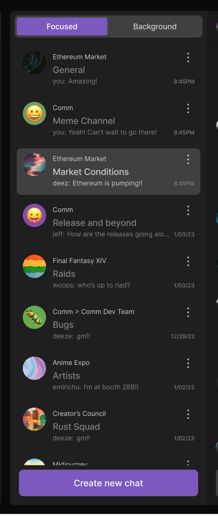
This diff updates the chat thread list ui to match the ui of the new web app redesign. The new chat thread list ui has a border radius on the selected/hovered chat items and the chat items also have a row gap in between each item. Additionally the padding for the create new chat has also been updated. Here are the screenshot of the figma for reference:

Screenshot 2024-01-04 at 7.03.45 AM.png (1×760 px, 239 KB)

Linear task: https://linear.app/comm/issue/ENG-5970/update-the-ui-for-the-selected-chathovered-chat-thread

Depends on D10528

Test Plan

Please see the demo video below

Diff Detail

Repository
rCOMM Comm
Lint
No Lint Coverage
Unit
No Test Coverage

Event Timeline

ginsu retitled this revision from [web] update thread list item hovered/selected ui to [web] update thread list ui.Jan 4 2024, 4:11 AM
ginsu edited the summary of this revision. (Show Details)
ginsu edited the test plan for this revision. (Show Details)
ginsu added reviewers: atul, inka.
ginsu requested review of this revision.Jan 4 2024, 4:12 AM
web/chat/chat-thread-list.css
21

I have a product/design decision that I wanted to get a second take on.

Currently when there is chat w/ a sidebar and the chat is selected and the sidebar is hovered this is what it looks like:

Screenshot 2024-01-04 at 7.17.21 AM.png (716×982 px, 113 KB)

This case was never accounted for in the figma designs; however, right now there is a row gap of 8px in between each chat. My intuition is telling me that we should add a gap of 4px in between each sidebar item so that we don't have this "dimple" when two items with border radiuses but 4px is close enough to indicate to a user that these sidebar items are part of the parent chat. Let me know if that makes sense and what we prefer and I can update the diff accordingly

cc @ashoat

web/chat/chat-thread-list.react.js
153

The chat thread list uses absolute positioning to layout each item

Screenshot 2024-01-04 at 7.00.56 AM.png (2×3 px, 1 MB)

This is why we need to add rowGap to the itemSize function

web/chat/chat-thread-list.css
21

Would your proposed gap increase the size of the sidebar item? If so, I'd like to see a screenshot of the before / after, with a variety of cases represented (some chats with no sidebars, some with 1 sidebar, some with 2 sidebars, some with a ton of sidebars so we see the "See more" item, etc.)

web/chat/chat-thread-list.react.js
153

Wondering, why do we use absolute positioning?

atul added a reviewer: ashoat.

Looks good, but adding @ashoat as blocking to get sign off on design/product question before landing.

web/chat/chat-thread-list.css
21

Unsolicited, but apart from sizing/spacing, would expect the tint for selected list item and hovered list item to be different.

Example from VSCode:

405b56.png (126×930 px, 24 KB)

(bottom is selected, top is hovered)

web/chat/chat-thread-list.css
21

I agree with this. Maybe we can create a Linear issue to discuss increasing the gap vs. differentiating the tint vs. leaving as-is (considering the costs of each option), and just land this diff as-is

This revision is now accepted and ready to land.Jan 4 2024, 2:28 PM