Page MenuHomePhabricator

[web] Added possibility to change input type and icon position in EnumSettingsOption
ClosedPublic

Authored by jakub on Sep 12 2022, 8:52 AM.
Tags
None
Referenced Files
Unknown Object (File)
Wed, Feb 28, 8:55 AM
Unknown Object (File)
Feb 19 2024, 4:40 PM
Unknown Object (File)
Feb 19 2024, 3:36 PM
Unknown Object (File)
Feb 19 2024, 2:39 PM
Unknown Object (File)
Feb 19 2024, 1:35 PM
Unknown Object (File)
Feb 19 2024, 12:59 PM
Unknown Object (File)
Feb 19 2024, 12:44 PM
Unknown Object (File)
Feb 19 2024, 12:18 PM

Details

Summary

Depends on D5110
Context: here

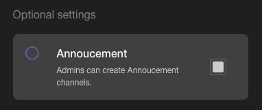
Added possibility to change input type of EnumSettingsOption from "radio" to "checkbox" and added iconPosition param to set vertical position of the left icon.

Additionally, setting cursor icon to pointer, when we hover on it.

Now, according to Figma design, we could use one component to create both radio and checkbox options.

image.png (161×382 px, 10 KB)

Test Plan

Currently, this improvement hasn't been used yet. It will be used in next diff.

To change EnumSettingsOption input type to checkbox, set inputType param as a "checkbox".

To change a vertical position of the left icon, set iconPosition as one of the {"top", "center", "bottom"} (by default is set to "center")

Diff Detail

Repository
rCOMM Comm
Lint
Lint Not Applicable
Unit
Tests Not Applicable

Event Timeline

jakub edited the test plan for this revision. (Show Details)
jakub added reviewers: tomek, atul, ashoat.

Looks good, left some comments to be addressed before landing

web/components/checkbox.css
7 ↗(On Diff #16590)

Can we use px units here? IIRC the only time we use % units for border-radius is when it's 50%.

17 ↗(On Diff #16590)

Same feedback as above regarding % and px units.

web/components/enum-settings-option.react.js
35–36 ↗(On Diff #16590)

Should we set a default value for type here like we are for iconPosition?

58 ↗(On Diff #16590)

Can we change this to

type === 'checkbox'

for consistency with the rest of our codebase?

(WebStorm's default style rules would suggest putting 'checkbox' before type here.. might be worth turning that rule off if you happen to be using WebStorm)

74–81 ↗(On Diff #16590)

We can probably define this outside of the component altogether?

This revision is now accepted and ready to land.Sep 15 2022, 8:32 AM
jakub edited the summary of this revision. (Show Details)

Changing % to px units, set default value of type param, move iconPositionClassNames outside of the component and adjust to codebase

I should not be a first-pass reviewer except for the cases listed here

tomek requested changes to this revision.Sep 16 2022, 11:06 AM
tomek added inline comments.
web/components/checkbox.css
23 ↗(On Diff #16741)

It's great that we're using pseudo-class here - it's a lot more convenient when debugging

web/components/checkbox.react.js
10 ↗(On Diff #16741)

We already have a different kind of checkbox in the codebase (used on calendar tab -> filters). It looks differently, so probably can't be reused, but definitely it's worth to take a look.

17 ↗(On Diff #16741)

We should definitely have this as a prop instead of hardcoding it

web/components/enum-settings-option.react.js
26–32 ↗(On Diff #16741)

Can we modify this code so that keys in iconPositionClassnames are consistent with IconPosition type? Maybe we can use $Keys?

This revision now requires changes to proceed.Sep 16 2022, 11:06 AM

Set readOnly as optional param and use $Keys instead of hardcoding IconPosition type

tomek added inline comments.
web/components/enum-settings-option.react.js
25–32 ↗(On Diff #16812)

Maybe we should move it before Props where it is used?

This revision is now accepted and ready to land.Sep 20 2022, 10:21 AM

Rebase and move additional types declarations before Props type

web/components/checkbox.react.js
1

Nit: please try to maintain style consistent with the rest of the codebase. Note that we always include an extra newline following the // @flow declaration