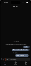
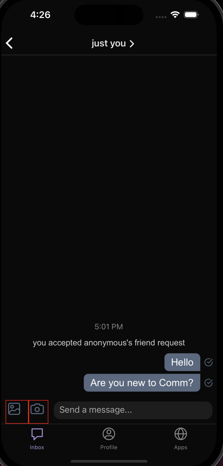
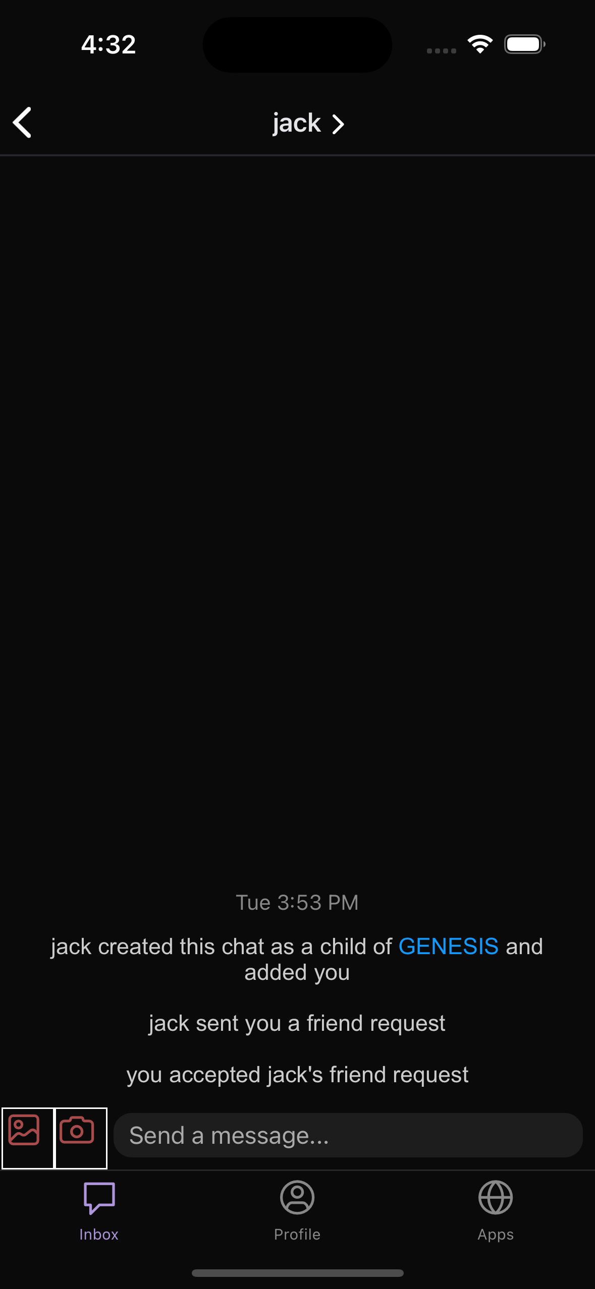
Increased the size of the icons in chat (camera and gallery icons), and added some more padding
between the icons and the chat input to address the issue of accidental clicks. This addresses ENG-1723:
https://linear.app/comm/issue/ENG-1723/take-photo-photo-gallery-icons-should-be-bigger
Details
Details
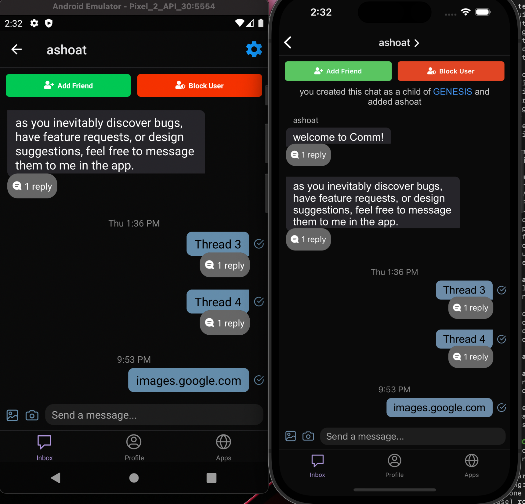
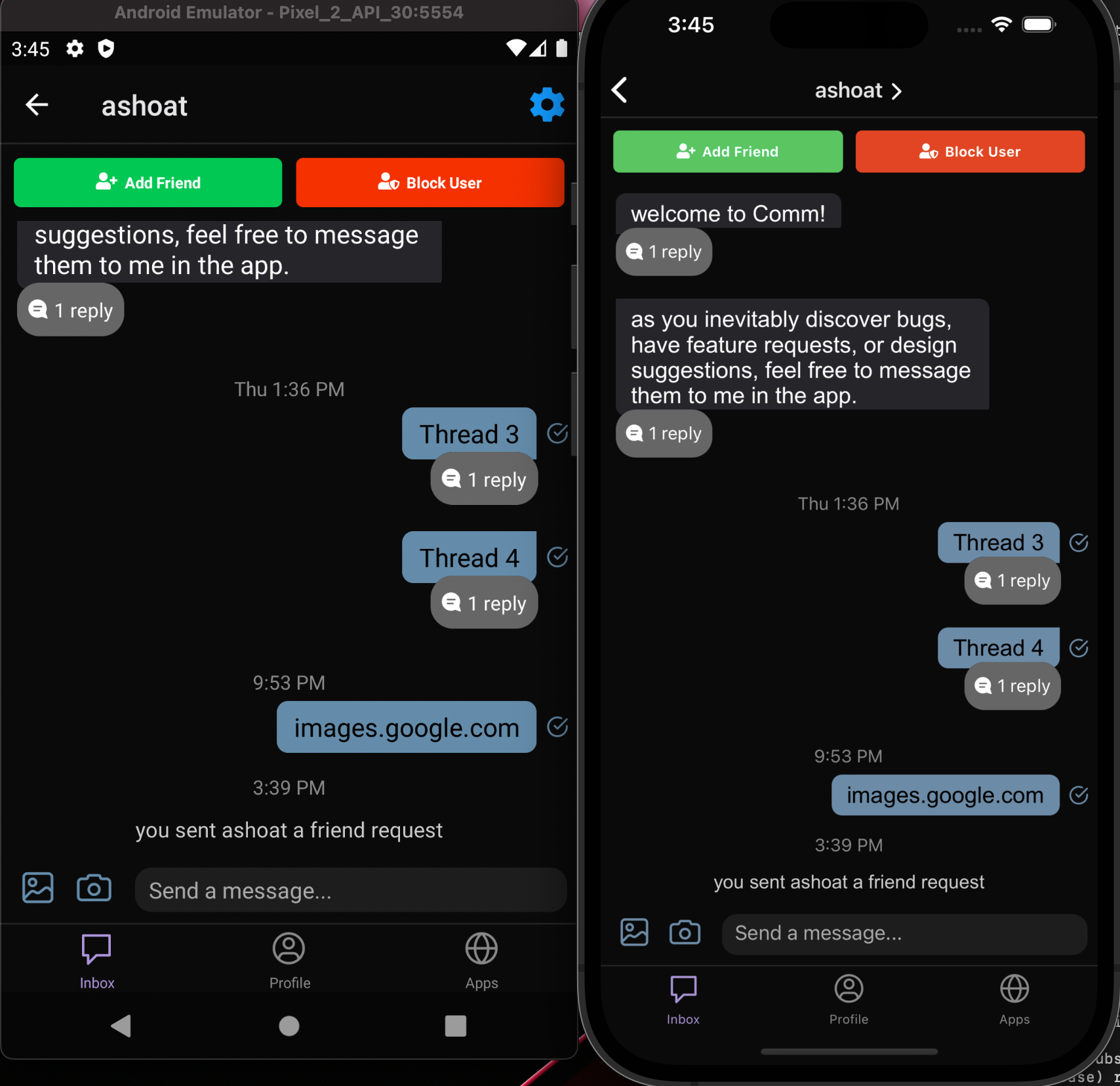
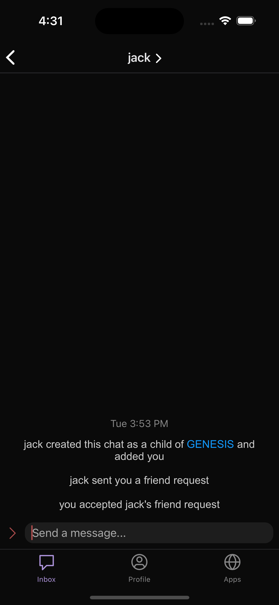
Compared the icon sizes on both Android and iOS before and after making these changes, and the
icons are visually larger and easier to click as they are separated a little more. Since there is no official
design for this yet, reviewer feedback can decide if it's visually and functionally better.
Before:
After:
Additionally, I tested the tap radiuses of each component and it's much easier to interact with the respective icons. Similarly, increasing the size of these doesn't cause any undesired behavior with the expando button and typing a message.
Diff Detail
Diff Detail
- Repository
- rCOMM Comm
- Lint
Lint Not Applicable - Unit
Tests Not Applicable
Event Timeline
Comment Actions
Looks great!! A couple questions:
- Have you played around with the expando button and the keyboard to make sure animations / transitions still look good between every combo of states you can identify? (Would add this to test plan.)
- What's the tap target here? Can you share a screenshot of the tap target highlighted in some color?
Comment Actions
Yes! Simulated the typing experience with the expando button multiple times on both devices when I had them running. Transitions still look good and I didn't notice a difference in behavior either. Thanks for the heads up, I'll add it to the test plan now.
- What's the tap target here? Can you share a screenshot of the tap target highlighted in some color?
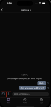
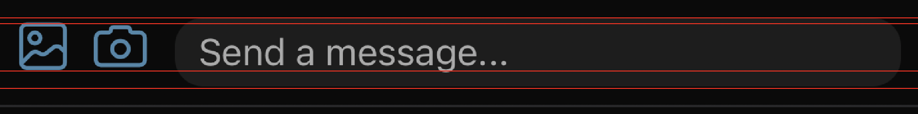
Yes, the current tap target is as follows (anywhere within the box surrounding the icon opens that respective icon):
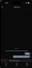
I can even it out a little by increasing the padding on the camera icon, to have a tap radius like this

For reference, the tap targets look like this currently, before any changes and this diff:

Comment Actions
I can even it out a little by increasing the padding on the camera icon, to have a tap radius like this
I wouldn't do this if it results in things looking off-balance. Tap target changes should never result in visual changes... goal is to keep things looking the same, but to make the tap target better.
Comment Actions
Some fit and finish issues here
- Expando button isn't centered horizontally
- Expando button has too much horizontal margin/padding
- Vertical alignment between camera/media gallery icons and chat input bar is off
- Vertical alignment of "Send a message..." within the ChatInputBar is off
In addition the size of the camera/media gallery icons might have been increased a little too much IMO
Since there is no official design for this yet, reviewer feedback can decide if it's visually and functionally better.
Like you said, there's no concrete solution here and things are a bit subjective... but I think we can at least address the alignment stuff right. Once those obvious things are addressed, we can set up a call or something to settle on the more subjective stuff (CC @ginsu since he's got design interest/background).
Comment Actions
Revision to update icon sizing.
To address your points @atul, looking back at the photos I can agree that perhaps the icons were a little too big, and that was causing some undesired UI effects like the alignments and the expando button's padding being affected.
I spent some more time on this revision to make sure the padding doesn't get in the way of alignments, let me know your thoughts & if you feel like it can still be refined!
Comment Actions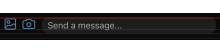
Closer!
Let's nudge the icons down a bit to get it centered vertically w/ the ChatInputBar.
(If you want we can schedule a call to get this right without the Phabricator back and forth if there are any issues)