Page MenuHomePhabricator

[native] Add horizontal margin to buttons in LoggedOutModal
ClosedPublic

Authored by ashoat on Apr 18 2023, 11:04 AM.
Tags
None
Referenced Files
Unknown Object (File)
Sun, Oct 27, 8:44 AM
Unknown Object (File)
Oct 14 2024, 3:06 AM
Unknown Object (File)
Oct 14 2024, 3:06 AM
Unknown Object (File)
Oct 14 2024, 3:06 AM
Unknown Object (File)
Oct 14 2024, 3:06 AM
Unknown Object (File)
Oct 14 2024, 2:59 AM
Unknown Object (File)
Sep 25 2024, 5:56 PM
Unknown Object (File)
Aug 30 2024, 4:08 PM
Subscribers

Details

Summary

In order to iterate on the new registration flow, I'm going to replace the register button with two side-by-side register buttons, with the second one only visible to devs.

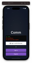
In order to make it easier to add space between those side-by-side buttons, I'm adding some horizontal margin to the buttons. (This wouldn't be necessary on React Native 0.71, where we could use gap properties instead of margin ones.)

Test Plan
beforeafter
Screenshot 2023-04-18 at 2.00.02 PM.png (1×521 px, 295 KB)
Screenshot 2023-04-18 at 2.00.14 PM.png (1×521 px, 294 KB)

The only difference is in the horizontal margins of LoggedOutStaffInfo

Diff Detail

Repository
rCOMM Comm
Lint
Lint Not Applicable
Unit
Tests Not Applicable

Event Timeline

This revision is now accepted and ready to land.Apr 18 2023, 12:47 PM

Keep LoggedOutStaffInfo margins the same as before

Also removed what appeared to me to be an extraneous View

This revision was landed with ongoing or failed builds.Apr 19 2023, 6:39 PM
This revision was automatically updated to reflect the committed changes.