Page MenuHomePhabricator

[native] render user avatars in chat screen
ClosedPublic

Authored by ginsu on Mar 14 2023, 1:37 PM.
Tags
None
Referenced Files
F3360676: D7067.id23794.diff
Sun, Nov 24, 1:53 PM
F3360563: D7067.id23858.diff
Sun, Nov 24, 1:25 PM
F3360518: D7067.id23802.diff
Sun, Nov 24, 1:01 PM
F3360505: D7067.id23735.diff
Sun, Nov 24, 12:58 PM
F3360276: D7067.id24006.diff
Sun, Nov 24, 12:33 PM
F3360275: D7067.id24032.diff
Sun, Nov 24, 12:32 PM
F3360230: D7067.id23772.diff
Sun, Nov 24, 12:29 PM
F3360225: D7067.id24033.diff
Sun, Nov 24, 12:28 PM
Subscribers

Details

Summary

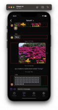
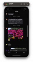
Rendered user avatars in the chat screen. Avatars only render for users who are not the viewer and at the end of a message cluster. When the message gets swiped, the avatar will move with the message.

UPDATE: First draft of diff did not consider the width of chat bubbles being affected by the new avatar component. I changed the value of some composedMessageMaxWidth instances to consider avatarOffset


Depends on D7099

Linear Task: https://linear.app/comm/issue/ENG-3107/build-out-a-dummy-avatar-component-and-render-it-everywhere-we-will
Test Plan

Please watch the demo videos to see all the cases I tested

multimedia message with multiple images:

video message:

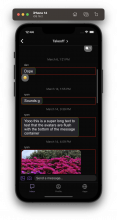
Chat screen pre avatar world (when !shouldRenderAvatars)

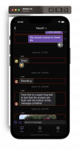
Chat screen post avatar world (when shouldRenderAvatars)

Under the hood here are what these components look like:
Chat screen pre avatar world:

Screenshot 2023-03-23 at 12.44.26 PM.png (1×1 px, 1 MB)

Chat screen post avatar world:

Screenshot 2023-03-23 at 12.44.09 PM.png (1×1 px, 735 KB)

Super thin photo:
pre avatars world:

post avatars world:

Diff Detail

Repository
rCOMM Comm
Lint
No Lint Coverage
Unit
No Test Coverage

Event Timeline

There are a very large number of changes, so older changes are hidden. Show Older Changes

only reduce the width of non viewer-composed messages as well as all multimedia messages

Offline asked @ginsu if we should maintain consistency on the width of chat message bubbles for viewer vs. non-viewer, he's going to check with Ted

Offline asked @ginsu if we should maintain consistency on the width of chat message bubbles for viewer vs. non-viewer, he's going to check with Ted

I spoke to Ted about this before he headed out, and he agrees that we should maintain consistency on the width of chat message bubbles for viewer vs. non-viewer. Will have an update out here shortly; apologies for the misunderstanding above

Reduce the width for ALL composed messages bubbles to maintain consistency on the width

make width consistent for all composed messages

ginsu edited the test plan for this revision. (Show Details)
ginsu added inline comments.
native/chat/chat-item-height-measurer.react.js
58 ↗(On Diff #23802)

We still want the original value of useComposedMessageMaxWidth in composed-message.react.js so we need to do this extra step in the composedMessageMaxWidth calculation outside the hook

ashoat requested changes to this revision.Mar 16 2023, 3:38 PM

Did you decrease both chat bubbles' sizes by avatarOffset? That means we're subtracting 2 * avatarOffset when we only need space for avatarOffset, right? Can you please adjust it appropriately to maintain previous proportions?

This revision now requires changes to proceed.Mar 16 2023, 3:38 PM

Did you decrease both chat bubbles' sizes by avatarOffset? That means we're subtracting 2 * avatarOffset when we only need space for avatarOffset, right? Can you please adjust it appropriately to maintain previous proportions?

Hey @ashoat I am a bit confused by this comment, and want to make sure we are on the same page about what I need to do here. When you mean decrease both chat bubbles' sizes you are referring to both viewer and non-viewer chat bubbles correct? If you are then the answer is yes. I was under the impression that we wanted to reduce the width for all composable messages (text and multimedia) for both viewers and non-viewers to maintain a consistent width for all the chat bubbles.

Can you please adjust it appropriately to maintain previous proportions?

I am not sure what previous proportions you are referring to. Is it the previous proportions of viewer-composed text messages?

I'm thinking basically:

  1. In current master, figure out what % of total screen width a chat bubble can take
  2. Subtract the space necessary for the avatar from the total screen width
  3. Keep the % from 1 the same after adjusting for 2

Does that make sense?

I'm thinking basically:

  1. In current master, figure out what % of total screen width a chat bubble can take
  2. Subtract the space necessary for the avatar from the total screen width
  3. Keep the % from 1 the same after adjusting for 2

Does that make sense?

Okay I think I am following now. I will double-check my understanding with you IRL after lunch just so we don't waste more code review cycles

ginsu edited the test plan for this revision. (Show Details)

rebase after changing up diff stack order

Changed the stack order so that this diff comes after D7099, so that we aren't blocked on this diff for landing the avatars work once D7099 (feature flag work) is accepted. I tested on my local stack each diff when changing the order and nothing was broken

Still need to fix chat bubble poking out (will timebox for 1-2hrs)

add feature flags and fix poking chat bubble

My last proposed solution to fix the chat bubble poking out of the message box is to make the message box a flex container and align the inner text messages (either flex-end or flex-start) depending on if the message came from the viewer or not. This solution is very similar to how we position the InlineEngagement component, which inspired me to implement the solution this way.

So under the hood this is what the chat bubble (green) and message box (red) look like:

Screenshot 2023-03-21 at 5.31.04 PM.png (1×1 px, 1 MB)

The message box is now the size of the available real estate (screen width minus a horizontal side margin). The inner text message (chat bubble) will either move to the left of the message box (using flex-start) or the right of it (using flex-end) just like how InlineEngagement behaves.

When testing all of this, I am still maintaining the previous proportions as before I rendered the avatar screen and the swiping still works great:

I am also not getting any logs regarding incorrect height measurements.

I feel pretty good that this is the best solution; however, if this is not the case, I will need your help @ashoat to figure this out quickly

ashoat requested changes to this revision.Mar 22 2023, 4:09 PM

That general approach looks great!! Great work figuring this out.

Just minor comments at this point. Can you amend your Test Plan to:

  1. Include testing a multimedia with multiple images
  2. Include testing a video (not sure if you already did that)
  3. Test how everything looks if !shouldRenderAvatars
native/chat/composed-message.react.js
96 ↗(On Diff #24006)

What happens if we always include this? Does it break rendering in the pre-avatars world?

98 ↗(On Diff #24006)

It's pretty confusing that styles.messageBox is passed to messageBoxStyleContainerStyle rather than to messageBoxStyle. Can you clean up the naming? (The easiest thing would probably be to rename styles.messageBox)

100 ↗(On Diff #24006)

What happens if we just add flex: 1 to styles.messageBox? Does it break rendering in the pre-avatars world?

In general we should move all "static" styles to styles rather than defining them inline, so if we really need this it would be good to do that.

272 ↗(On Diff #24006)

What does this line do?

272 ↗(On Diff #24006)

Do we need display: 'flex' here, or does React Native "assume" that by default or something?

native/chat/text-message-tooltip-button.react.js
156–171 ↗(On Diff #24006)

Looks like you're copy-pasting this code in multiple places. When you find yourself copy-pasting something, that should be a "red flag" that you're doing something wrong.

Can you factor this code out into its own component, and make sure you use that component in all of the places that you're doing this? (All places in this diff, and all places in other diffs)

This revision now requires changes to proceed.Mar 22 2023, 4:09 PM
native/chat/composed-message.react.js
96 ↗(On Diff #24006)

At one point as I was implementing this new solution the rendering broke; however, after trying to repro it to get a screenshot, everything seems to be copacetic now both in the pre and post avatar world. I think I had a style out of place as I was tinkering, which caused my misassumption. I will fix this and show this in the test plan

100 ↗(On Diff #24006)

At one point as I was implementing this new solution the rendering broke; however, after trying to repro it to get a screenshot, everything seems to be copacetic now both in the pre and post avatar world. I think I had a style out of place as I was tinkering, which caused my misassumption. I will fix this and show this in the test plan

272 ↗(On Diff #24006)

It brings the avatar down to the bottom of the message box. Without it our avatar would be rendered like this

Screenshot 2023-03-22 at 7.44.33 PM.png (1×1 px, 1 MB)

native/chat/text-message-tooltip-button.react.js
156–171 ↗(On Diff #24006)

Gotcha will put up a diff to address factoring out shouldRenderAvatars logic into a AvatarFeatureFlagWrapper component

native/chat/text-message-tooltip-button.react.js
156–171 ↗(On Diff #24006)

Spoke to @ashoat IRL and we will just be factoring out this part of the code in only text-message-tooltip-button and multimedia-message-tooltip-button

native/chat/text-message-tooltip-button.react.js
162 ↗(On Diff #24032)

This component and multimedia-message-tooltip-button.react.js and robotext-message-tooltip-button.react.js have a ton of code that is copy and pasted with each other (reactions, inline engagement, and some styles). This is something we shouldn't spend time on now but wonder if eventually, we should make a general MessageTooltipButtonWrapper component that factors out all the shared code between these three components. If this is something we should do, I can create a task to track it

ginsu edited the test plan for this revision. (Show Details)

memoize MessageTooltipButtonAvatar

ashoat added inline comments.
native/chat/text-message-tooltip-button.react.js
162 ↗(On Diff #24032)

Yes, great idea for a Backlog task!!

This revision is now accepted and ready to land.Mar 23 2023, 7:32 PM

One last thing that would be great if you could test: what happens if you upload a single very "thin" photo? I want to make sure it doesn't expand to take the whole width and then becomes super tall. (Or at least, that there's no regression in this.)

Sorry for all the specific test plan requests, I just remember there being a lot of edge cases with this code from back when I was working on it.

no worries, I amended the test plan to test that case, and everything still looks great, even with a single very "thin" photo