The last step here is to make this menu button a touchable and to navigate to UserRelationshipTooltipModal whenever the menu button gets pressed.
Initially I had all this logic living in UserProfile; however, I didn't want to overcrowd this component, so I created a separate UserProfileMenuButton component to keep things better organized
Here are the figma designs showing which options should be shown in different states:
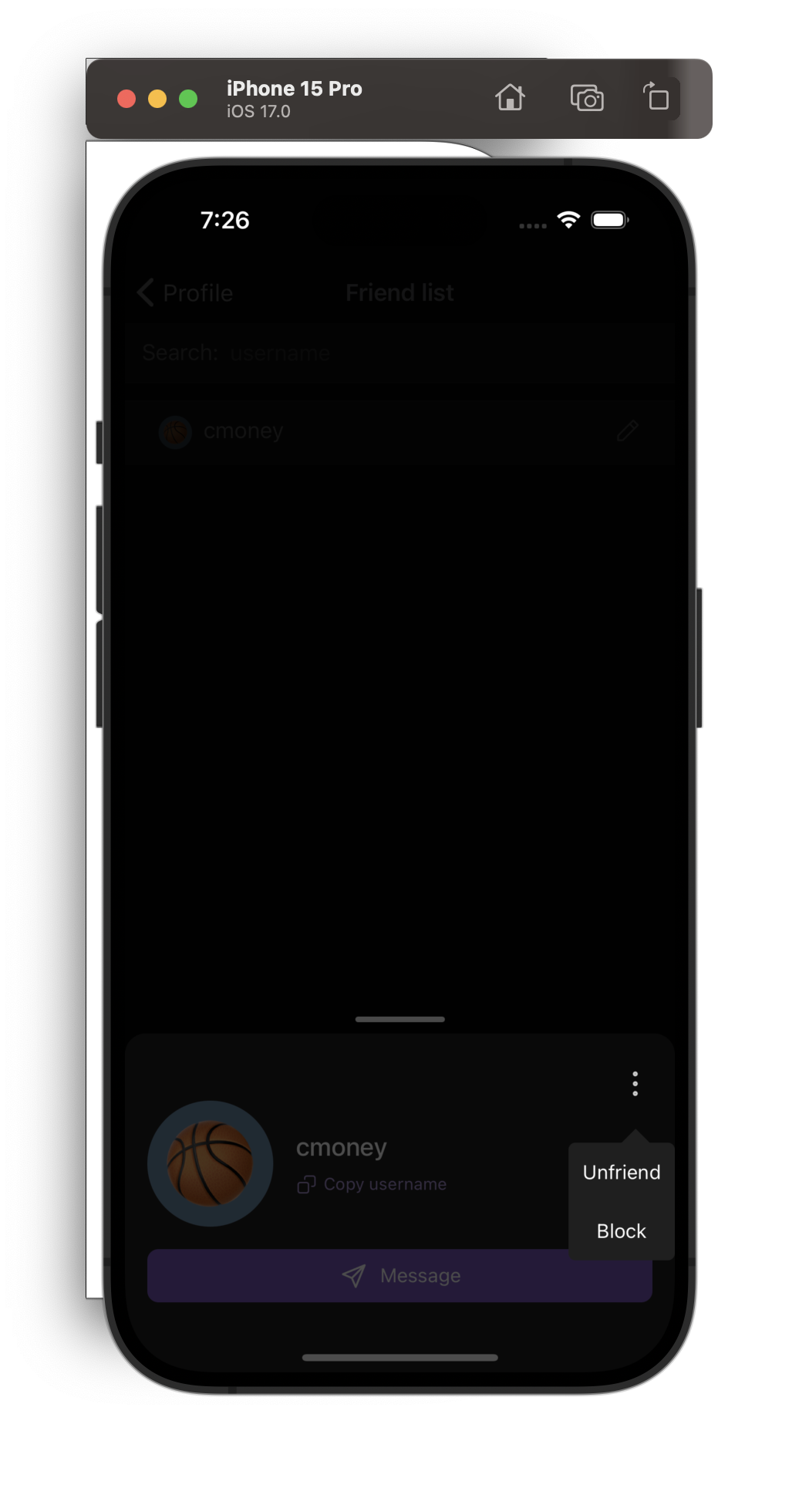
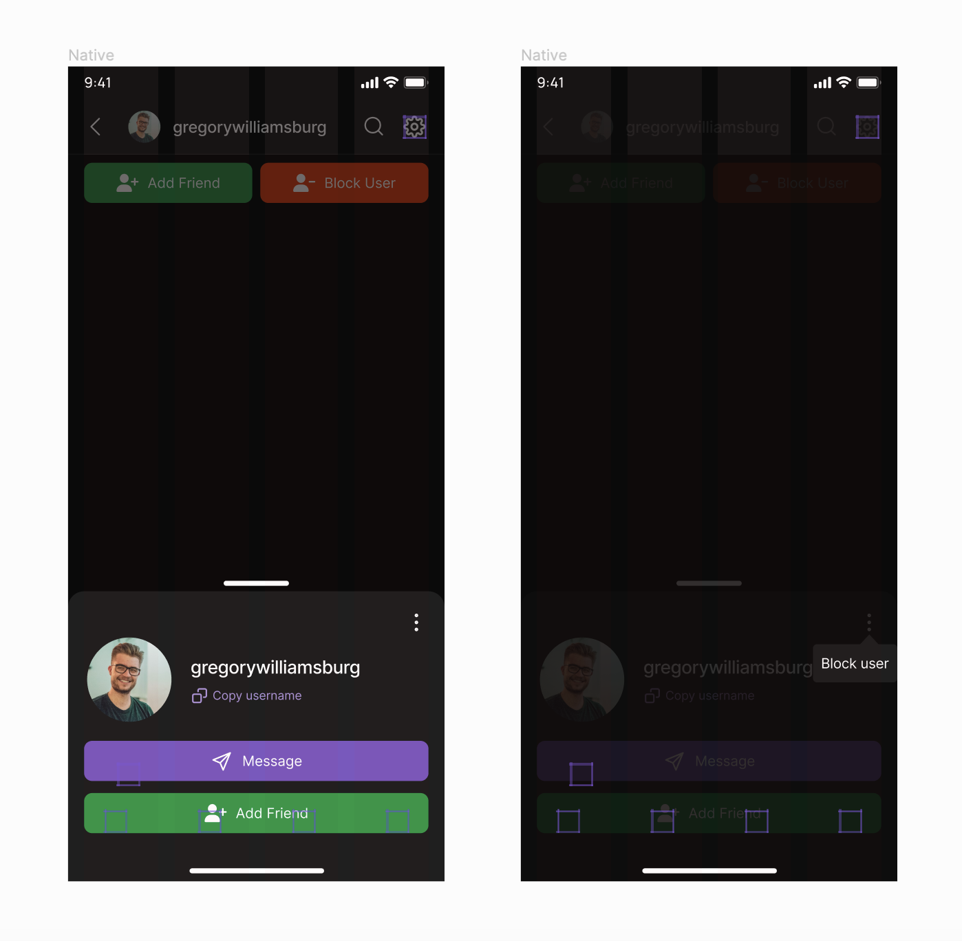
When user is a friend:
{F792574}
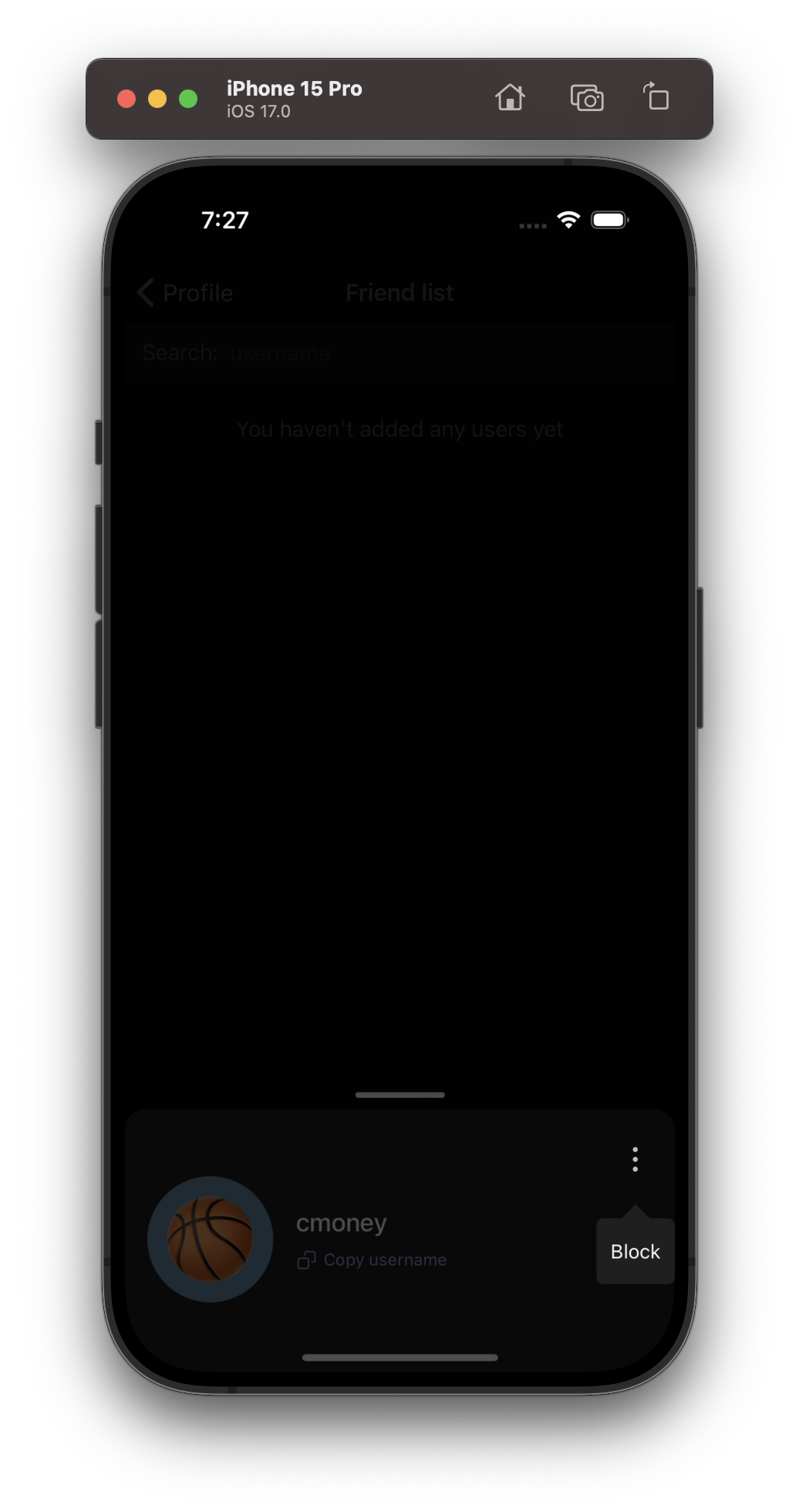
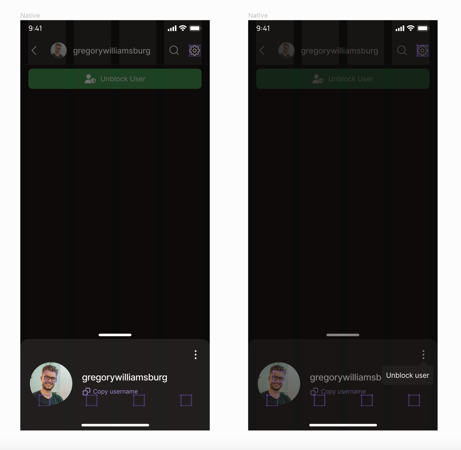
When viewer is blocked (couldn't find native designs but the concept is the same here):
{F792580}
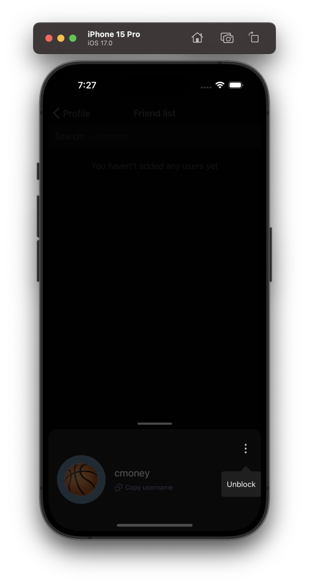
When user is blocked by viewer:
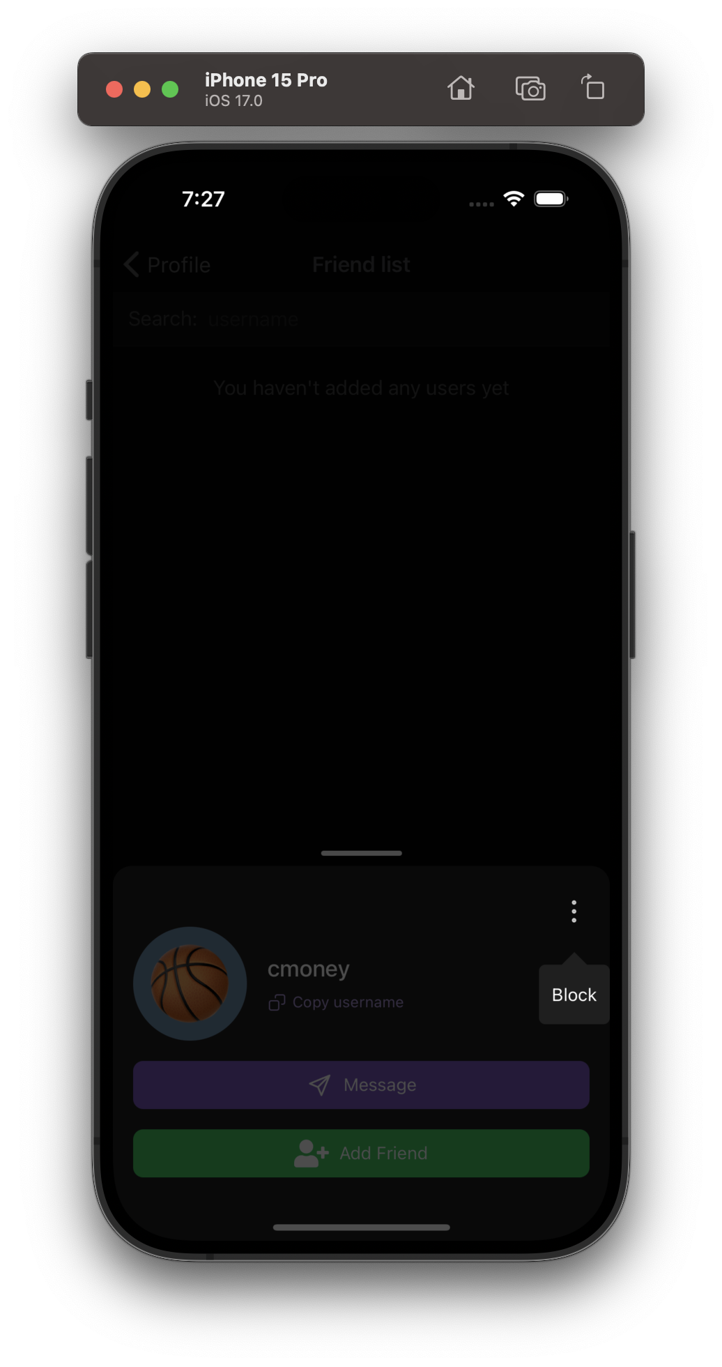
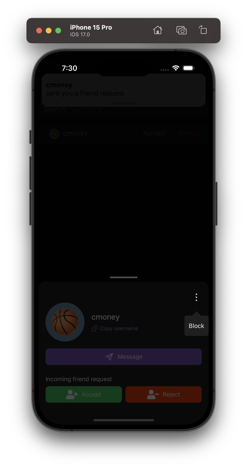
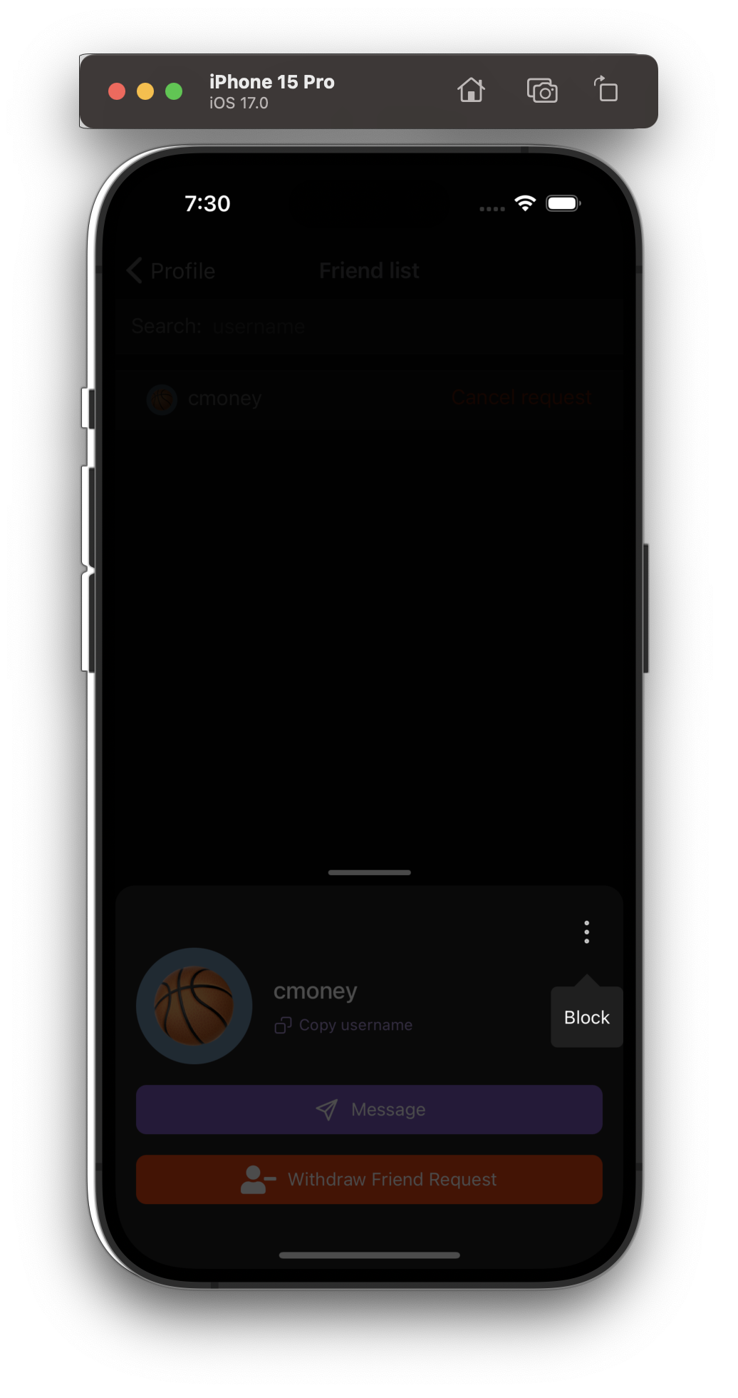
When there is no relationship status between user/viewer, or there is a pending friend request in either direction:
This is step 5 in the list below
Outlined below are the steps I will take to update RelationshipListItemTooltipModal:
- Add the block action to relationship list item tooltip menu (RelationshipListItem won't need this option, but User profiles will. This is shown in the figma screenshot above)
- Rename RelationshipListItemTooltipModal to something more generic like UserRelationshipTooltipModal
- Make UserRelationshipTooltipButton into a functional component (We need to use the useColors hook in a subsequent diff)
- Introduce the tooltipButtonIcon as a param to RelationshipListItemTooltipModal (RelationshipListItem will use a pencil icon and user profiles will use a kebab menu icon)
- Introduce UserProfileMenuButton (This component will handle navigating to RelationshipListItemTooltipModal
Depends on D9381